Fintech conquers Belgium – switching bank accounts service providers automatically and interoperability – part 2
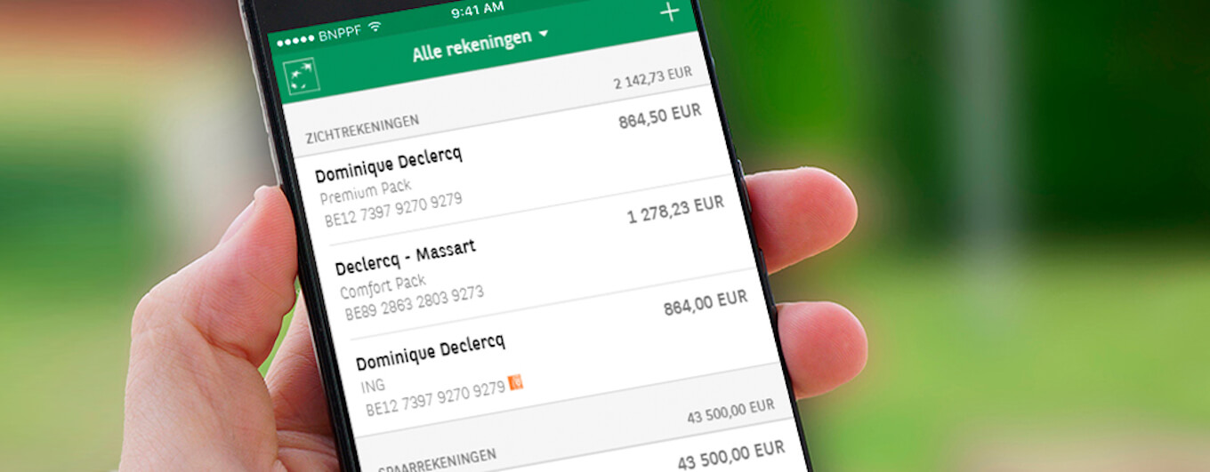
‘If you can’t beat them, join them’ as the old saying goes, which continues to be valid even in the age of Fintech. ING Belgium is attempting to exploit opportunities for rapid financial growth with the help of its own incubator programme, while BNP Paribas Fortis is playing emphasis on openness. This is how the interoperability of bank accounts, which was unimaginable a decade ago, could become a reality: in today’s Belgium, financial matters related to bank accounts held with multiple banks can be managed in a single application.
ING Belgium
The country consisting of Flanders and Wallonia has its own subsidiary within the ING Group. The financial institution used to be known by the name Bank Brussel Lambert; it was acquired by the parent company in 1998 and has been operating under the name ING Belgium since then. It primarily offers residential and commercial banking services to private individuals and businesses, in addition to related services such as insurance and asset management.
Its services, provided to more than three million customers, are wide in range, including everything from business services to personal banking. Therefore, its customer base is varied as well; it ranges from young people to the elderly and does not just include local residents as they are attempting to reach foreign residents as well. The financial organisation, which employs approximately 7 thousand people, reported profits before tax of close to EUR 150 million in 2020.
Incubator programme for Fintech undertakings
The company is aiming to keep pace with its Fintech competitors through its ING Labs initiative. One of these is registered in Belgium: ING Labs Brussels is combining the knowledge and network of the parent company with the rapid implementation of new financial ideas that appear feasible. It dedicates special attention to the identification and exploitation of opportunities hidden in the property market and the fields of commerce, credit, financial health, and compliance.
Within the framework of the ‘financial incubator programme’, which used to be called Fintech Village, ING Belgium develops partnerships with up and coming start-ups that align with the innovation goals of the financial institution. As soon as a project reaches the stage of scalability, the team behind the initiative may decide to either continue development as an independent company backed by ING or as part of the banking group itself. In order to maximise success, the emphasis is always on understanding the needs of customers and ensuring that these needs can be served in an effective and efficient manner. The initial assumptions are tested and evaluated before a complete infrastructure is built around them.
Automated switching between service providers and termination of subscriptions
The story of the Swedish Minna Technologies, founded in 2016, is an excellent example of this. The Fintech partner of the bank provides full insight into all subscriptions of their customers. It makes it possible to manage their subscriptions without exiting the app used for banking, for example, by terminating them or switching to another service provider (even automatically), thus allowing them to monitor their monthly utility expenses in a comfortable and efficient manner. The Swedish company claims that since its foundation in 2016, it has saved more than EUR 40 million for their bank customers with the help of their initiative, which allows them to switch to services that result in lower electricity or mobile telephone bills.
The Fintech undertaking entered into a partnership with ING Belgium, or more precisely ING Lab Brussels, in 2019. After the two organisations successfully proved the viability of the service model, the technology of Minna was integrated into the app of the Belgian financial institution in the summer of 2020. When summarising the experiences of the pilot project completed with approximately 100 thousand users, it was found that average savings of EUR 400 per year (EUR 32 per month) can be achieved by Belgian (and Luxembourgian) customers using the service called OneView. Every tenth customer cancelled a subscription that was unnecessary for them and 1.7 per cent of them got rid of even more.
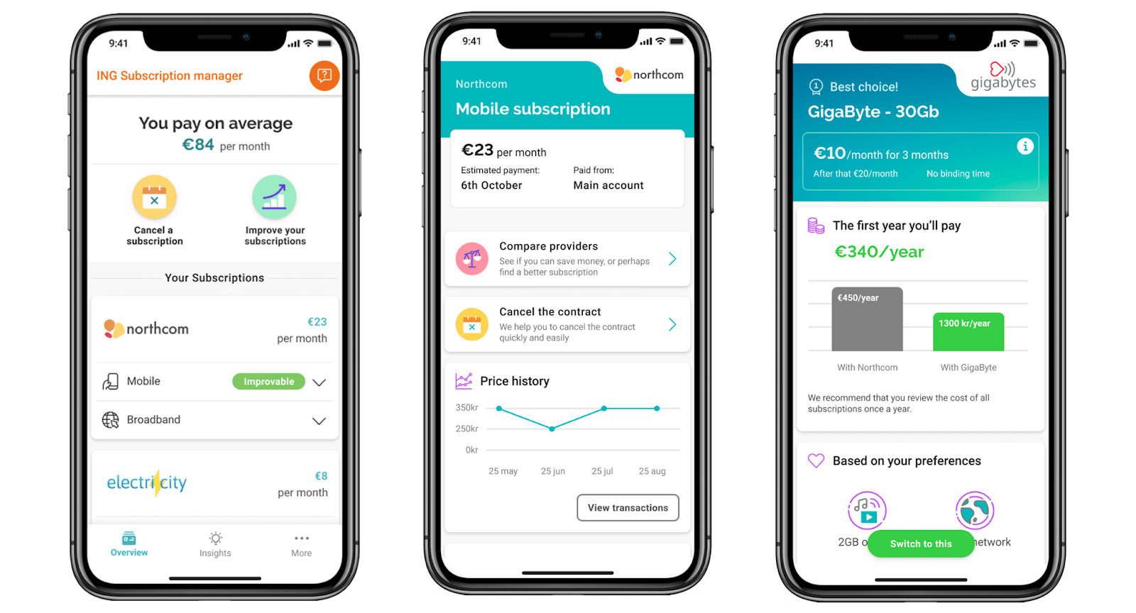
In addition to the above, ING Belgium also launched its service called Switch, which was also integrated into its mobile application. This allowed customers to compare their subscriptions with the offers of competing service providers with the help of a smartphone application for the first time in the country. By just tapping on their mobile device, customers were not only able to switch to cheaper alternatives but could also selected green(er) energy usage as a criteria. Whatever consideration serves as the motivation of an ING Belgium customer, the bank only needs the decision to be made; after that, it takes care of all administrative tasks itself.
Artificial intelligence in credit management
It was also in the spring of 2021 that the Belgian bank announced its cooperation with Flowcast in order to improve the efficiency of credit services. The Fintech startup, in the first-round financing of which ING Belgium has already participated, develops lending and debt collection solutions based on artificial intelligence. Including the spring investment of EUR 3 million, Flowcast has already attracted a total working capital of approximately EUR 10 million.
The service makes it possible for the bank to manage its credit portfolio in a proactive manner, reducing costs and customer migration, as well as improving the borrowing experience. Currently, a pilot project investigating customer satisfaction and the effect on consumers is underway in the country.
ING – A customised banking interface
The varied customer base of the bank is superb from a business point of view; however, it makes designing a bespoke customer experience and providing a meaningful banking experience to every individual difficult. Different segments of the financial institution’s clientele have unique and varied needs; however, every single user is greeted by the same application and the same interface.
What can be done in such a case? IGN decided to create three customer segments based on the different customer needs and have a different customisable banking interface designed and developed for each such segment. From these, we are going to present the research methodology and design process of the interface developed for young people with the help of a university case study prepared on behalf of ING bank.
The process went as follows:
- understanding the financial behaviour of students
- identifying possible ‘points of pain’ in the current application
- developing the concept of a new, custom interface for the segment, and of course finally
- testing and validating the finished interfaces
Research: starting point and interviews
Naturally, ING bank had prior information on what differentiates the behaviour and expectations of the various segments from each other; however, the designers of the interface had to contend with a number of additional challenges. In the first round, they established hypotheses about the possible financial behaviour of each segment. They supplemented these hypotheses with the help of desk research (reading the literature, finding studies, and summarising them). This means that they had not done any field research at this point; they were working on theoretical grounds.
The agency preparing the concept plans of the application (https://leslieman.com/) wished to understand in detail how young people used their money, how they managed their savings, and what their relationship was like with their bank.
They believed that understanding these aspects would bring them closer to the creation of a more customised interface. In order to achieve this, having established their hypotheses and completed their desk research, they conducted detailed interviews with members of the selected and examined student segment, with respect to whom the criteria were that they were between 18 and 25 of age and were attending an educational institution. During the interviews, they asked questions such as ‘which functions of the current banking application do you use the most?’ and ‘what financial goals do you have and how could your bank contribute to achieving these goals?’. The aim was to learn how students actually used their money and what their relationship was like with their bank.
The conclusions drawn from the interviews, as well as the data of the desk research and the market research were grouped on the basis of various criteria with the help of an affinity diagram (see the image titled ‘Affinity diagram; thematically organised information’):
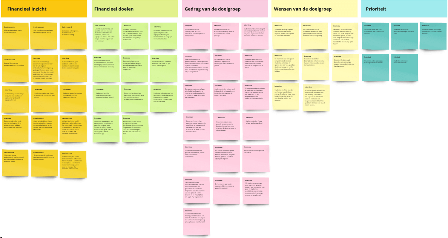
According to this, the most important issues were as follows:
- Opportunities for gaining insight into finances: Students do not find their finances to be sufficiently transparent; they tend to forget how much they spent, when, and on what. Many know it more or less but definitely not exactly.
- The topic of financial goals: Many students complained that although they had financial goals, they were not able to reach them. For example, they wished to save some money or simply spend less. These goals were different from person to person; however, a typical requirement was to remain within a budget or even start saving.
- The behaviour of the target group: The majority really wanted to stay within a monthly budget but found it difficult to do so.
- Wishes of the target group, especially important criteria: They would like to see how and on what they spend their money exactly.
Brainstorming
After this, the process of coming up with possible solutions began. A brainstorming session was organised, where the participants wrote down their ideas and proposed solutions related to specific functions. After this, the ideas raised were categorised and finally distilled down to four functions, which later became a single solution. (See the image titled ‘Brainstorming, results, categorisations’)
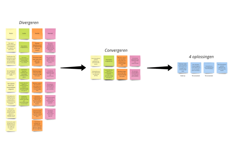
The solutions (under the text ‘4 oplossingen’ – solutions) to the issues described above were the following:
- Learn about savings opportunities,
- Stay within a budget,
- The ability to see how and on what they spend their money,
- The ability to plan future expenses.
The concept
Based on the research, it was possible to outline what problems students were facing and how they wanted to solve these. What happened then? The process, and in this case the problem, is as follows:
- The student gets paid,
- The student thinks about saving but does not record this anywhere,
- They shop without thinking,
- They go to the shop but find out that their balance is too low and they have not even known about it,
- The student ends up not being able to purchase the desired product / service,
- They fail to reach their financial goals because of too high expenses.
On the basis of the research and the interviews, a goal was set to develop a solution that helps the students facing the issues identified in similar situations:
- encourages the creation of a budget
- provides appropriate insight into finances
- creates awareness of spending and find more encouraging savings goals
- supports the development and improvement of financial awareness
After this, the possible plans for the solution were drawn up.

Testing and iterating
After the first draft of the original concept was ready, it had to be tested.
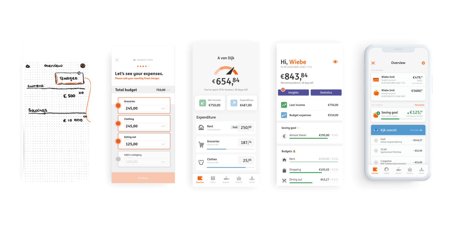
Paper prototype testing was performed with users belonging to the target group on two occasions. The feedback received was sufficient for starting the iteration of the next prototype. From this point on, the process of repeated testing and design continued for a few weeks. A few results from this testing and iteration cycle are shown below. The screenshots are characterised by minimalistic interfaces, uniform typography, and a youthful colour palette. It is visible that the most important information on an interface is shown in a larger font and/or different colour. This helps users take the information in quickly and navigate more easily. Content can be displayed visually in a way that promotes understanding was designed to appear in such a way too.
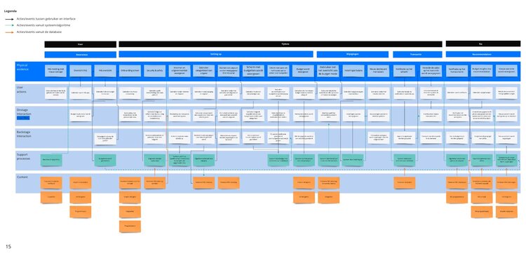
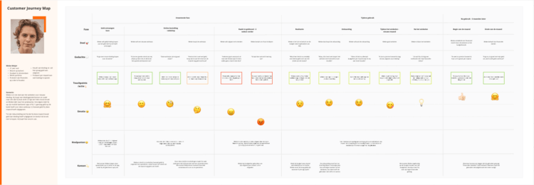
Later on, customer journey mapping was performed, a service blueprint was created (see the image titled ‘Service blueprint’), personas and the value proposition were developed, storyboarding was completed, and a market analysis prepared.
The end product – Insight
Following an appropriate amount of testing and iteration, an interface fulfilling the originally set criteria and providing a solution to all of the points of pain identified during the research was created. This solution helped students plan and adhere to their budget, achieve their financial goals, and most importantly, provide insight into when and on what they spend their money.
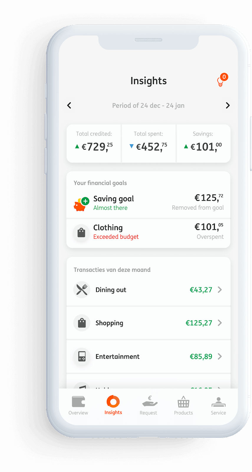
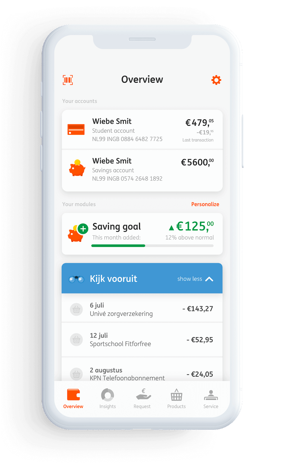
On the insight page of the new application, users can see their monthly total income and expenses, categorised, and summarised on a single interface. These categories (at most three, such as groceries, shopping, and entertainment) can be set up individually. Users can also see their monthly savings (if any) and the interface even shows what financial goals they set for themselves for the given month and whether they were able to reach them.
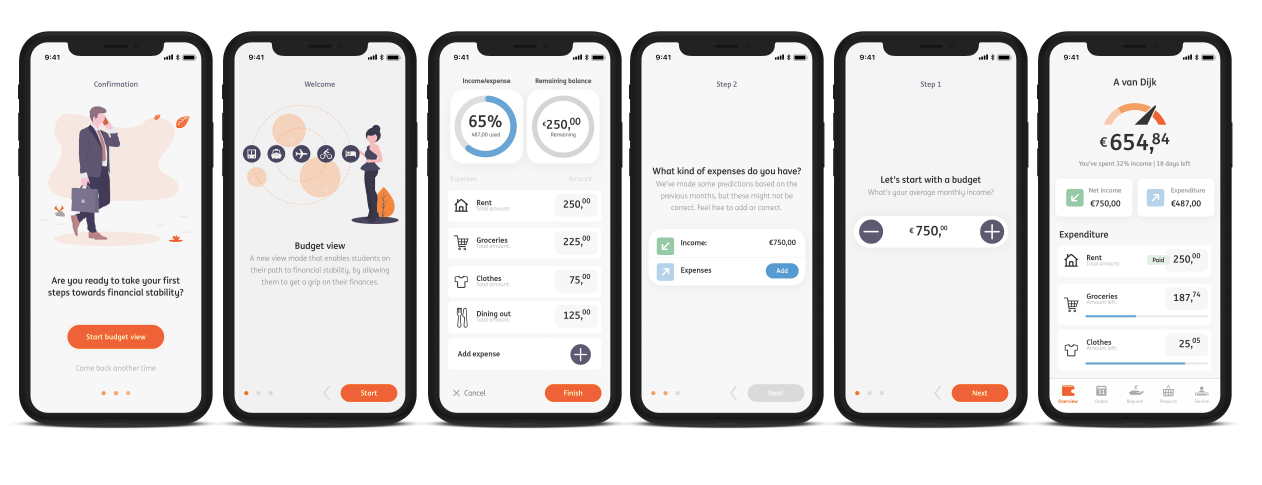
As a bonus, they created an interface that is useful not only for students but for anyone who had difficulty managing their finances and this leads to financial problems. (Figures titled ‘Details from the iterations 1-3’, ‘Insight: how much was spent on what?’, and ‘Insight: how much did I manage to save?’)
What did we learn from the design and development process as a whole?
On the one hand, that at the beginning of projects, it is worth performing review research that is thorough and detailed, even varied if necessary. The data thus obtained will serve as the foundation of not only the design and development of the product to be created but also creates a dataset that can later be revisited. This will help in future decision-making concerning the design and development process, as well as other aspects of the product.
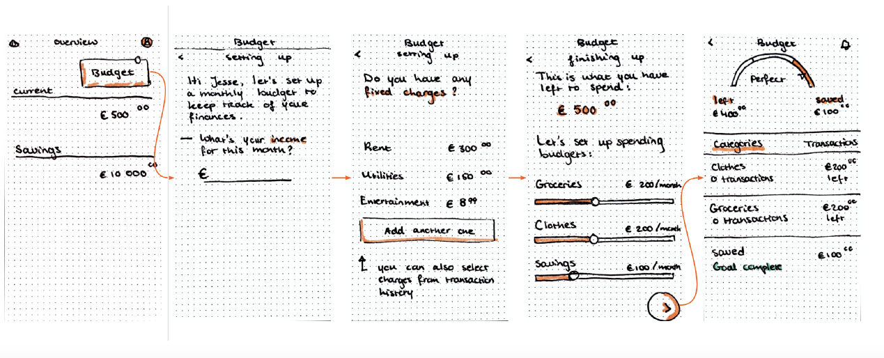
It is clearly visible that the tested paper prototypes (Image titled ‘First concept plans of the application’)
had not been developed in detail. That would not be necessary since during testing, the designer/tester/developer receives a large amount of feedback during testing, and based on these, the minute details can be added to the design of the next iteration. Another important lesson is that it cannot be said enough time that testing as early as possible is better than testing later.
The reason for this is that the testing done with early drafts (even with designs drawn on paper by hand) immediately shows the largest and moderately large UX issues. At this time, correcting the plans is very simple; the researcher simply erases the relevant parts and re-draws them, perhaps even with the help of the research subject. It is clear that the cost of this process is miniscule compared to the testing and correction of more developed, computer-based designs. Another advantage of testing done on paper: research subjects do not assume that someone has already put a lot of work into it. In contrast, they are hesitant to ask for changes on a designs with well-developed graphics for the same reason. ‘Let’s leave it, it is good as is’ they often say regarding the issues identified when seeing a beautiful design with elaborate graphics.
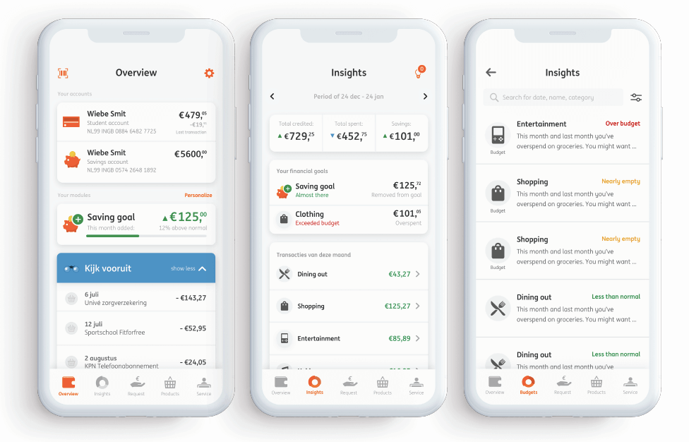
The new ING OneView boasts an even simpler interface than its predecessor, easier navigation, and new functions.
BNP Paribas Fortis
This international bank based in Belgium and founded in 1990 operates as the subsidiary of the French BNP Paribas. Earlier, it was known under the name Fortis, together with its Dutch and Luxembourgian divisions. However, an unsuccessful ABN-AMRO takeover, the 2008 secondary mortgage crisis, and certain incorrect decisions by management resulted in the separation of the Dutch and Luxembourgian markets. The financial institution fell into the hands of the French financial giant after having been acquired by the Belgian government. After this, Ergománia also actively worked on the digital transformation and the development of the digital strategy of the company in 2013.
As the largest bank in the country, it covers the full range of financial services: private and business customers, state and financial entities can also be found on the partner list of BNP Paribas Fortis. The organisation, which employs 18 thousand people in the country, reported a profit of nearly EUR 8 billion in 2020.
With open cards
More protection for consumers and a more open environment for the development of banking applications – this is the spirit in which the PSD2 (Payment Services Directive) of the European Union was born in 2015. The Directive obliges the financial institutions of the old continent to open up their services to Fintech developers, and make it possible for external market operators who see opportunity in such activities to access and expand their banking applications. It would be difficult to find a better example for this process in Belgium than BNP Paribas Fortis.
In 2019, the bank stood fully behind PSD2, announcing the availability of its Open Banking Portal to state-accredited developers independent of the organisation. The complete technical documentation of the application programming interfaces (APIs) used by BNP Paribas Fortis for the development of digital solutions is available on the portal. In addition, the bank also offers a sandbox option to Fintech innovators, in which they can put their freshly-made applications to the test before their introduction to the live environment.
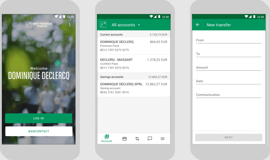
The option is available in the Belgian mobile banking service called Hello bank! as well, in which customers are able to take care of not only their banking tasks but they also have the option to enter into insurance contracts and launch crowdfunding projects, provided in cooperation with Ulule. The latter allows other bank customers to be involved in providing the financial foundation of a good concept without having to convince one (or more) large investors.
Although the initiative is progressive and it is difficult to imagine an investing opportunity simpler than crowdfunding integrated into a banking application, it appears that the service did not really gain popularity. Based on information found on the website of Ulule, only a total of five concepts have reached the closing phase so far. These are typically items costing around a few thousand euros, which can even be saved just from wages in a country with the calibre of Belgium.
As mentioned earlier, BNP Paribas Fortis, the Belgian subsidiary of BNP Paribas, was the first one to launch the version of the Easy Banking application that incorporates multiple banks on iPhone and Android smartphones. The keywords were as follows: ‘First in Belgium!’, ‘For the first time in Belgium!’ The success of the initiative contributed to the launch of a similar campaign designed in Austria.
This meant that when using the application, users could view the balances of their other accounts held with other banks as well in real time, while also seeing an overview of the transactions on their savings accounts held with financial institutions independent of BNP Paribas. This was especially important to the bank, since every fourth BNP Paribas Fortis customer has an account at another bank as well. This new approach is in line with the efforts of the bank towards providing new, innovative services to their customers, which make their everyday lives easier. In this case, customers are able to see all information related to their savings accounts at the same time and at a single glance, in the case of both personal and business accounts. To do this, it is no longer necessary to switch between the mobile applications of different banks.
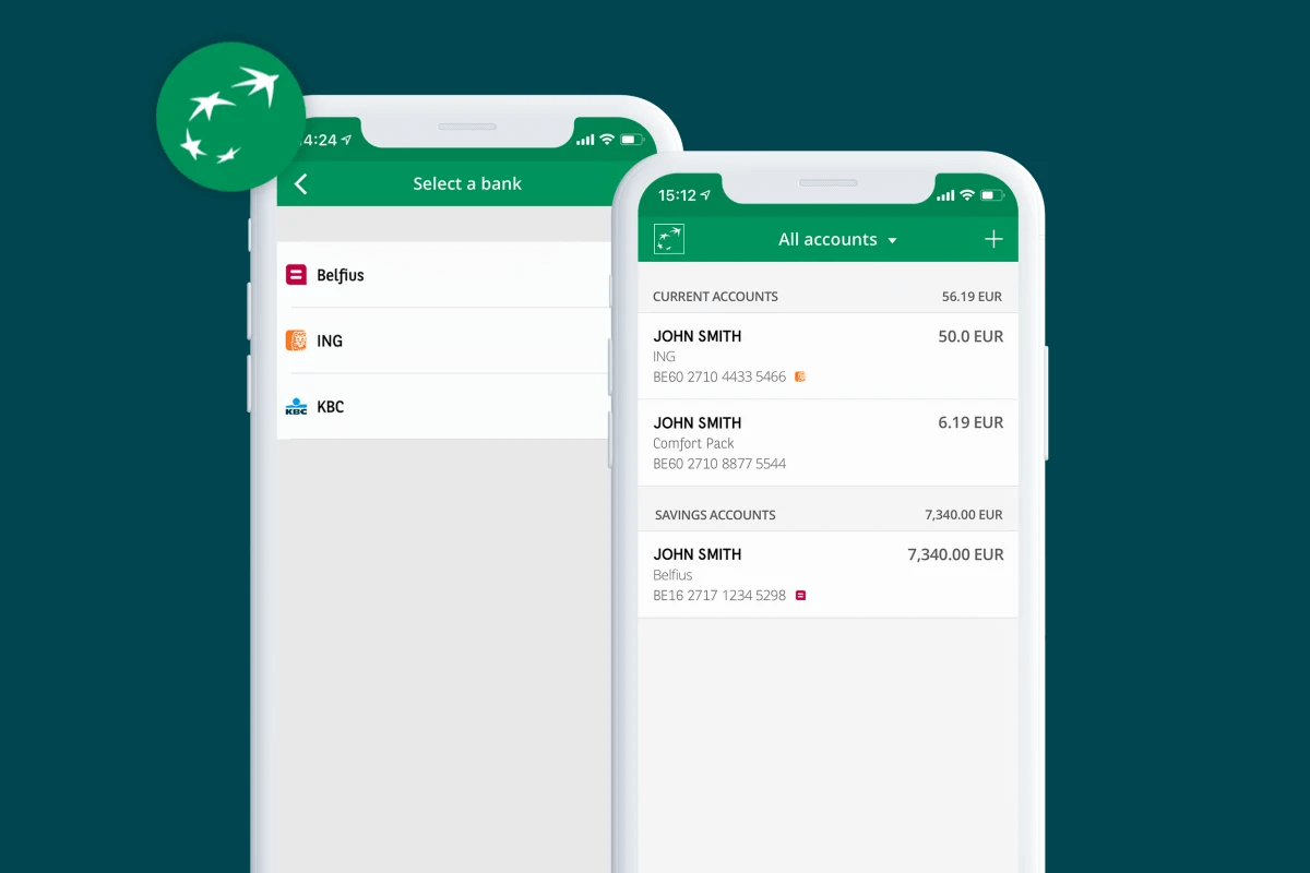
Currently, accounts with Belfius, ING, and KBC can be added to the application; however, according to the plans, the accounts of additional banks will also be integrated into the account aggregator of BNP Paribas Fortis, including a number of new functions, such as payment initiation and personal finance management (PFM) services. In the case of the former, customers can initiate payment transactions comfortably, with the help of an authorisation provided to a third party, without having to sign in to their other banking applications.
How was this all made?
BNP Paribas Fortis is well aware: there is not an agency, company, or digital guru that can tell them what mobile banking applications should or should not look like. The only one with access to the truth is the everyday user themselves.
Learning this truth, that is user research, is essential for providing the highest quality mobile experience. In turn, the research can be conducted in a variety of ways. One possible method is the KANO model, which is a resourceful solution to understanding the basic needs and requirements of the customers. It helps map out what users love, what they hate, and what they desire for example during the use of a banking application.
Research was conducted during the entire design process of In The Pocket, the web application of Paribas Fortis, and KANO surveys were performed with particular regard to mobile banking applications. During this, 200 Belgian users, aged between 25 and 65, were interviewed. As we have mentioned, the creation of KANO models is a quantitative research method, in which every single potential function is described (in this case, the functionalities of banking applications) and three questions are asked from users:
- How would you feel if this function was added to your banking application?
- How would you feel if this function was NOT in your banking application?
- How important is this function to you?
The KANO model helps map out what a mobile banking application should look like in the minds of the users.
The KANO model puts the preferences and priorities of customers into five categories, which are as follows:
- Basic requirements, must-have features (Performance needs): these are the basic characteristics of the product; the more developed they are in the solution, the more satisfied customers will be. An important attribute of these is that if they are fulfilled, the customers consider that natural but if they are implemented incorrectly or forgotten about, the customers are going to be very unsatisfied.
- Attractive features (Delighters): These are the characteristics that customers do not expect, the absence of which does not present an inconvenience but they are going to be pleasantly surprised and satisfied if they encounter them.
- One dimensional features or basic requirements (Basic needs/attributes): The customers expect these to be present and they consider them neutral even in the best scenario. These are typically the features based on which users compare two companies.
- Indifferent features (Indifferent attributes): These features are neither good nor bad in the eyes of customers; they do not contribute to customer satisfaction or dissatisfaction. If these are implemented correctly, it can be important to let customers know about them.
- Bothersome features (Reverse attributes): The more of these are included in the product, the more dissatisfied users/customers are going to be.
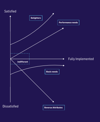
It is worth using the KANO model, which is intended to help understand the preferences of customers in details, in combination with other qualitative methods (e.g. detailed deep interviews, surveys, questionnaires, and other feedback collection methods) in order to allow us to learn about underlying drivers.
This is what was done in the case of this research as well. Let’s see what surprising or obvious lessons were learned from the research.
- It is naive to think that only a single banking application is running on the users’ telephones. They use a multitude of them at the same time and switching between them does not present an issue to anyone. This means that their existence is among the indifferent attributes.
- Not everything has to be digital! Take the case of credit simulation for example. One would think that it is very useful but in fact, customers trust bank consultants more: simulations are good but they are only a basic tool for information gathering compared to personal conversations. This means that we love using online tools but we do not trust them completely; the human voice, understanding listening, and personal attention are still required for finalising deals.
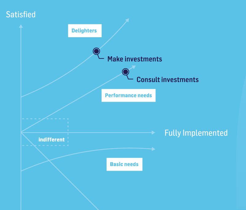
- Customers like paying attention not only to simple savings but their investments as well, which they also like to track with the help of their banking app. It can be a bonus point if they are able to start investing directly from the app. These can not only be Basic requirements (Performance needs) but Attractive features (Delighters) as well. This means that it is worth making investment options an integral part of the mobile experience.
- The onboarding process is often tiresome for customers; therefore, it is worth making it as short and simple as possible. Neobanks, such as Revolut are well aware of this.
- The creation of a new account or ordering a card should be very-very simple. The simpler the process, the more satisfied customers will be.
- No-one wants to pick up the phone to make an appointment with a bank teller. Users almost expect to be able to do this easily within the banking application; they would also like to have immediate access to the calendar view as well, so they can schedule an appointment and that’s it. If the bank would like to please its customers even more, it should make it possible to start a video call with a bank employee from the application: this ensures total success and satisfaction. These are included in the basic requirements, the ‘Performance needs’.
- Traditional banks tend to pay attention to neobanks more and more to learn what will be the newest great feature in the world of banking. Many customers would like banks to provide opportunities to start retirement savings as well, with explanations and customer information as simple as possible.
- So many banks are offering insurance today that this does not really count as an added value anymore.
These were the points discovered by the research performed using the KANO methodology, which is available on the website of In the Pocket.
Expenses have never been easier to monitor
Openness definitely paid off in the case of ING and BNP Paribas Fortis. The two Belgian financial institutions reformed their method of communication with customers using similar concepts and adjusted their banking interfaces accordingly. With these developments, opportunities such as automated service comparison and switching became available, which allow customers to keep their expenses under control more easily than ever.
The appearance and functionality of the modern banking application was based on research conducted using the KANO model. As a result, the features of the mobile app were aligned with true customer needs and all of this was done in the most straightforward way possible. This is due to the fact that the simplicity of use is the key that allows the doors of customer engagement to be unlocked and opened wide.
recommended
articles
Find out more about the topic



Share your opinion with us