Europe’s most popular digital banks – what should we know about them?

Online banking services are satisfying more and more needs and are becoming more and more widespread; many are choosing the comfortable solution of using their smartphone as a bank, among others.
Many decided to do so because they have bad experiences with the institution of traditional banks or they feel like they charge unreasonably high fees for purchasing foreign currency or transferring money abroad. Others did so because their bank does not deal with foreign stock brokers or cryptocurrency. Therefore, traditional banks are falling behind with the quickly-changing needs of their clientele.
Digital banks and decentralised payment systems (DeFi) do not hesitate to make use of this advantage, offering a completely new financial experience to investors, tourists, freelancers, and small enterprises.
In our article, we have collected the most popular mobile banks in Europe to show the new ways in which these banks are attempting to win over customers.
Bunq
| Headquarters | The Netherlands |
| Target group | Private individuals living or travelling in Europe, sole traders, freelancers |
| Year of foundation |
2012 |
| Extra | SEPA / SWIFT transfers, community building, sustainability |
Bunq is a Dutch startup founded in 2012. By 2015, it had already had 60 employees and it launched the first version of its banking application that year as well. This was the first bank in the Netherlands that operated exclusively as a digital platform. Since then, Bunq has introduced a number of innovative services and functions over the years, which have helped it stand out among its fintech market competition. We have written in detail about the UX solutions of Bunq in an earlier article.
Version V3, which was introduced on 17 June 2020, brought the full redevelopment of the interface and a completely new appearance for users. However, many criticised the change. In addition to the abrupt and radical change not leaving any time for users to become familiar with the new interface, the most important criticism that V3 received was that it did not favour a content-first approach.
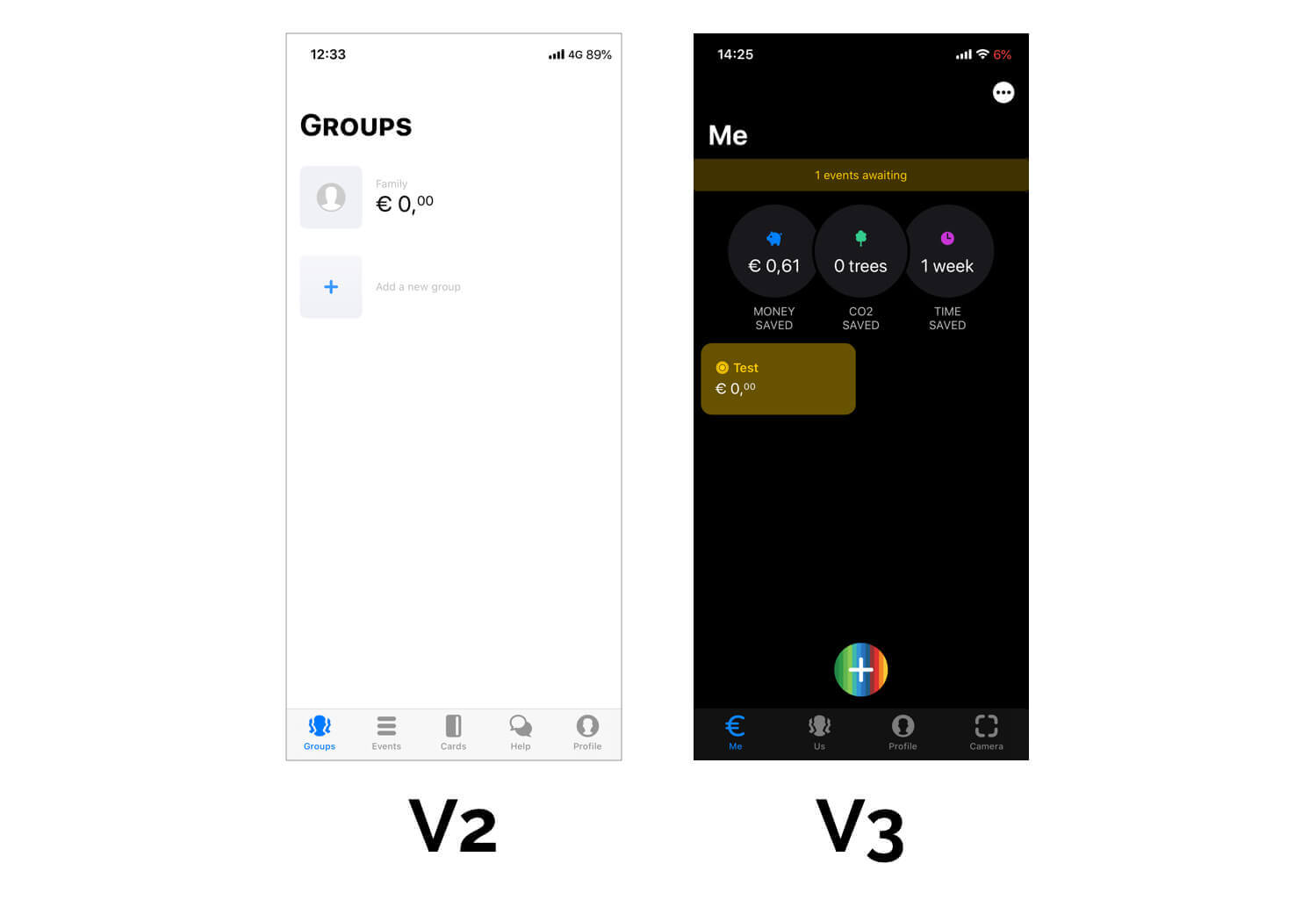
What do we mean by this? An example: on the new interface, the ‘+’ button was introduced as part of the navigation solution in the lower half of the screen. It appears that this button essentially functions as a menu; however, it hides different contents on each page. Main features and less important features receive the same level of emphasis and they are all hidden behind the ‘+’ button, meaning that there is no information hierarchy, which causes a lot of confusion for users when they are trying to find specific functions in the app.
CurrencyFair
| Headquarters | Ireland |
| Target group | Expats |
| Year of foundation |
2009 |
| Extra | Cheap transfers |
CurrencyFair was created with the aim of solving the problem of expensive and slow cross-border transfers. Since its 2009 launch, this simple idea gave rise to a huge company, with the total value of its transactions exceeding USD 8 billion today. In itself, this result has meant more than USD 200 million saved and several tens of thousands of satisfied customers.
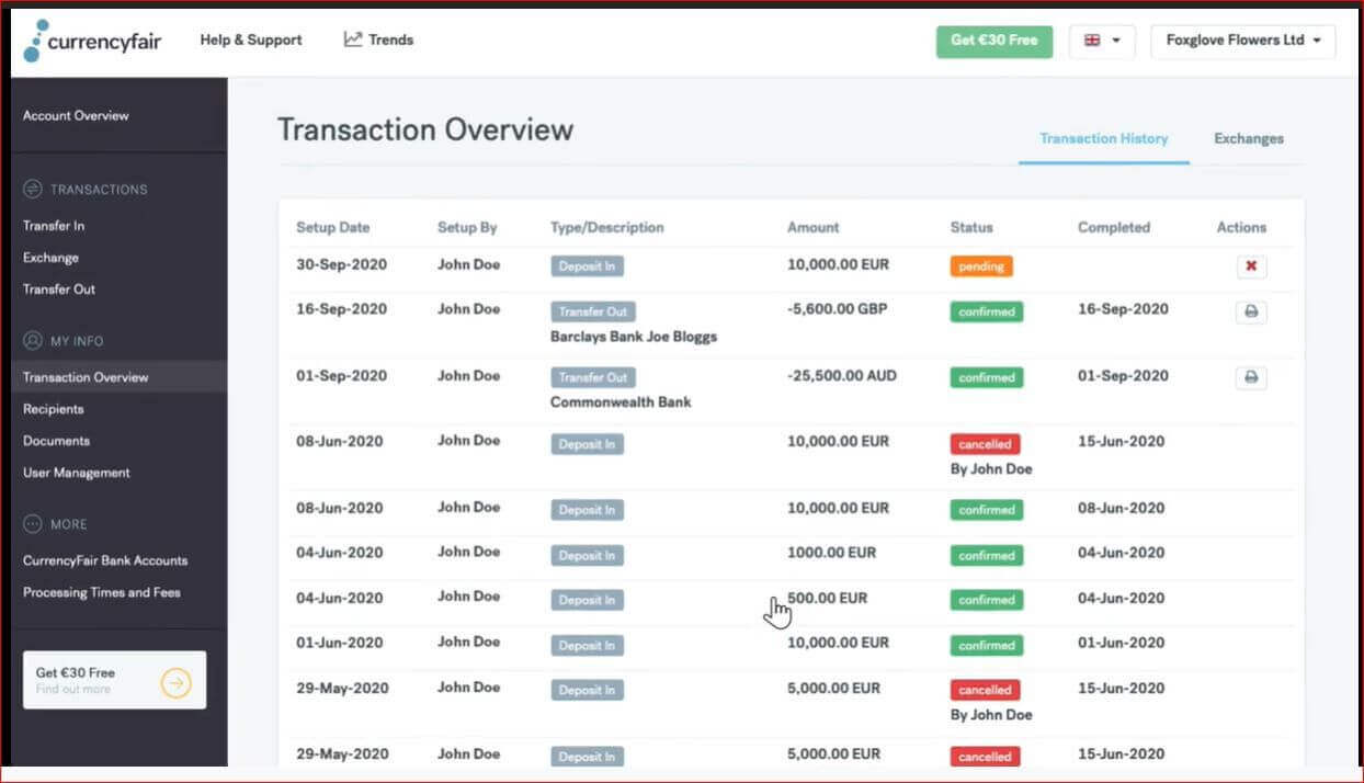
The designers of CurrencyFair created a simple, clean, easy-to-use, desktop-first interface. In addition, iOS and Android mobile apps naturally also exist, which make the desktop interface easier to access and more comfortable to use on a smartphone or tablet as well.
User feedback is unanimously positive: the performance of simple but specific processes is aided by inline help, functions and services appear in a clean format in groups of three at most, and the desktop layout has been designed so that users do not have to scroll down to see the entire content of each page (or they only have to scroll very little). A useful feature is that CurrencyFair sends an automatic confirmation email about every operation performed on the platform. These messages always have a friendly tone and in addition to giving confirmation to users about the success of the operation completed by them, they give guidance on possible future actions as well. This can be especially helpful to first-time users of the service.
Curve
| Headquarters | United Kingdom |
| Target group | Young Europeans, who use multiple credit cards |
| Year of foundation |
2015 |
| Extra | All bank cards in one place |
Founded in 2015, Curve is a London-based fintech company, which provides e-money services to its customers living in the United Kingdom and Europe. Its flagship products are an application and the card that comes with it, which allow multiple bank cards to be handled in a single place for easier use. In addition, Curve also offers other unique rewards and products, which range from a redeemable point collection function to financial needs associated with travels, making Curve excellent for those who often use many bank cards, especially if they do so abroad. However, for those who already have a proven system for managing their finances, Curve Card will only be another card to carry around in their wallets.
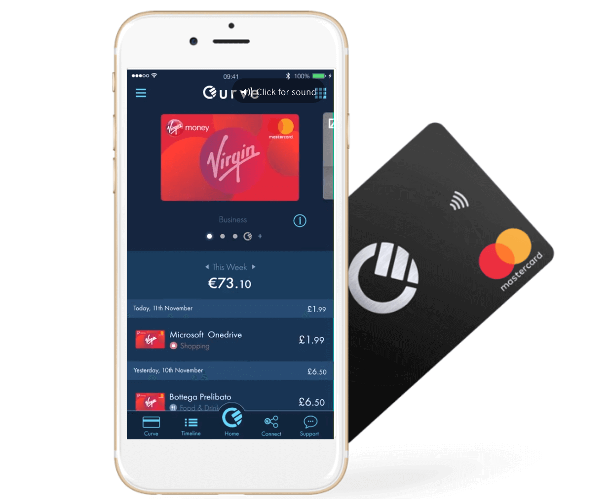
Curve’s mobile application, which is available on both iOS and Android operation systems, offers a simple, intuitive and easy-to-use interface, which has received overwhelmingly positive feedback from customers. Each step of the onboarding process is well explained and uses simple yet beautifully designed UX solutions to guide users through the procedure.
Holvi
| Headquarters | Finland |
| Target group | freelancers, sole traders, and European micro enterprises |
| Year of foundation |
2011 |
| Extra | Features related to invoicing, cost management, and accounting |
Holvi‘s slogan: ‘Work Nice Balance’ – this is exactly what this innovative business banking solution is offering its users. Holvi was created with the goal of helping the owners of small and medium enterprises grow by simplifying the most important business functions, such as invoicing, and invoice management, as well as the creation of reports and statements. Holvi provides a quick and simple overview of the financial processes of businesses. In addition, company owners receive a Holvi MasterCard with their account as well, which can be used to withdraw funds or make certain purchases. An application similar to Holvi is Unquo, launched by the innovation lab of the Swedish SEB bank.
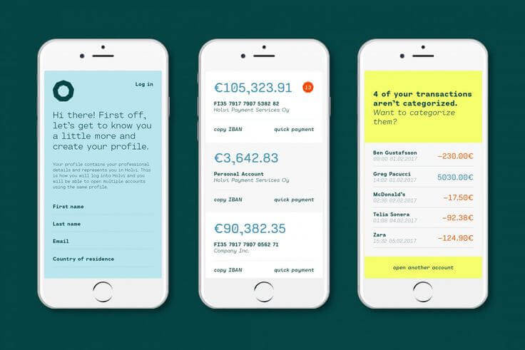
Holvi can be used comfortably on a PC and mobile devices as well. The web-based account offers full functionality and even more options than the app in sharp contrast to most alternative e-accounts, which primarily focus on the application. The interfaces are easy to understand and use; the vast majority of negative reviews criticise the operation of the customer service.
Monese
| Headquarters | United Kingdom |
| Target group | European private individuals, online freelancers, British businesses |
| Year of foundation | 2014 |
| Extra | British or European bank account without proof of residence or credit history |
Founded in 2014, the aim of Monese is to make the benefits of online finances accessible to all. Due to the relatively low requirements regarding documentation needed to register, it can be an excellent choice who have just recently joined the Eurozone or moved to the United Kingdom.
The interface offered by Monese is simple and clean, its image follows the fintech design trends that have developed in recent years. From a UX perspective, the introduction of location-based expense-tracking and the development of intelligent transactions were exciting novelties.
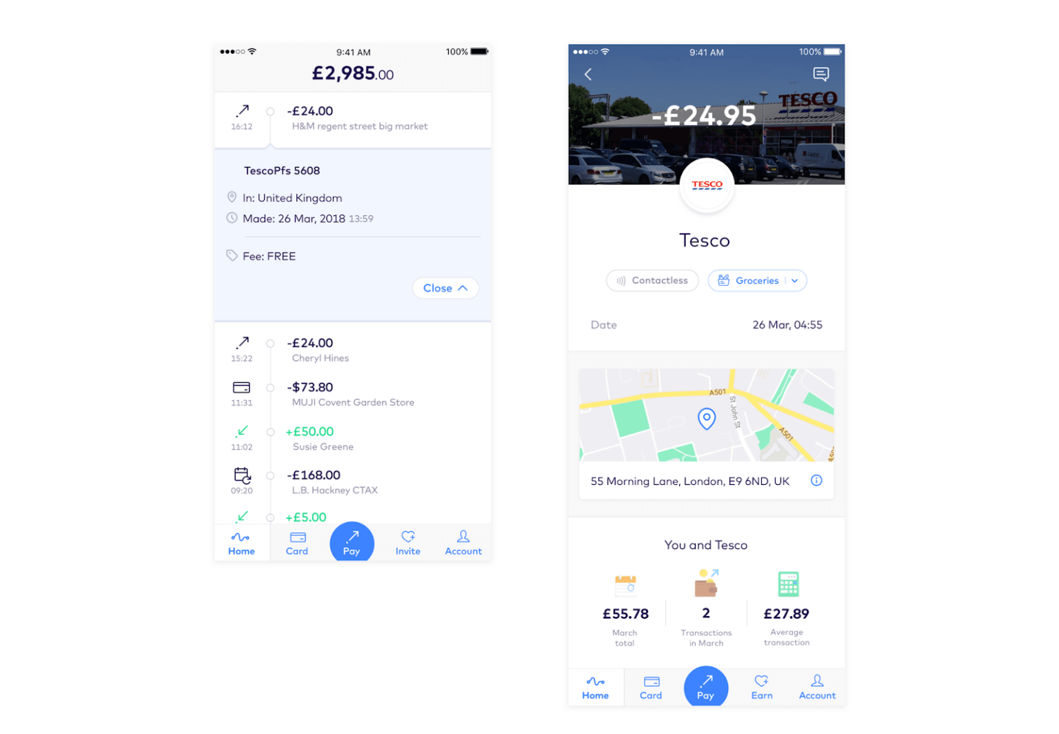
To summarise, they have discovered that similarly to the management of savings, users have difficulty managing their expenses as well. With the help of location databases and online resources, they have created a location-based transaction history, which allows transactions to be filtered and searched based on the time of purchase and shows the total amount spent at a specific location as well.
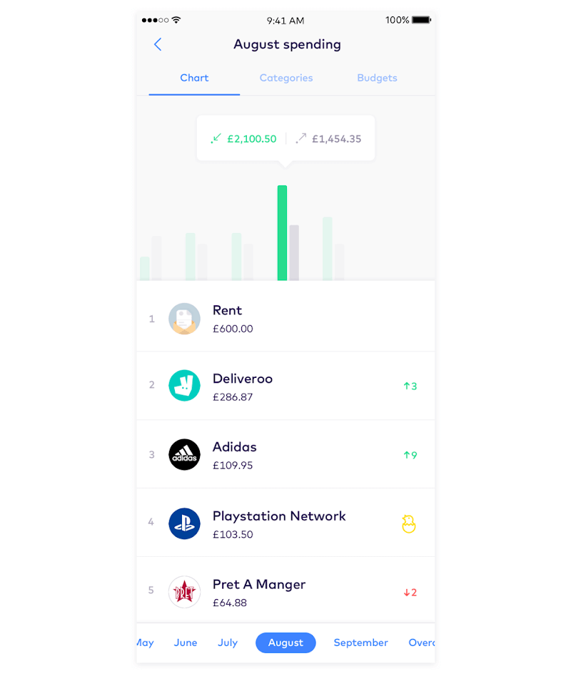
Displaying this vast amount of data in a single place allowed the creation of a different approach to categorisation. Automatic categorisation always carries some level of risk in terms of errors; however, these can be easily corrected thanks to the options of location-based purchases, location tracking, and manual editing. In exchange, customers can track their spending much more easily. In order to sneak a bit of gamification into the process as well, Monese created top spending categories based on an idea taken from the top lists of the music industry.
N26
| Headquarters | Germany |
| Target group | Tourists, expats |
| Year of foundation |
2013 |
| Extra | Cheap international transactions, health and travel insurance |
N26 is an online bank, which was developed specifically for the millennial generation, frequent travellers, and digital nomads. Launched in Berlin in 2015, N26 announced that it has reached 5 million users in January 2020. Its wide range of services, such as free ATM withdrawals around the world, travel insurance coverage with especially favourable conditions, and an intuitive, efficient mobile application have made N26 one of the largest challenger banks in the world.
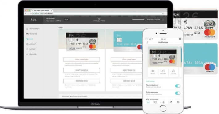
The success of the mobile application is clearly owed to the fact that the designers relied on the results of robust research, focusing on the data thus obtained while creating the interface. You can read about the research in detail in this interview with Jolene Tan-Davidovic, lead product designer at N26.
Nuri (formerly Bitwala)
| Headquarters | Germany |
| Target group | Cryptocurrency traders |
| Year of foundation | 2013 |
| Extra | Bank and crypto wallet, dedicated debit card, which can be used to spend crypto as well |
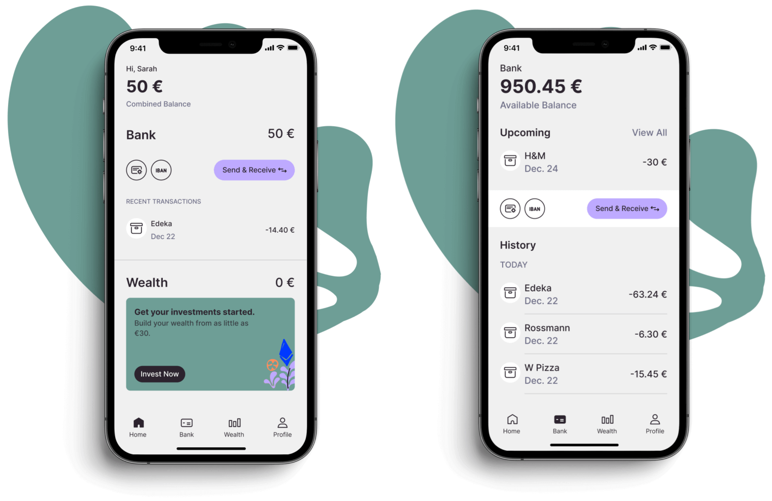
Nuri is a relative newcomer to the world of crypto. In 2018, it began mutual cooperation with one of the best-known banks in Germany, Solarisbank, in order to create something completely new – namely to combine traditional national currency with bitcoin and Ethereum support, thus creating the first real cryptocurrency bank. It offers Euro accounts and wallet services to users, in addition to an option to purchase two of the most popular cryptocurrencies.
The web interface is easy to navigate and the dashboard provides a clear overview of the total balance and displays the latest transactions on the account as well. The distribution of cryptocurrencies and the display of the portfolio are both clear at the first glance. It is also visible on the interface how much interest we have gained or collected. The clean appearance reflects the simplicity of the services. Unfortunately, the site is not optimised for international users since the value of the account can only be exchanged for EUR or USD and customer service is also only available in German and English. Similarly, the mobile application does not include live chat support.
Revolut
| Headquarters | United Kingdom |
| Target group | Tourists |
| Year of foundation | 2015 |
| Extra | Cheap international transactions, transfers without bank accounts, stock and crypto purchases |
Revolut is a fintech company established in 2015 with the goal of eliminating issues with traditional banks, which were affecting many people, particularly frequent travellers, who often had to expect overblown additional charges when exchanging currency or making payments abroad: features of financial life that do not have a place in our current globalised world.
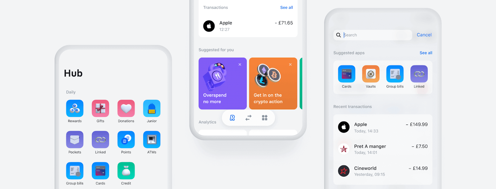
As opposed to traditional banks, Revolut offers fast and cheap transfers both domestically and abroad, peer-to-peer payment options, cheap card payments abroad, as well as free of charge or very low-cost ATM withdrawals.
At the centre of Revolut’s services is the debit card, which can be requested for payments and ATM withdrawals, together with the modern application, which allows all banking activities to be performed simply. We have looked at the latest developments of the Revolut app in detail in an earlier article.
Soldo
| Headquarters | United Kingdom |
| Target group | SMEs |
| Year of foundation |
2015 |
| Extra | Pre-paid bank cards for employees |
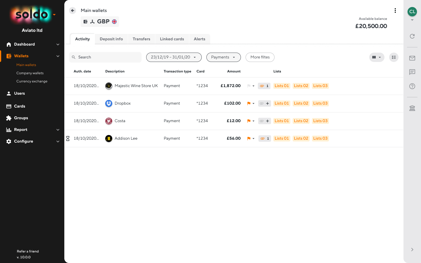
Let’s start with what Soldo is not: Soldo is not a bank and it does not offer a full-fledged bank account to users. It describes itself as an ‘expense control and management platform’, which provides pre-paid MasterCards for businesses to cover their expenses. These MasterCards can be integrated into Soldo’s cost tracking and accounting software. There are multiple levels of Soldo membership, which satisfy various business needs.
Both the app and the web-based interface are excellent for managing employee expenses. The administration interface makes it possible to manage multiple cards, currencies, and balances, the process of preparing reports is simple and transparent, while categorisation makes it significantly easier to record end-of-month transactions.
Vivid Money
| Headquarters | Germany |
| Target group | European private individuals |
| Year of foundation |
2019 |
| Extra | All in one place, low pricing, cashback features |
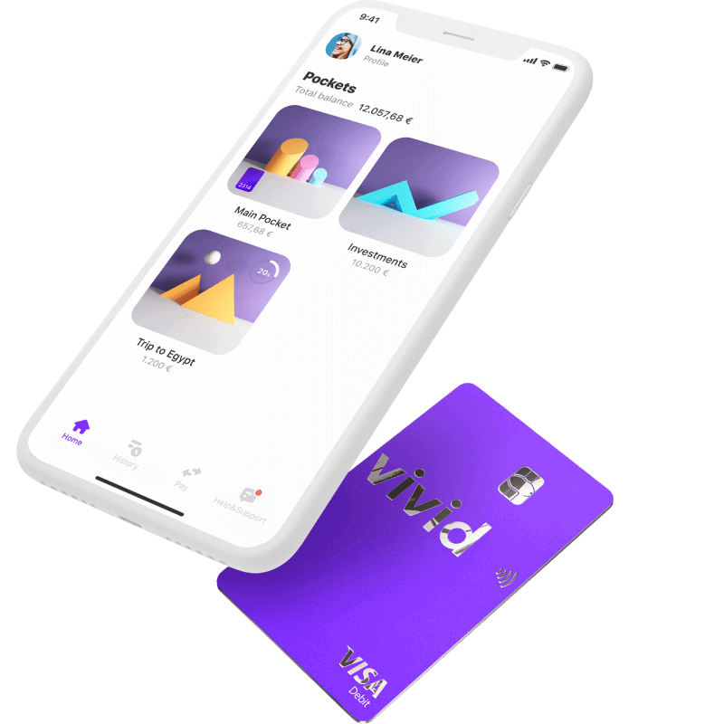
Founded in 2019, Vivid Money is a bank operating 100% online, which builds on the work of current players to create a competitive product, offering minimal fees and an exciting cashback package. The Berlin-based Vivid quickly established itself in the German banking sector, having recently won growth and product development financing of EUR 15 million. The early signs are all suggesting that Vivid is soon going to be a force to reckon with among German challenger banks.
Wise
| Headquarters | United Kingdom |
| Target group | Expats, digital nomads |
| Year of foundation |
2010 |
| Extra | USA bank account |
Founded by two friends in 2010, Wise (formerly Transferwise) helps make cross-border transfers fast, simple, and cheap. The combination of a strong brand-building marketing effort and the lowest fees in the currency exchange industry made it one of the largest currency exchange service providers in the United States and the world.
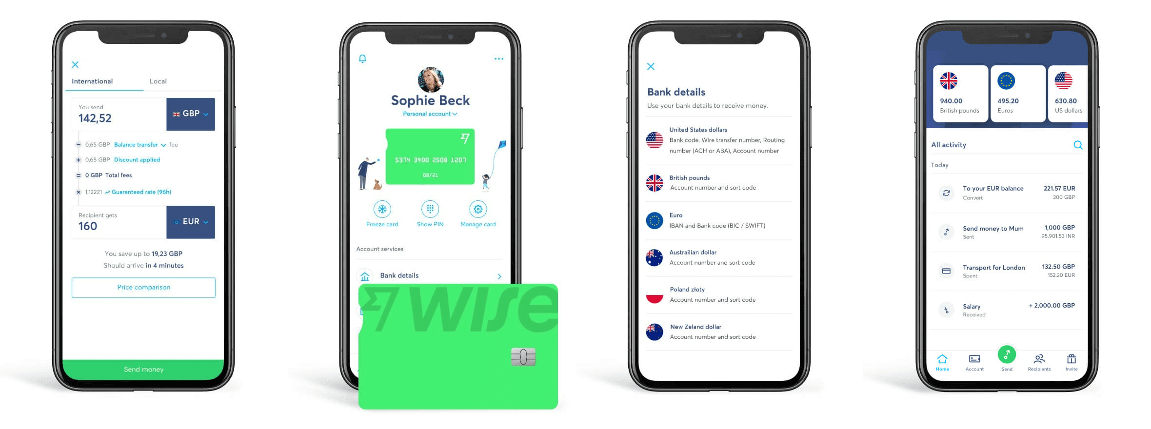
Users of the service are overwhelmingly satisfied with both the application and the web-based interface. The negligible number of negative reviews report that the registration process was so short and consisted of so few steps that they were not certain whether they had successfully created a new bank account or not. Although this review is more positive than negative, it provides important insight into how people approach banking services in general: bank administration is complicated and not transparent while opening a new account is long and troublesome. Of course, as modern banking solutions are becoming more and more widespread, users are starting to accept and trust simple processes as well; however, as a designer, it is important to take this valuable feedback into account and reassure users during the process with multiple confirmation screens or messages.
Lunar
| Headquarters | Denmark |
| Target group | Users in Scandinavian countries |
| Year of foundation | 2015 |
| Extra | Simple and cheap stock and investment portfolio management, automatic tax reports |
The Danish Lunar digital challenger bank was founded in 2015 with the aim of creating the first pan-Nordic bank. Today, it has more than 325,000 customers in Sweden, Denmark, and Norway, and it appears to be on the right track to achieving this goal. Its marketing strategy, focusing on the millennial age group, puts this company in the same ballpark as other Nordic neobanks, such as the Icelandic Indó, the Swedish Northmill, and Rocker, among others.
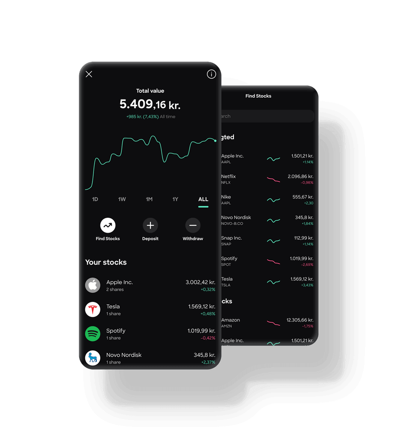
Lunar put special emphasis on making investment processes straightforward and it made the process of trading stocks simpler than ever. There are no hidden fees, while sale and purchase transactions only cost DKK 19 each (approx. HUF 670). With the help of the interactive search engine, we can easily find our favourite brands from around the world and from different trading sectors since we are able to perform searches based on their names and logos. There are no minimum entry fees or trading amounts and the application even generates automatic tax reports for us.
Summary
There are numerous banking solutions available to private individuals and companies in Europe. The question is essentially what they intend to use their account for and what financial services they need. Those who know the answer to this question will have an easier time deciding between the sea of digital banking solutions since the perfect design can often only be described in light of the situation and the relevant intentions.
As designers and product owners, we would like to highlight the following criteria:
- Pay attention to what customers are saying: instead of assumptions, listen to the complaints, concerns, and needs of customers to find the fastest and simplest ways to smooth out differences while increasing satisfaction.
- Do not be afraid of going against the status quo: Familiarise yourself with the standards of the industry and the opportunity for progress within them even if it is ‘only’ about designing simpler or more intelligent services.
- Be customer-centric: Instead of product-centric, your design strategy should always be customer-centric. Design a service that satisfies the needs of customers in the ways they prefer instead of forcing outdated methods down their throats using expensive marketing campaigns.
- Make the user experience attractive: Amaze users with beautiful interfaces and make processes simple and modern because users have in fact become spoiled and lazy in the world of millions of digital apps and services.
recommended
articles
Find out more about the topic



Share your opinion with us