Revolut – What to love and what not?
For a long time, the big banks, the behemoths of the financial industry did not take the new financial (so-called fintech) service providers seriously. Not one bit. They were not regarded as serious competitors, they were the guide fish feeding on the scraps left by the shark in its wake. However, as these newcomers are beginning to grow, the big players cannot afford not to pay attention anymore, both financially and in regulatory aspects. Now, with the help of Ergomania’s staff, I decided to take a closer look at one of the main contenders or rather well-known challengers of the classic banking era, Revolut, and as usual, we are focusing our investigation on user experience.
Founded in 2015, Revolut has become the flagship and in many ways, the prime example of the inner workings of the fintech world. By the end of this year, they expect to have 8 million users worldwide. Not too shabby, nor surprising, since they offer free account management, free debit card, low-cost money exchange and transfer and much more – and we are only talking about the basic package. No wonder, so many people turn to Revolut to manage their daily finances.
Their secret is that there is no secret
What is their secret? What many people ask about Revolut, though there is no secret at all. The only thing they do differently is putting the user experience above everything else, making it as easy and intuitive for customers as possible.
It all starts when you sign up to be their customer. In the olden days this was pure torture, an otherwise productive day lost by walking into a branch, taking a number, waiting to be called and seated, filling out endless streams of computer printouts providing way too much information in exchange for a service (having a bank account). At Revolut, it can all be done from anywhere where internet exists. It takes a minute: you login, open up the app on the phone or in a browser, scan your ID using your phone or webcam, take a selfie so that the system has something to compare your ID with, and that’s it. And you did not have to set foot in a bank, where all these take place albeit a lot slower.
Although we do not feel the need for personal care when becoming a customer – not that it is always a given in traditional banks – our only “physical” relationship with the company, i.e. receiving our debit card via mail, tries to compensate for this. We receive the card with amazing speed to boot, within a week in most cases, which many old banks often cannot or will not fulfill. On the other hand, the card is shipped in a neat little case: pulling on one side, the card slides out at the other end. It’s just a plain cardboard case, but the idea is really smart behind it, since most users remember the moment they held it for the first time in their hands, and consider the whole gimmick cool.
I am a person, not an account number
Naturally, the service is backed up by some serious business thinking, but in essence, it is also about promoting a better user experience. They make the most important features easily accessible and free of charge, and also the cheapest and least risky in terms of banking. The solutions, the interface and the structure of their application are also aimed to make its daily use easier. Ease of use – this should be the credo to live by for all services. Based on our experience, one of the key features that could make it or break it for any fintech application is the speed we can transfer money by.
If the recipient is in our address book, the transfer is close to instantaneous. Nearby Revolut users can also be found via bluetooth search, which comes handy if someone is not in our contact list, but is right next to us. The very experience of being connected to individuals and not to account numbers makes the application more humanistic to use. Recent contacts are always at the top of the list, further reducing search time. It is just as easy to claim money from someone else, and the sum arrives just as fast.
If our friend is not a Revolut user (yet), the invitation process is just as simple as signing up for the service. There are regular promotions that reward both the inviter and the invitee with money contributing to the wildfire spread of the service.

Clean and transparent
We get free push messages about everything – not paid text messages which many traditional banks use, and the app also notifies users about failed transactions. In addition, it gives us a daily rundown on our spending, which is really helpful in raising financial awareness.
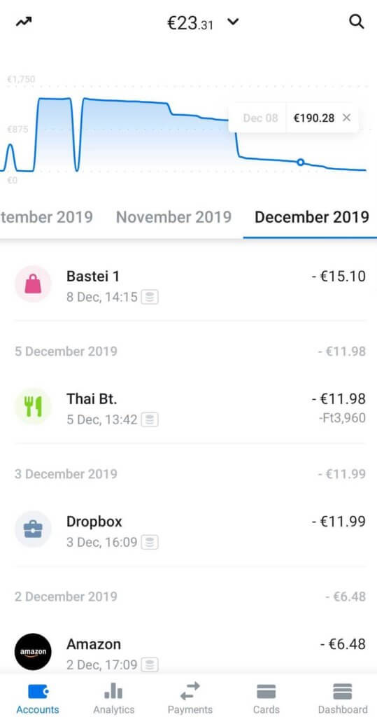
The user interface is streamlined, with a particular focus on making everything clear and comprehensible at a glance. The transaction history is searchable, each category is indicated by icons, whether we spend money on travel, food, or entertainment, for example. The app makes an educated guess in which category each transaction needs to be included, but the user can change these on the fly. There is a so-called meditative graph giving us a visual glimpse on how our balance has risen and diminished in recent times. (Hopefully increased.) Entering the app can be done with biometric identification, which many traditional banking applications have already employed, but it is definitely a useful convenience feature.
For someone who travels a lot or does a lot of shopping online, exchanging currencies at interbank rates can easily be the most tempting feature. Runner-up: free cash withdrawal from any ATM in dozens of currencies (up to a certain amount). We can have a separate account for each currency, including cryptocoins.

Everyday problems meet premium lounge access
Managing our debit card is an easy feat with simple, but straight-to-the-point answers given to everyday problems. It is easy to set a spending limit, and you don’t have to call anywhere if you lose your card (who knows the number to dial from the top of their head anyhow?) The application can be used to freeze the card at the touch of a button – or to unfreeze it if we realize that we have actually forgotten it in our other jacket.
A very clever idea is the system of safes, which is Revolut-speak for savings account: we can set the amount we want to reach, and then we can place money in this safe either regularly or occasionally. You can also open a safe (or rather, a piggy bank) for all the virtual spare change rattling around in our virtual pockets, and the app deposits the change that’s hanging around your account after each transaction had been rounded up. Let’s say, someone from your firm retires, and you have a whip round to get them something nice. Revolut offers the possibility to pool our resources together. Also, if you want to go Dutch in a restaurant, splitting the bill has never been easier.
Of course, the premium (paid) packages offer more bang for the buck, and there are services to buy separately: access to airport lounges – also, the first visit is free – disposable virtual debit cards, travel insurance and also a concierge service that provides help in various situations, like booking a last minute plane ticket or finding a table in a fancy restaurant. Travel insurance is location based, so you pay only for the duration of your stay abroad. This is one of those perks only a few would ever use, but providing services for these customers is what makes the application better.

Okay, is there anything you don’t like?
Many people do not consider Revolut as safe as traditional banks – although some of them would then add hastily: but they are getting there. By the way, the firm, realizing that people rarely put their trust into a virtual financial service if they have the chance of actually walking into an actual bank, acquired a special banking license at the end of 2018, allowing them to manage deposits and handle loans. Unlike a full banking license, this license alone does not allow you to provide investment solutions.
However, as the company does not provide local bank accounts in all the countries they are operating in, we may not be able to ask our employers to send the paycheck to our Revolut accounts – yet. Also frustrating in case of the free version that costomer support is made up of quite expertly programmed chatbots, so only simple questions, please.
Although exchange at the interbank rates is one of the most enticing elements of the Revolut experience, the company fails to advertise the fact that over the weekend interbank rates are not in effect, and exchanging money can be a very costly endeavor. According to the official explanation, they want to compensate for possible exchange rate fluctuations between the closing and the opening of the currency market which is understandable, but there were some who complained that the application did not warn them about all this.
Regarding the user experience, the app has no real individual character, as opposed to many other fintech challengers who have highlighted certain features such as support for local communities or features that can be used with our friends. But this is probably just nitpicking.
recommended
articles
Find out more about the topic


Share your opinion with us