What do we like about Asana?
We have been using Asana since 2013 to manage both UX and web development projects and to keep record and manage general company-related tasks. We are convinced that every company needs some sort of online project management tool, as projects cannot be efficiently managed using only emails and Excel sheets. To complement Asana, we use Slack for communication between staff members.
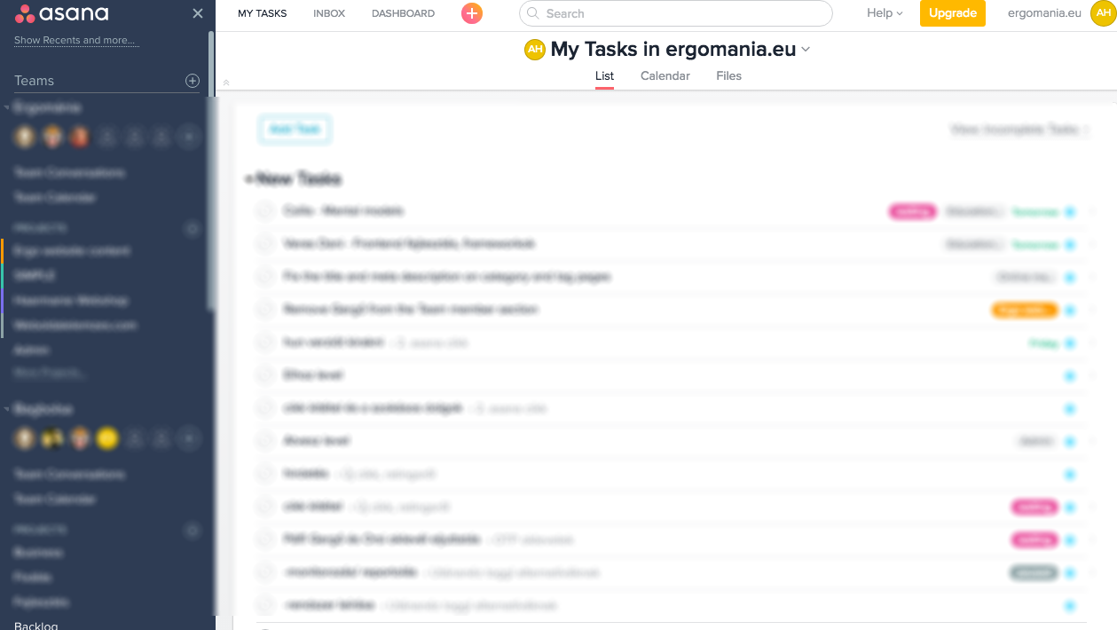
One of the biggest strengths of Asana is its user-friendly and uncluttered interface. Functional units are adequately distinguished from each another and the most important elements stand out visually. The dashboard boasts a logical and uncluttered structure, the sidebar on the left contains the created projects, while the centre of the screen shows the comments on the specific task.
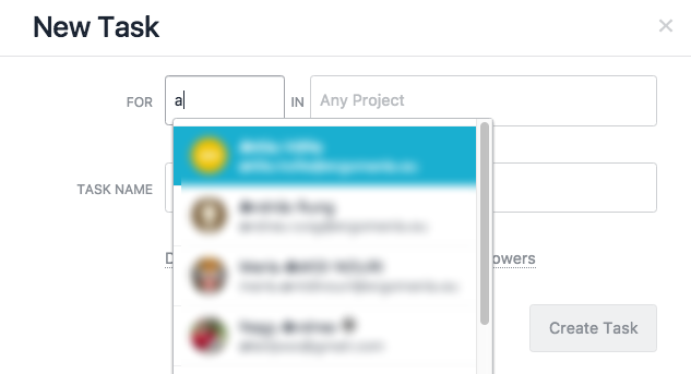
The interface is easy to learn, the visual elements (icons, typography, etc.) enable easy use of basic functions like adding new tasks, assigning a task to someone, etc.
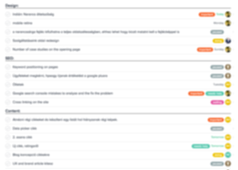
We can create separate projects on the dashboard, and can set up smaller thematic units called sections within each project (for example a web development project may include UX section, UI design section, a frontend section, a backend section, etc.) making complex structured projects with multiple tasks more transparent.
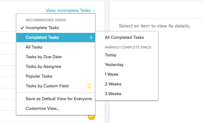
Tasks in progress and completed tasks can be filtered separately, a function we find very useful especially when we need to retrieve information on a completed task.
The information we regularly need during a project can be entered in the description section; typically for web development projects, this may include the availability of servers, login data, etc., so they do not have to be stored in a separate document and be easily retrieved at any time.
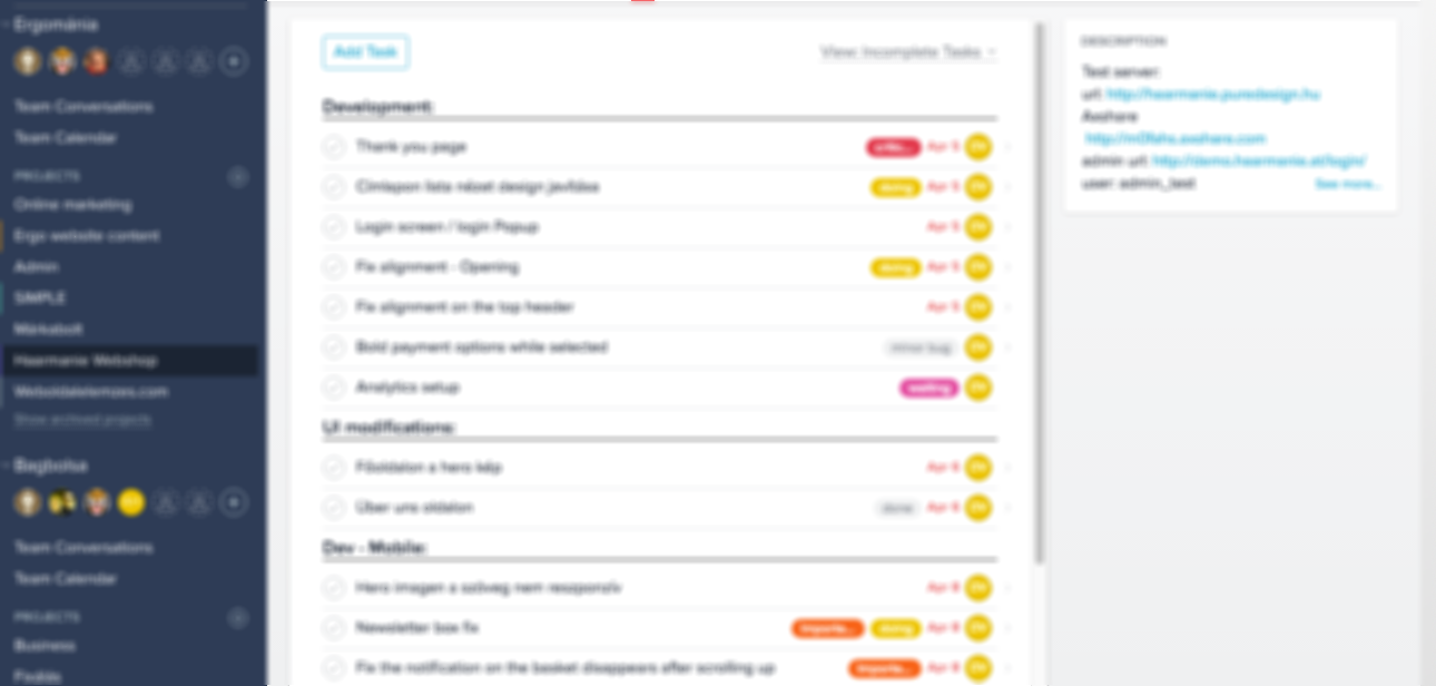
Tags (critical, important, needs help, etc.) help in categorising, prioritising tasks and providing a general overview, which not only give guidance for users, but also provide a visual aid to decide which tasks have priority.

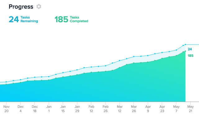
We can also track the status of a given project visually; we can easily query how many tasks have been completed and how many are still underway.
An especially useful function of Asana is the Inbox view, where we receive notifications about the tasks assigned to us and the tasks that we are following.
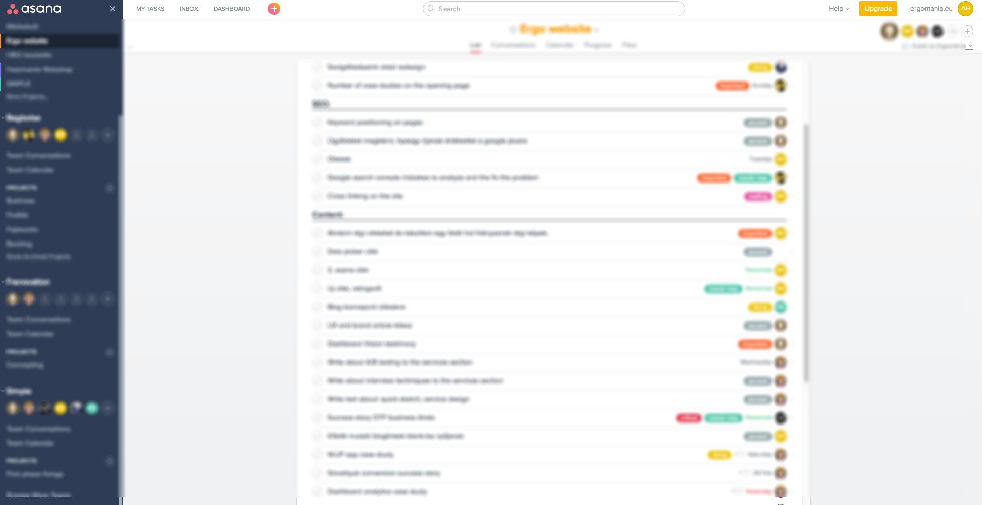
This is the easiest way to review current events related to our tasks. We can also request email notifications about these and we can assign new tasks via Slack.
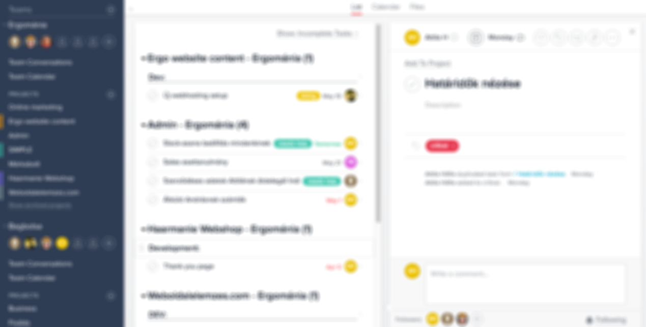
We can set a single deadline for a task or define the task as recurring, which is useful for generating weekly reports. Not only a specific date can be set as the deadline, but also a specific hour within the day (e.g., 1 PM etc.).
If many people are working together on a task, a function we often use is the tagging of the person involved in a specific task (tagging) so that we can easily initiate dialogue about the completion of the task. This functionality makes it clear to the participants of the discussion who the comment is directed at, so the discussion is kept within boundaries as opposed to email. We also often use this functionality when we want to involve the client in Asana usage, making it clear to the client when we expect his/her cooperation or comment.
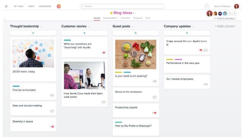
In Asana’s most recent release, instead of showing project components in a list, we use the board view, which was already available in other project management tools (e.g. Trello). The major benefit of this view is that it gives a superior visual overview and better navigation.
recommended
articles
Find out more about the topic


Share your opinion with us