UX in Zurich

It’s Switzerland’s biggest city, with a population of less than half a million, of which nearly a third are not Swiss citizens. It’s the world’s largest trading center for gold, and its secretive ‘Gnomes’ are said to be the most discrete bankers anywhere. Welcome to Zurich in the north central part of the country, a hub for transport, business, and banking.
Zurich should therefore be just the place to go in search of the great UX-UI agencies which have no doubt sprung up to service Fintech, banking and allied industries. True or not? ‘Discrete’ is perhaps the watchword here as from the many agencies I reach out to, only two actually commit to interviews. And the others? Well, I wonder about any business which says on its website, ‘Do get in touch’ and then either fails to harvest queries, or ignores them. As it turns out however I get to talk with Martin von Siebenthal of Ginetta, and Pau Todó of Jam’on, both of whom provide much food for thought. Mike Zurbrügg of thirty3 nearly made it three interviews but then said ‘thanks but no thanks’ due to pressure of work.
Checking the field
Looking at the offerings in Zurich, there does seem to be a reasonable amount of UX activity, among all that gold. Take Mindnow, led by CEO Jean-Paul Saija, and showing a wide spread of clients, including a Mexican Restaurant chain with its own cryptocurrency loyalty program. A family banking app, Clanq, also touches on financial matters.
Nephila says of itself, ‘We are a company specialized in the development of solid digital solutions with open source technologies and agile methods. We are conscious that the platforms we build have an impact on society, and on how people see things and interact with the world.’ The company is based in Florence and London, as well as Zurich, and looks to be very much at the ‘techy’ end of the spectrum, using Django and django CMS.
More at the ‘creative’ end of that spectrum is Amazee Labs, who ‘Create meaningful digital experiences that are impactful and relevant to your audience. We base our work on creative passion and unique insights, and implement your projects with a team of experienced, industry-leading designers and engineers using Drupal, Gatsby, and React.’ Clients include the Swiss Nuclear Forum, and NAGRA – the National Cooperative for the Disposal of Radioactive Waste.
Being a dumb non-German speaker, I immediately warm to the website of Hatch, offering easy-to-find English pages, which suggests a more outward-looking viewpoint. And indeed ‘global’ appears immediately in the opening blurb, which adds, ‘Across multiple touch points, we bring outstanding digital products alive that are centered around your business goal and your customer’s needs.’
Website Marketing is the name of the game for freihandlabor, who ‘Design, implement and optimize digital campaigns and websites. Always tailor-made, quality-conscious and with a lot of passion.’ Ah, passion! I have a feeling that may be the cue to go visit the first of the UX-ers who have actually agreed to speak with me:
Swiss culture and design
OK, so the topic of culture first, with a call to Pau Todó. I ask how a hot blooded Catalan-born copywriter came to set up his business in a city of allegedly secretive gnomes. Yes, I know that ‘Spanish passion’ and ‘Swiss reserve’ are unhelpful stereotypes, but sometimes there is truth in our perceived cultural differences. As is often the case in those of us living away from our native country, affairs of the heart played their part for Pau. He was a busy Barcelona copywriter working in branding and brand building, and as the internet really started to take off, and website building became the thing, he was working in an agency specializing in web design and branding. Then in 2009, Pau met Sarah Hähnle, the Swiss art director who he was to subsequently marry, and they relocated to Zurich, initially working together at a small agency, but nurturing plans for their own set up. That came around 2017 with the founding of Jam’on Digital, along with two partners. “We didn’t have a clear positioning. We were very good in everything content-related in a technical sense, meaning information architecture, design, and branding,” says Pau. “I felt the need to find a really good niche, and a strong position. It came naturally and was quite logical in the end: that if you take the traditional branding business, like how to not only position a brand, but how to create a brand, and then you bring it to the web design business… What you have in the end is pure UX design, because it’s about bringing the brand attributes in design terms, but also in the tone of voice, in copywriting.”

We’re jammin’
I sense a somewhat unusual approach at work here which appears, let’s say, more cerebral than many UX-ers I’ve spoken to. It seems the name of Jam’on Digital is also related to a theoretical background. ‘Culture Jamming’ is a loose movement going back to the 90s, popularized by the writings of Naomi Klein, the author of No Logo. Culture Jamming uses the codes and formats of advertising to promote political messages, subverting the very same media used to promote commodities – in other words, subverting the role and purpose of advertising. Pau recommends the Adbusters Media Foundation as a good place to get further information, as well as ‘one of the largest repositories of Culture Jamming images out there’, the Jam’on blog. “I was really interested in Culture Jamming because it subverts the goals of advertising to convey new meanings, using the same techniques and language of advertising. It’s genius! I was so interested that I started studying it, and running small conferences here in Zurich. It was around the time we were starting the agency and we were thinking, ‘Culture jamming… jamming… digital culture jamming.’ Then Sarah said, ‘Jam’on Digital’, and our partners loved it.”
I had presumed that the company name was somehow related to the Spanish for ‘ham’, which it is, kinda. The website features video of a cute piglet snuffling at a melon, so there is a playful pun involved, although the company could also nearly have been called Silverfish. This was an existing software development agency run by the third founding partner, web developer Karsten Zingg.

Swiss connections
So, back to the question of cultural differences, now that we know about the origins of Jam’on Digital. “Basically we have a good reputation among clients that we work with,” says Pau. “Then these people know other people so we stay alert and keep the phone busy talking with people who they know. That’s a very cultural thing in Switzerland. Trying to get clients on a cold call is not impossible because there are super big agencies who can do that. But in general in Switzerland it works through relationships and networking. Clients are very stable and if you get things right they stay with you – you can have a client for life!” An example comes with a current pitch that Pau is working on through an established partnership with a Zurich PR agency, where Jam’on has been invited to ‘a potential game changer’ which may be Fintech-related – for the moment Pau is staying Swiss-discrete on that subject. So who you know is an important feature in Zurich business life, although Pau also admits to the search being on for a colleague able to, ‘Go out and knock on cold doors.’ In Spain, clients are much less loyal, and he says you can do a job and get great feedback… then never hear from a client again. In Switzerland, loyalty counts.
And is Jam’on focussed solely on the Swiss market, or are there aspirations for international developments? Well, there are connections in Spain and Italy, but primarily it’s centered on the Zurich scene, with Jam’on being a lean, five-person company. It’s backed by a stable network of providers, including the Zurich/Kuala Lumpur software developers, Comerge who are, “really strong in programming, and do very powerful things, like complicated mobile apps with lots of capabilities.”

Overlapping circles
We’ll return to Culture Jamming and UX Branding presently, but now let’s head across town to the offices of Ginetta, described by Martin von Siebenthal as, ‘the best in Zurich.’ Martin is Circle Lead at Ginetta, a term I haven’t come across before. “That’s something we are good at, inventing new terms!” Martin laughs. He’s speaking to me from a balcony area, with lots of people-traffic glimpsed through a large window. “Sometimes my role is also called ‘Team Lead’. In Ginetta, we have different UX circles: there is a research circle, a visual design circle and so on, so that everyone who works within the same field has a home to exchange ideas, and a place for personal development. And then, of course, everyone also works on projects.” So there’s a matrix of the main knowledge, and then projects – a sort of Venn diagram of interaction.
Ginetta has grown steadily to its present size of more than 70 employees, with Martin joining the ‘Digital Experience Company’ in mid-2019 when there were 50-60 colleagues.
“We cover strategy, design and engineering for digital products. So the DNA of Ginetta lies in user-centered design, but then grew into other fields as we expanded,” Martin continues. “But I would say the DNA is still the same, and that’s what Ginetta is known for. It’s what we are really good at and why clients come to us: We put the user in the center and have researchers really find out user needs.That’s still the biggest part, and what we cover is the full circle of product development.”

Creating value for real people
And – to ask my habitual question – what’s with the name? As is often the case, there is a story. Company co-founder, designer and entrepreneur Simon Raess, was close to and inspired by his grandmother, named Ginetta. Together with his co-founder Valérie Vuillerat, the company was named, and started in 2008 as a two-person operation, to ‘craft digital experiences to create real value for people and businesses.’ So is it solely a Swiss operation? Martin says there are developers in France, Portugal, a backend developer in Hamburg, and a client partner in San Francisco. But yes it is a Swiss based, and indeed a Zurich, Bern and Basel based operation, although with international clients. And are the 70+ employees predominately Swiss? I ask because in looking through the English language version of the company website I’m impressed by the fluency and error-free text. Martin’s pleased to hear this, and says that Ginetta’s official language is English, and that in any case Switzerland has four languages, with Ginetta employees being ‘from everywhere’, currently comprising 19 different nationalities. It doubtless helps keep a fresh and outward looking attitude to clients.
Clarify, simplify, amplify
And with that we’re back to stereotypes, and what a Swiss company represents in terms of approach and values. “The first action is to Clarify,” Martin says. “What we always do, with strategy, is to clarify. When we have clarified, as designers we Simplify. And then in development and engineering we Amplify.” Having looked at the website I agree that it does not take long to ‘get’ the Ginetta offering, so is that a Swiss thing? Martin considers, “There are certain aspects or mentality behind that, it’s true. It’s also related to Swiss design like typography, back in the day. We have this cultural aspect of being precise and clean, and maybe a bit humble. Swiss people are not really loud, and we try to be polite. That’s the culture of Switzerland, and this also relates to how we simplify. Our approach at Ginetta is not to make crazy ideas and fireworks and have things explode, but to simplify and make things as clear and effective as possible to the user.”
Fast, simple, beautiful
An example please! Martin mentions the Endaprime Hive Simulator which he describes as a good mix of being clean and clear, or – another Ginetta term – ‘Fast, simple, beautiful’. For the Endaprime project the brief was to create, ‘a digital simulator to demonstrate the impact of electromobility, renewable energies, and the application of local measures on the distribution system, energy self-sufficiency, and environmental pollution. To present the multi-layered interrelationships within complex systems as comprehensively as possible to the user… the Endaprime idea was turned into an easy-to-use, compelling working tool for political and business actors.’ Endaprime’s sustainable and fair energy system is intended to promote sharing and action among all local actors, and as Martin explains, the app is “Fun to use, with some flavor, and it triggers some thoughts. So it’s not just a blank canvas, and is a good balance between the two worlds of being creative and using colors, while at the same time being effective and clean.”

Testing and validating
Trying to get hip with the correct language, I ask Martin what he personally did as Circle Lead on this particular project, but in fact on the Endaprime work he was actually more of a lead designer, working from the very beginning to the very end, for a concept and product which had never existed before. There were four two-week sprints, during which time the brand identity was developed, and Martin helped manage the process to ‘converge and diverge’ as the scope was defined. So on this energy transition project, how important was Testing, and where does that fit into the activities of Ginetta?
“It’s super important, “ he replies. “Testing is in the DNA of Ginetta, and that we are user-centered. Of course a lot of companies say that they are user-centered, but…” Not so many UX-ers really walk the talk? Martin probably doesn’t want to diss the competition, but agrees, “Our default is that we validate everything that we do in the sprint with the user. So whatever it is – if it’s screens or prototyping – then it’s testing to identify usability issues, from start to finish, and to minimize risk at the end. The more effort you put in and delay testing, of course, the bigger the risk there is in changing stuff later. That’s why we test and validate from the beginning. If you have a concept, validate this with the user. In the beginning, when you do an interview, that’s when you learn the most, and that’s why it’s crucial to do it. It’s also why clients come to us: even if it means extra effort in the beginning, it reduces a lot of effort in the end, which is definitely worth it. We have dedicated researchers here with a psychology background, who really want to understand who the user is and what their needs are, and what’s the mental model behind that.”
UX branding in action
Right, so that’s a clear approach from a large Zurich company which seems to embody ‘Swiss’ values, and is dedicated to simplifying things. Let’s take the 1.5 kilometer (virtual) walk due west back to Jam’on Digital, where there’s an altogether more ‘guerilla’ view of branding and UX. As Pau Todó states in the introduction to his ‘Syllabus for UX Branding’ (available in German only), ‘UX Branding is the combination of Brand Management methods, User Experience and Behavioral design principles aimed at the creation of an objectively efficient interface through the subjective perception of reliability of a brand, by ways of matching brand attributes to the internal and external features of a product. The linkage of brand attributes to Graphic User Interface (GUI) elements, along with the design of brand-aligned behavioral nudges, facilitates a transference of brand meanings to product internal and/or external features. The combined appraisal of these cognitive, contextual and experiential stimuli creates a so-called ‘experience’ (of brand and user).’
Well, I’m just about hanging on in there with understanding the concepts, but how do they translate into real jobs? “We’re going to a new paradigm,” Pau says. “Obviously all UX designers have a strong knowledge of branding, but they still consider themselves mainly as designers, not as branding experts. More and more we’re doing things where branding is naturally part of the work of a UX designer. What I found was a very clear positioning and I said, Let’s try to explain that UX branding can not only be a real thing, but also a method of working. I started working basically with startups and our first big experiment was YuuJou.”
This was a project where two journalists from Zurich created a worldwide contest, with two competing teams departing from Zurich, with the goal of meeting up in Tokyo. The process was to be live streamed through a multimedia platform, requiring a lot of UX, a lot of design, and a lot of new ideas.
Sarah was in charge of the art direction for every element of the design, Karsten was taking care of development, and meanwhile Pau was convincing the clients that they had to have a strong brand, a very specific tone of voice, and needed to create their own world of colors, words, and tone. “We pitched against some very powerful agencies, and that was the first time I really applied UX branding in a real project… and it worked very well.”
The e-learning startup
Following this initial success, Jam’on also pitched to Spross and won business from the container and recycling company, but as Pau notes, “We did some positioning for them, but it was too late to rebrand the whole, because they already had a brand.” So, on the lookout for another startup where UX Branding could be developed from the get-go, Pau was in on the ground floor for an elearning initiative, which was to become Evrlearn.
It started with a masters degree written by Felix Schmid at the University of St. Gallen, where he proposed an e-learning platform and marketplace, with on one side people looking for e-learning opportunities, e-learning providers on the other side, and an algorithm in between matching offers and demands. “They needed a strong brand,” Pau explains. “And we created everything from the logo to even the name. It was amazing to work from the very beginning and we are still working with them.” This includes refreshing the brand in the summer of 2022, and now “The attributes are really visible, and the brand is part of the website, and the website is part of the usability.”
Which takes us on to behaviorism… and nudging.
Behaviorism and nudging
Pau cites the UK government for having a department of nudging and behaviorism, but stresses that there’s a fine line between gently persuading people to do something, and ‘dark arts’ where ethics can be questionable. “Digital behaviorism is a big part of branding,” he says. “Digital behavior is about how you help users accomplish certain tasks in the most efficient way, without making them think ‘Where should I click or swipe?’ ‘Nudging’ is the process of advising people rather than ordering them to do something. As a McKinsey report on the subject explains: ‘A nudge is an intervention that maintains freedom of choice but steers people in a particular direction. A tax isn’t a nudge. A subsidy isn’t a nudge. A mandate isn’t a nudge. A ban isn’t a nudge. (But) A warning is a nudge: “If you swim at this beach, the current is high, and it might be dangerous.” You’re being nudged not to swim, but you can.’
Pau laughs and stresses that he’s not a lone voice, “I’m not nuts inventing all this stuff, and there’s a lot of academic research to back it – really hardcore stuff!”
Building a brand?
OK, Pau finds startups attractive, so I pose the question that I’ve got a startup idea, but I don’t know how to go about it. I know what the product is. I know how it’s going to function, but how will Jam’on interrogate me and my team to get things moving towards UX branding? “Not everything comes down to it, but a good starting point would be the product fit,” Pau answers. “When you get the product, basically, when you understand very well what serves your product – for who, in what situation and what you want, then psychological and emotional implications derive from that product fit. From that point on, you can start building a really good online, digital brand.” He points out that this must not be a ‘tricky’ brand designed to fool people into things. “It’s really at that interesting point of use of UX, which is the crossing point between aesthetics, design, efficiency, and real user requirements. And once you have a very clear idea about how your users will enjoy this product, both in an efficient but also in a pleasant and aesthetic way, then you can start building your brand. Of course, then there are thousands of other requirements, but I think that the product fit and the positioning of the brand will go towards creating a good UX brand.”
Of course, with the help of a little nudging.
UX theory becomes UX fact
“You have to make the web page really transmit the brand attributes. When I started doing research I thought, I couldn’t be the only one who had thought about this – it’s so obvious! It’s about aspiration, and aspirational products. If you followed the cult of Steve Jobs, it was all about personality, and aspiration: 100% branding. And guys like Jobs managed to create that, without giving it a name. They were doing huge branding, when nobody was even thinking about it.” As a result of such thought, Pau devoted a lot of study to the history of UX, and slowly realized that his concept of UX branding as a name had not been recognized. It existed, but wasn’t named. “The missing piece was that there wasn’t anybody taking views of usability and branding and putting them together. But it’s more than that. It’s a specific way of doing things.” That’s doing things with real clients and real projects, where the theory becomes fact.
Fintechs and banking?
Pau Todó has mentioned ethics, and that’s also a subject on Martin von Siebenthal’s radar, over at Ginetta – as in clients the company won’t work with, such as, ‘Weapon industries, porn, alcohol…’ And what about Fintechs and banking? He mentions the Zürcher Cantonal Bank (ZKB) as a client with the launch of its mobile banking app, along with PostFinance, one of the largest financial institutions in Switzerland, where Ginetta have made mobile banking ‘effortless, simple – and a bit more fun – but always secure.’ Well that statement ticks the boxes. I want to know what hat Ginetta wears when going in to talk with banks, or insurance companies: A ‘Design hat’, or ‘Financial hat’, or what?
“It depends on which stage we are at,” Martin answers. “In the beginning, we want to understand what the client and their potential users need, to be able to make the best offering to them. So we’ll start by wearing the client hat, then the user hat. When we go in as a design unit, we will be wearing a design hat. But there’s always someone involved who ‘speaks’ finance.”

Innovation and UX
I get that Martin is not super-focussed on the next big thing in Financial Technology, so we move on – or ‘nudge’ as Pau might say – to the subject of innovation. Anything new and exciting there?
I suspect that he is now on firmer ground and that – aside from not engaging with guns, alcohol or porn – Ginetta is a company which looks to bring the simplification message to any client, and is sector-agnostic. Sure, they’ll work with financial companies, but they don’t specialize in Fintech and banking – unlike Ergomania, which is out loud and proud as a UX-UI Design Agency for the financial sector, and has commissioned a series of interviews into Fintech across Europe. With a current team size of around 40, and clients including BNP Paribas Fortis, and Rabobank, along with the biggest Swiss Media company, Ergomania is particularly active in the DACH and Benelux markets.
But back to Martin and what is stimulating his interest at the moment. He says he is excited by AI possibilities, “But who doesn’t say that!” Soon, he says, it will be possible for AI to generate everything from text, to image, to video, and at some point UI: an example being through Midjourney, describing itself as, ‘An independent research lab exploring new mediums of thought and expanding the imaginative powers of the human species.’ Wow. Martin comments, “It’s super inspiring, and cool to see what you can do with that, if it was incorporated in our projects. And of course, it triggers a lot of thoughts about what UX or UI will be in one or two years, by including these technologies. Right now, I think it’s a super inspiring resource to include and create ideas that our brain can’t even think about.” And then from high-level abstraction, he’s back to earth with the observation, “And from a topic perspective, at the moment the energy crisis is interesting and opens a lot of new discussions and opportunities.”
Swiss Voice applications
And speaking of AI, we move onto the use of voice applications. Although Martin hasn’t yet had experience of designing for voice, he remarks that with Switzerland being a four language country, there are opportunities for translation apps, for instance, but which are also therefore made more complex. There are already apps to simultaneously translate into Swiss German, although with some mistakes, “But you can understand it. Voice user interfaces are mostly about structure, but you also have to define laws and then information architectures and so on: How does the user navigate from A to B?” He draws parallels between voice user interfaces and graphical user interfaces: The user, their needs, and the context always have to be understood in order to provide the fastest and most simple solution. ‘Beautiful’ also applies here, only more related to acoustics rather than visuals. “The challenge in designing voice interfaces is, what would someone say at this point? There are all these dialects too, and maybe it’s also a cultural or generational thing, that voice is less used in Switzerland. Until recently text messages were a predominant means of connecting between individuals.”
A third point of contact
I’ve talked to two practitioners of the UX-UI arts in Zurich, and received two thoughtful overviews. Pau’s company seems to have a preference for building from the ground up and beginning with a clean sheet. Martin’s approach, with Ginetta, is to look at existing businesses and find a way to strip down the messaging to its most simple rendering. But of course Jam’on will also work with established companies, and Ginetta will take on startups. Let’s close by checking in with the third company from my hitlist, thirty3, by way of their website. I see that they also have a presence in Warsaw and Mexico City, and ‘are striving for products with passion between 2 continents.’ The LinkedIn page speaks of ‘Mastering growth together,’ and there are references to scale mentioned on the website, through research, design, engineering, consulting and marketing. It seems that there are around twelve Zurich-based employees, and the portfolio of clients is extensive, with a ‘coming soon’ reference to one revolutionary financial planning software called Fintegrate.
It appears that thirty3 is a force to be reckoned with on the Zurich – and Swiss scene – or as Andreas Logk, co-founder and CFO of deeptrue is quoted as saying of the agency: ‘With the idea of disrupting classic market research, we were looking for a reliable technology partner. thirty3 supported us optimally in every phase, from the idea, to the prototype, to the technical realization and implementation.’ And another quote from the thirty3 website, this time from CMO of Creadi, Oliver Johnson: ‘For small and medium-sized businesses that want to evolve their digital products and services rapidly, thirty3 enhances your digital skills and resources with expertise and practical support.’
Leaving Switzerland’s biggest city
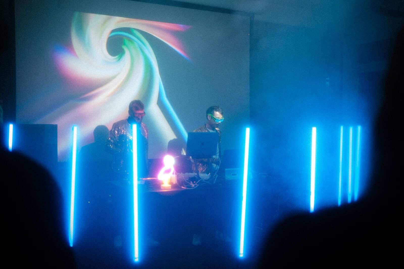
Before leaving Zurich, I do want to draw your attention to PHAWS. Say what? Well Martin von Siebenthal’s name was somehow shortened to the nickname ‘Phaws’ back in the day, and it’s now his performing name as a composer of richly compelling electronic music that is well worth checking out. Oh, and just to add a cherry on a cake of talents, he’s also a private pilot, able to take friends for a spin over the Alps. What’s not to like about that?
So in a brief visit to Zurich I have discovered some great music, learned of theories relating to UX that I didn’t previously know existed, and found out about a particularly Swiss approach to simplicity.
Of gnomes however, sadly, no trace.
recommended
articles
Find out more about the topic


Share your opinion with us