Paper prototype fidelity
Prototypes are the representation of a design concept which we prepare in order to communicate or test our ideas. Paper prototyping is a technique that involves quick hand drawn sketches of interfaces which are valuable assets for user testing. The paper prototype test session also requires a “human computer” who is responsible for acting as the computer when the participants interact with the paper screens. The technique has its obvious limitations (for example: it is difficult to simulate parallax scrolling) but it is pretty useful if we know for what and when to use it.
Advantages of paper prototyping are: it is available for everyone, and does not depend on your resources and budget; it is time efficient, rapid prototyping lets you to sketch your ideas quickly and your users are more likely to give you honest feedback if they see that you did not put hours of work in a prototype. This user behaviour is driven by a simple unconscious motive: users assume that a lot of work went into the designs and are thus loath to mention any flaws, while sketches drawn on paper appear casual and can be easily tweaked with pencil and an eraser, even during testing. Nevertheless, usability experts argue on the trustworthiness of the method, its time efficiency (because even though sketching itself is quick, you have to put the same time and effort in the user testing regardless the nature of the prototype); and the value of the user feedback collected with paper prototyping since the paper screens are so far from the actual product it will not evoke those feelings and reactions from the user that we are looking for. This is where we should introduce the concept of fidelity as a metric that helps categorising prototypes and defining what method is the most suitable to our research.
Fidelity describes to what extent does your prototype look or act like its real world version. There are several concepts using fidelity to define prototypes. The most common and rather vague notion is the use of high and low fidelity. The problem with this is everyone has a different idea about what high and low fidelity are. Others try to differentiate several types of fidelity: visual, functional and content-related. This approach is more helpful since we are able to decide what are the important aspects for us, for example if we test the vocabulary of the site we need high fidelity in content but don’t really care about visuals.
Dimensions of fidelity
Carolyn Snyder developed this idea further by introducing dimensions of fidelity in prototyping. She proposes four dimensions: breadth (horizontal prototypes), depth (vertical prototypes), look and interaction. Breadth refers to product’s functionality and features (how many features are available on the prototype) and it basically defines what we can test. Depth refers to the detail of implementation and logic applied in the prototype (do the links work and navigate you to the proper destination?) and it affects the amount of exploration the user is able to do. Look stands for visual look, and interactions shows to what extent the prototype can handle the inputs / outputs with the user (e.g. error messages, loading time). Later, Snyder added content as fifth dimension.
With the help of the above dimensions we can easily compare different prototyping methods. Let’s compare for example digital wireframes and paper prototypes (in the following table we emit the breadth aspect since it is rather a choice of business than a feature of the prototype):
Don’t forget that fidelity also depends on what kind of product you prototype and on what platform because product type and platform may limit the interactions you can simulate. When we start testing, the first thing we should determine is what do we want to learn from the test, what is that we would like to focus on. If we have too many questions we should divide them to questions now and questions later and start with the now group.
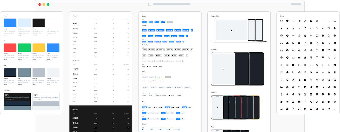
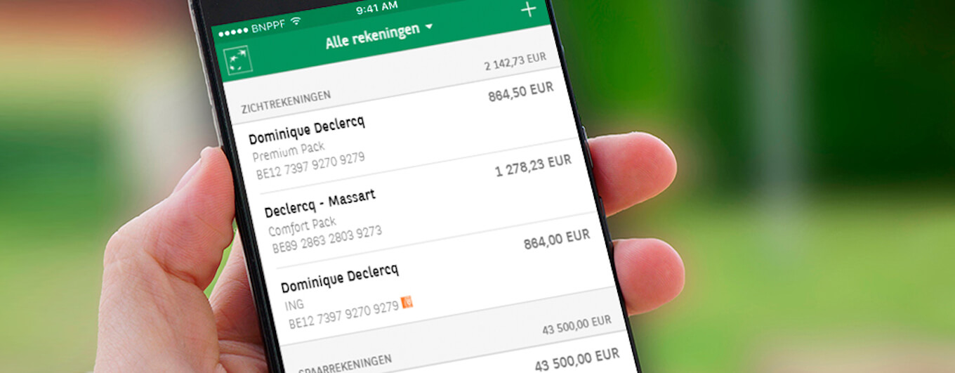
Digital wireframes are great assets for user testing, as the matrix shows we can achieve at least medium fidelity in all areas. Their creation is more time consuming and digital tools are tend to hinder creativity but we have far more opportunities to include interactions than in the case of paper prototypes.
Paper prototypes perform well regarding depth fidelity. This means that we can simulate well how the computer reacts and show several screens (even sketch one or two during the test session) the user wishes to explore. The number of screens prepared for a test session varies and it is probably between 12 and a couple hundred screens. (You can always speed up the production of the paper items with the help of a photocopy machine and stencils). The look dimension can also vary from greyscale sketches to colour printouts. The most difficult aspect which requires a lot of abstract thinking is the interaction dimension, touching is not clicking, writing is not typing and the computer is acted by a human.
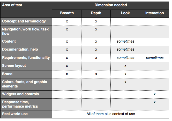
In her book, Paper Prototyping: The fast and easy way to design and refine user interfaces, Carolyn Snyder describes which dimensions matter in different areas of testing:

The interactive paper prototype
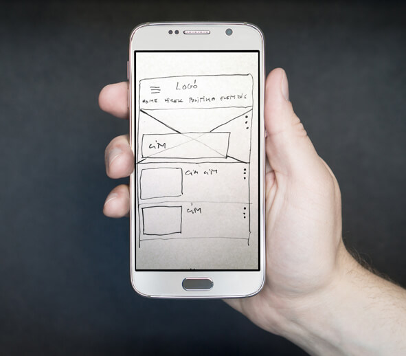
How to unite the advantages of rapid paper prototyping and interactive wireframes? Hybrid methods such as paper-in-screen aims to solve this problem. The basic idea is that you draw your UI sketches record them with a digital camera and present them on a phone, tablet or whatever you platform is. This method enhances the trustworthiness of the user feedback and we can learn more about the users’ behaviour since they test the product in context of use, they held the actual device in their hand. Latest test applications like Popapp and Pentotype even replaced the “human computer” from the interactions to make the experience smoother and less disturbing. For more on these, see Linowski Wireframes Magazine.

As demonstrated above, paper prototyping is a simple and very low-cost research method. It can be applied during the initial stages of development before any graphic or programming work is undertaken. It is worth testing designs during their early initial stage of development.
As with any other method, its sophisticated application requires research expertise and greater experience, but in-house testing under simple circumstances with only a handful of participants can also deliver valuable insights. This tool can help identify major flaws during the early stages of development.
Sources:
SNYDER, Carolyn (2003), Prototyping: The Fast and Easy Way to Design and Refine User Interfaces. Morgan Kaufmann, H.n. (Et.al.)
PULIDO, Diego, Paper-in-screen prototyping
http://uxmag.com/articles/paper-in-screen-prototyping
TRAVIS, David, 7 myth about paper prototyping http://www.userfocus.co.uk/articles/paperprototyping.html
https://medium.com/@jakek/paper-prototyping-is-a-waste-of-time-353076395187
http://uxmas.com/2014/if-you-think-paper-prototyping-is-a-waste-of-time
http://www.uxforthemasses.com/rapid-prototyping/
http://usabilitygeek.com/paper-prototyping-as-a-usability-testing-technique/
recommended
articles
Find out more about the topic


Share your opinion with us