Five things to get more out of your online shop

Even if you own a successful webshop there is always room for improvement in order to reach higher conversion rates: helping the user to achieve her goals by removing obstacles from her way or at least not hinder the user in her activity. Here are five tips to try on your website.
Emphasize delivery information
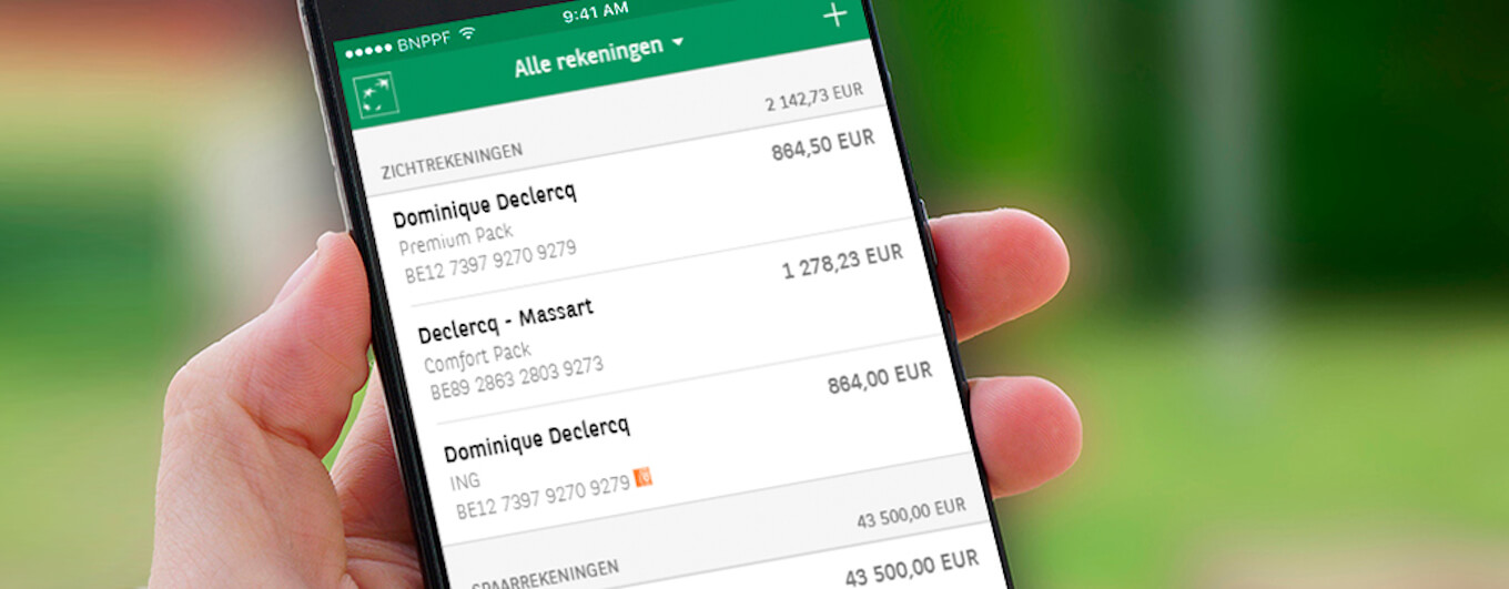
Majority of the webpages require at least a one or two minute research from the user to find out delivery details. The information is usually hidden somewhere in the obscure section of Shopping or Customer Information. Delivery information should be accessible otherwise you have to face with the following situations: Your customers will leave your site feeling unsecure and presuming that delivery fees are hidden because they are too high (hiding prices is a bad habit which convinces people that the product is too expensive). Or if your site gained more trust, the customers may add a product to the cart and click their way through the checkout process to see the delivery fee, then they will abandon the cart and start real shopping or leave your shop forever. If your shop has a lot of abandoned carts this behavior can be a reason. To avoid these situations you have to ensure visible display for the delivery fee and show the frequently applied fees on the opening page. Complicated pricing is not an excuse. On the one hand, display the most frequently calculated fees (e.g. 220volt.hu) and give direct access (link or tooltip) to your pricing information. On the other hand, complicated pricing is a problem, users don’t understand it and what they don’t understand, they won’t like. Make your pricing clear and comprehensible.
Mouse over actions
Product listing pages often include a bunch of actions buttons (for example: “add to cart”, “compare”) which make the list cluttered and messy. To keep your list page clear and friendly, display the action buttons by mouseover on the product page. If the user is serious about the product she will hover her mouse over it and will see the buttons. This method is prevalent and easy to learn if the user is unfamiliar with it.
Lazy loading
Product listing pages allow the user to decide the number of items to see on a page. People just don’t care about this. They would like to see as many items as possible by scrolling down. Let’s make the listing page simpler by removing the unnecessary action of drop down selection and pagination. If you choose to implement lazy loading, use a pop-up solution to display detailed product information or be careful to navigate the user back from the product page to the precise position where she left the list. Check pinterest of facebook for best practice.
Tooltip additional information
The overuse of tooltips are dangerous. Users easily get irritated if every innocent mouse action summons a tooltip. However, if you add tooltips carefully they will serve you and your customers well. Use tooltips on the result page: add an image viewer or a larger image to the product image, a detailed view to the ratings, and a short description in case of the product title.
Automatic results update
Users want to see results as soon as they change a search filter. Users don’t want to click on additional buttons but see the updated product list. Automatic update can be problematic in case of numeric input (filter by price). Now, design the search button to be clearly visible and place it with close proximity to the input field to make clicking easy for the user. If you are not sure that the refresh is noticeable give it more visual feedback by blurring the list and sharpen it again when updated.
Dr András Rung
CEO, Founder

A real veteran of UX by having 18 years of experience. Strong focus on business needs and innovation. András Rung has worked for various institutions and companies since 2002. He is the co-author of the first Hungarian usability book and author of the usability blog Ergomania.
recommended
articles
Find out more about the topic
We like you;
get in touch
Let's make memorable things together.
Dear Ergo,

Bartók Béla street 39.
1114 Budapest
Visitor info
Share your opinion with us