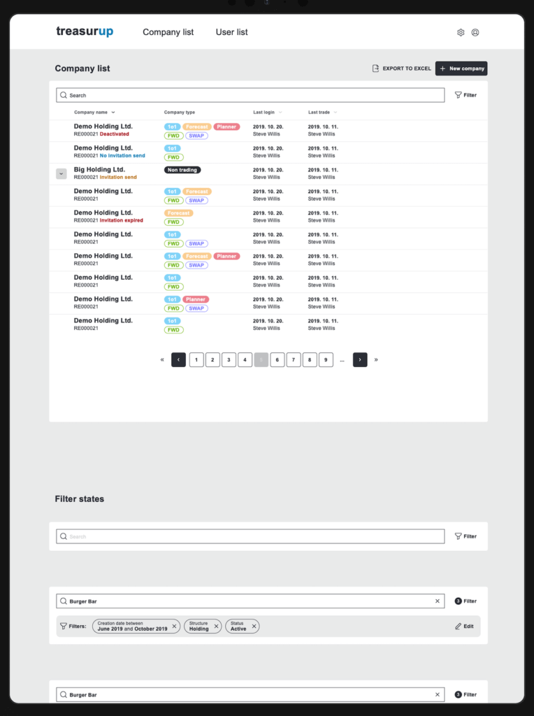
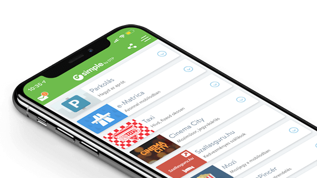
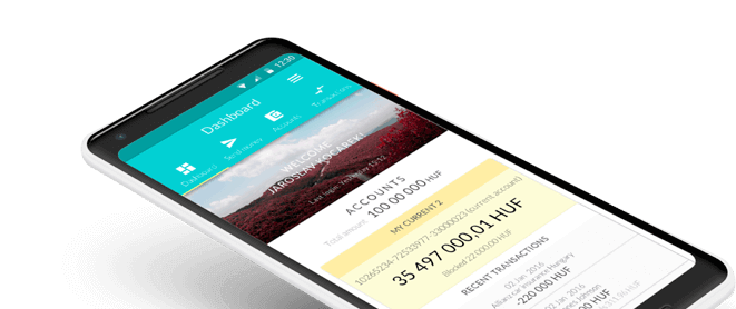
"Simple by OTP Bank" is Hungary's No.1 mobile payment app for cashless payments with 1M+ downloads and 1 million+ transactions. However, as a Fintech-focused product design agency, we are particularly proud of the user ratings: 4.8 (App Store) and 4.5 (Google Play). The app also won the Most User-Friendly Finance App award in 2017.
Dutch Fintech TreasurUp started life with a different name and a different mission, but is now firmly growing and consolidating its market. Eward Bartelma also began with a different career trajectory, having studied Political Science, but the UX head for TreasurUp is well-placed to tell the story, having been the first hire of the startup. “I began in an operations role, but it turned out that wasn’t my cup of tea. However I had UX experience and expertise, so I filled in as a designer to create the first versions of the application,” says Eward, speaking from his home office in Utrecht. Of late Eward has moved again, into Marketing and Data Analysis activities, but it’s the crucial years of developing TreasurUp’s UX that form the topic for today.

The company was started in 2016 as the winner of a global initiative from Rabobank’s ‘Moonshot’ incubator program, by four internal bank employees who named their software platform ‘Easytrade’. This was a hedging app which at the time was almost unique in a market still operating in traditional ways. Foreign currency deals were traditionally accomplished by telephoning a bank, with the process often being slow, and costly. Even with banks on the digitization pathway, the process often remained far from user friendly. Easytrade offered Corporates a much smoother method of dealing with foreign currency risk, and the platform gained rapid traction.
However around one and a half years ago, Easytrade morphed into TreasurUp, to offer not just Foreign Exchange Hedging, but wider Treasury solutions. “It wasn’t just a change of name,” Eward explains. “This was a whole change of business model. Instead of working with Corporates, we began to work directly with the banks, who use our ‘White Label’ solutions under license. They then deal directly with the Corporates instead.” To date TreasurUp have four multinational banks as clients, with the Scandinavian giant Nordea being the latest recruit, as of 2020. Eward hints at big growth opportunities for 2021 and exciting times ahead, but we’ll have to patiently wait and see what the next steps are for TreasurUp.
Misalignment and Mission Creep
So, fast growth and considerable success for Easytrade/TreasurUp, but in the process there was a lot of ‘learning on the job’, particularly in the area of UX design and implementation. And if you’re creating something which has never existed before, there may be design compromises which sneak in along the way. The system works of course, but there are likely to be what Eward terms, ‘Inconsistencies’. With the change of business model it became even more important that any such inconsistencies were ironed out. “We have some great Designers,” Eward is keen to point out. “But UX Designers are creative people, and they’re always thinking of new ways to do things, sometimes starting from scratch. It may make the design better and more contemporary, but there can be underlying problems.”
Aware of these inconsistencies, TreasurUp CEO Niels van Daatselaar had his imagination caught by a June 2019 meetup presentation entitled ‘The 7 Deadly Sins of Fintech’, given by Ergomania founder Dr András Rung. Ergomania is a leading UX-UI agency, based in Budapest, but with a global client base. After the presentation the two CEOs got talking, with the result that Ergomania was invited to make an assessment of TreasurUp’s UX. The review was, “Honest and straightforward” – qualities shared and appreciated by the TreasurUp team where, as Eward says, ‘You don’t hold a leaf in front of your mouth.’ This delightful phrase might be rendered as ‘Calling a spade a spade’ or ‘Not mincing words’. (Apparently the saying goes back to old theater traditions when actors were required to cover their mouth if they made fun of royalty. So now you know!)
Ergomania’s review, starting July 2019, and minus leaves over the mouth, began by identifying a lot of truths which needed to be attended to, and which TreasurUp then recognized as being necessary. In fact, the ‘7 Deadly Sins of Fintechs’ identified by András Rung seemed to have been exceeded, and there was clearly work to do. With the repositioning of the business model, it was time to step up to a new, more professional level for the company’s whole UX approach.
Searching for the Single Source of Truth
Ergomania’s UX Architect and Partner, Maria Amidi Nouri takes up the story, “We initially looked at one module of a current app, and TreasurUp appreciated our analysis. From there it became obvious that if we could identify problems, we would also have to come up with solutions.” Maria points to the fact that all Developers have their favorite tools and methodologies, with experience of different libraries. The same processes are arrived at by different routes and so, as Eward identified, inconsistencies multiply. This leads to a more expensive product in terms of time, cost, and the energy devoted to keeping it running. Just as importantly, it can result in a diminished customer experience. Maria points to an analogy from the aviation industry, “If a part is missing from a plane, there’s no option except to cancel the flight. Do that often enough and the company goes bankrupt.” OK, but TreasurUp are in an expansive phase, and there’s no danger of ‘cancelling flights’ is there? “No,” says Maria, “But we had to get to the ‘Single Source of Truth’ which was missing. We needed to define a set of rules which could be applied and followed by everyone in the business – Designers, Developers, Engineers and Product Managers.”
There already was a Style Guide in existence, established from day one to ensure that at least the ‘look’ of interfaces was consistent – for example in color use, font size and other surface criteria. However what Ergomania was now proposing was a root and branch overhaul of the way everyone in TreasurUp would use systems. Starting in August 2019, the agreement was made to address the inconsistencies which had accrued over time, such as scalability issues and usability problems. To achieve this, a Design System was required, and work on this began a month later.
From an aviation analogy to one from classical music. To play a Beethoven piece, an orchestra requires the correct sheet music. Give half the players the notation for Mozart, and the results may be rather avant-garde. Now imagine that the flutes get the double-bass parts, and the violins are given the percussion sheets. Even a very well-known symphony might not go exactly as envisaged by the composer! The idea of an overall Design System is to standardize all the parts, at the most granular detail, not to limit people’s creativity, but to ensure that every key player gets what they need. A Business Analyst can track goals, and Product Managers, Designers and Engineers can all resort to the Design System as the Single Source of Truth. Achieve that and you gain consistency, reduce redundancy, and give everyone the power of knowing exactly what they have to do. That in turn eventually leads to higher quality in production, and potentially faster adoption of new technologies, in addition to greater prestige and marketing benefits for the company. In other words the flutes get the flute music, the violins get their parts to play. Result? Music, sweet music.
Understanding Hedging and Treasury services
From the initial analysis undertaken by Ergomania, many basic investigations began. There were daily standups between teams – almost always done remotely – and a steepish learning curve for the UX design agency. “We know the Fintech market very well,” says Maria. “And we understand the basis of Hedging and Treasury services, but we also had to get up to speed with the business vocabulary used.” In a highly regulated sector, product offerings must be precisely, legally defined, however this is not always the language of users, and sometimes business requirements and user needs can be at odds. As a result, the deeper Ergomania and TreasurUp dived, the more they had to check, adapt, and in some cases even start from scratch on modules. “We needed to touch the pain points,” Maria recalls, “Including how customers of TreasurUp would perceive the offering. Not surprisingly, people are sensitive about financial apps.”
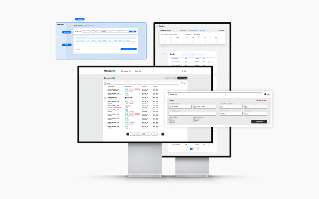
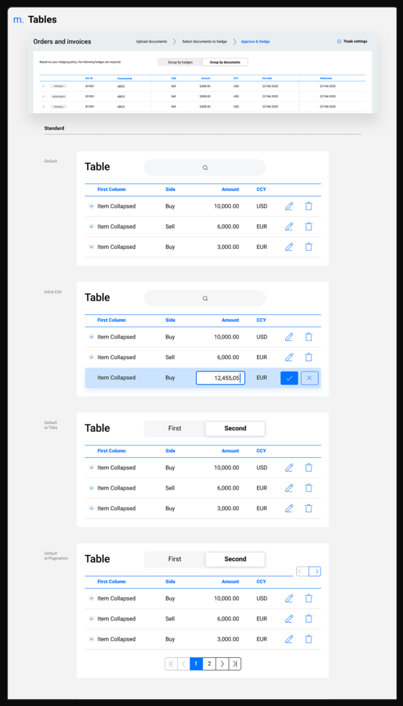
In the first two months of the project, two areas impacted the most – information architecture, and layout, both part of the UX foundations. The approach utilized ‘Atomic’ design methodology composed of five distinct stages, working together to create interface design systems in a more deliberate and hierarchical manner. The five stages of atomic design are: Step 1: atoms; Step 2: molecules; Step 3: organisms; Step 4: templates; Step 5: pages. In the current iteration of the Design System there are now 120 pages, as well as visualizations for existing and new modules, templates and pages.
Getting the Design System for TreasurUp operational involved a great deal more than ‘just’ the atomic approach. Understanding user needs was of course vital, and Ergomania and TreasurUp worked closely together on this, constantly checking and testing. As the Design System started to take shape, training sessions were necessary, particularly for the Developers. The TreasurUp team is spread across the Netherlands, Eastern Europe and Asia, so there were cultural and language implications which also needed careful attention. “We did a lot of brainstorming,” Maria says, but points out that this is a process which Ergomania are accomplished at leading, through a wide range of methodologies and tools. The result is that, “Now everyone knows exactly what they have to do.” And if there is ever any doubt, the Design System is accessible to all as one Single Source of Truth. A project which started with a January 2020 analysis of a single app has resulted in a complete Design System, with follow ups and finalizations in March 2020 to ensure that final deliverables are in alignment. So mission accomplished? Eward Bartlema says the signoff on the Design System is done, but “Not finished.” – Meaning that there is further work to extend the scope of the offerings, as well as turning attention to the development of a TreasurUp mobile app. New client banks for TreasurUp, including the OP Financial Group and KBC means that the scope of the company’s offering is constantly being extended. “We are expecting more clients, and more partners,” Eward says. “We’re planning major new features, for example in the Treasury Management area, and that means new modules.”
Lessons learned
“The work we have done so far with TreasurUp has resulted in making existing modules more intuitive and user friendly,” Maria summarizes. “But there’s also a compelling case that a Design System actually saves money. We calculate that TreasurUp’s ROI on the work came after two months.” So smiles all round – and it seems that everyone in the orchestra is playing the same piece of music, with exactly the right parts. Next up, the Mobile App?
The lessons learned from the TreasurUp experience are not isolated to the Netherlands, or to Treasury applications. In fact any and every Fintech is most likely in a similar position, of having been a fast-moving startup, where getting an app up and running needed ‘whatever it takes.’ That’s the way it is with new businesses. Only later do the inherent ‘inconsistencies’ noted by Eward Bartlema start coming to light. They can be ignored (not a great idea!), or patched up. But patching a problem often creates further problems downstream. The only real way to deal with such inconsistencies is the ‘root and branch’ in-depth analysis conducted by TreasurUp and Ergomania, providing a firm foundation for future growth, in the knowledge that everyone involved in the business can consult a Single Source of Truth. As such, the approach can benefit all Fintechs, and any company which currently does not have a Design System should be asking themselves, ‘Why not?’
and banking
We have grown to become the most experienced UX team specialising in FinTech in Europe, with 30+ FinTech projects successfully completed. Our portfolio ranges from mobile and Internet banking to internal systems, from sales support to chatbot and voice interfaces.
We provide full-blown next-generation mobile banking solutions for sales-oriented banks. We have created a seamless banking experience across dashboard overview, cross-sell-focused user-centric interfaces, banking services, and push notification services. The mobile banking app is adopted by several commercial banks.
