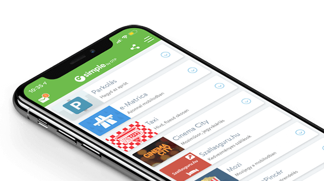
"Simple by OTP Bank" is Hungary's No.1 mobile payment app for cashless payments with 1M+ downloads and 1 million+ transactions. However, as a Fintech-focused product design agency, we are particularly proud of the user ratings: 4.8 (App Store) and 4.5 (Google Play). The app also won the Most User-Friendly Finance App award in 2017.
The client’s goal was to create a second-hand car advertising portal that only advertises verified and documented vehicles and sellers. Many of the difficulties encountered when buying a second-hand car arise because the buyer does not have enough information about the seller or the vehicle on offer. This leads to a lot of uncertainty during the search, as well as additional effort during the selection process and disappointment or even financial losses after the deal is closed.

Defining the problems of the user journey always helps to create processes, functions and interfaces that help the user to solve or avoid a particular problem. The client has designed a portal where sellers go through a central qualification process, and the vehicles’ history is confirmed by uploaded documents and certificates.
In addition to developing the UX concept of well-defined unique product features, we also had the task of developing advanced solutions that make car purchase easier and more successful, and provide an excellent user experience during the search, selection and purchase process.

The UX design stage was preceded by thorough business planning, including research into both demand and supply. We then started to develop the UX concept based on the resulting personas, user journeys and service list. The next stage of the concept development was to draw the wireframe of the basic pages and design the user processes describing their operation.

We made a clickable prototype of the wireframes for the first user tests. Based on the tests, we fine-tuned the wireframes and continued designing the other sides. Before we started the development stage, we prepared a package based on business priorities. After designing and building the package, the first version of the portal was published.
and banking
We have grown to become the most experienced UX team specialising in FinTech in Europe, with 30+ FinTech projects successfully completed. Our portfolio ranges from mobile and Internet banking to internal systems, from sales support to chatbot and voice interfaces.
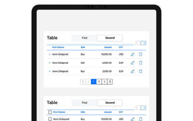
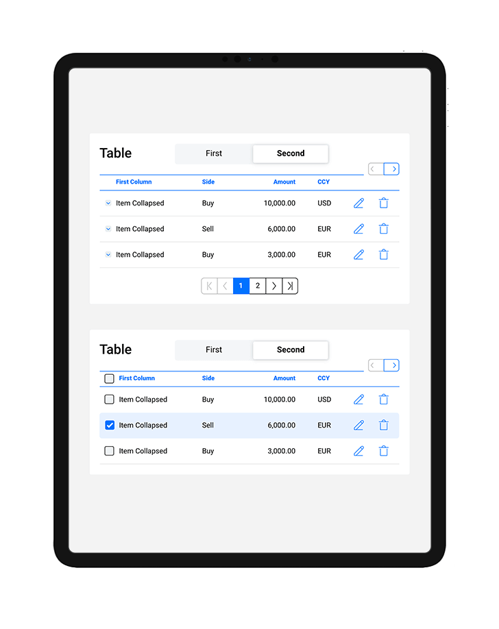
We established written and visual consistencies and guidelines for TreasurUp’s financial platform. To date TreasurUp has 4 multinational banks as clients, with the Scandinavian giant Nordea being the latest recruit, as of 2020.


