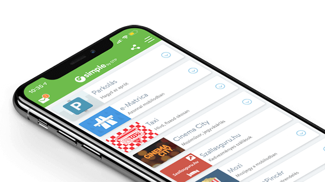
"Simple by OTP Bank" is Hungary's No.1 mobile payment app for cashless payments with 1M+ downloads and 1 million+ transactions. However, as a Fintech-focused product design agency, we are particularly proud of the user ratings: 4.8 (App Store) and 4.5 (Google Play). The app also won the Most User-Friendly Finance App award in 2017.
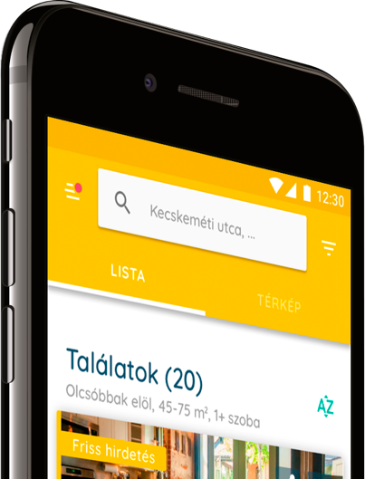
Our client, Real-Deal Hungary Kft. contacted us in the summer of 2017 to create a real estate rental web app optimized for mobile usage which meets 21st-century requirements. The client did not have an accurate concept encompassing the app’s functions but merely outlined the idea to our team. Based on this, we conducted an in-depth investigative research to specify the outlined concept, collected ideas and used it to subsequently create a brief and define the directions of the project hand-in-hand with the client.
During the six-month project, we used a wide range of UX research methodologies (best practice research, in-depth interviews, mental model research, Persona creation, card sorting testing, paper prototype testing and user testing.
The Property rental UX research enabled us to investigate the topic even before we got started with the design, which allowed us to identify the design objectives far more accurately and to leverage the research findings during the design process.
We use the following methodologies during UX research:
In-depth interviews (qualitative research)
We started the whole research process with a series of interviews. In this context, we interviewed potential users from the entire potential target group (lessor, lessee, seller and buyer), 32 people in total. We conducted semi-structured interviews merged with mental model research.
During the interviews, we first inquired about the users’ Internet use habits, discussed their typical methods of accessing information and then addressed their experiences during their most recent home rental/purchase, inquiring about good examples or any online interfaces that particularly pleased them.
We then moved towards finding the ideal solution: we want to find out how the participant imagines the ideal property/rental seeker, likes to use which functions and how could such a service facilitate their activity.
During the interviews, we identified participants’ accessible mental models and identifiable cognitive patterns associated with searching for properties. We were very curious to find out what additional ideas they had, which had not previously been consciously reflected. We were also interested in finding out what participants thought of competing websites, what they like and what they dislike in these websites.
Our results gave us a clear basis for subsequent design and the identified models/patterns and aspects helped our designers make the finished interface more friendly, accessible and easy to use for future users.
The outcome of the interviews:
6 personas based on our research. The criteria defined from the personas’ perspective in order of importance were: – Lifestyle and characteristic user story, – Identified mental models regarding the potential app, – Ideal real estate search app and its characteristics, – Ideas and concepts.
We also performed best practice research to identify the main competitor advantages and drawbacks simultaneously to the interviews.
Creating a Business Model Canvas
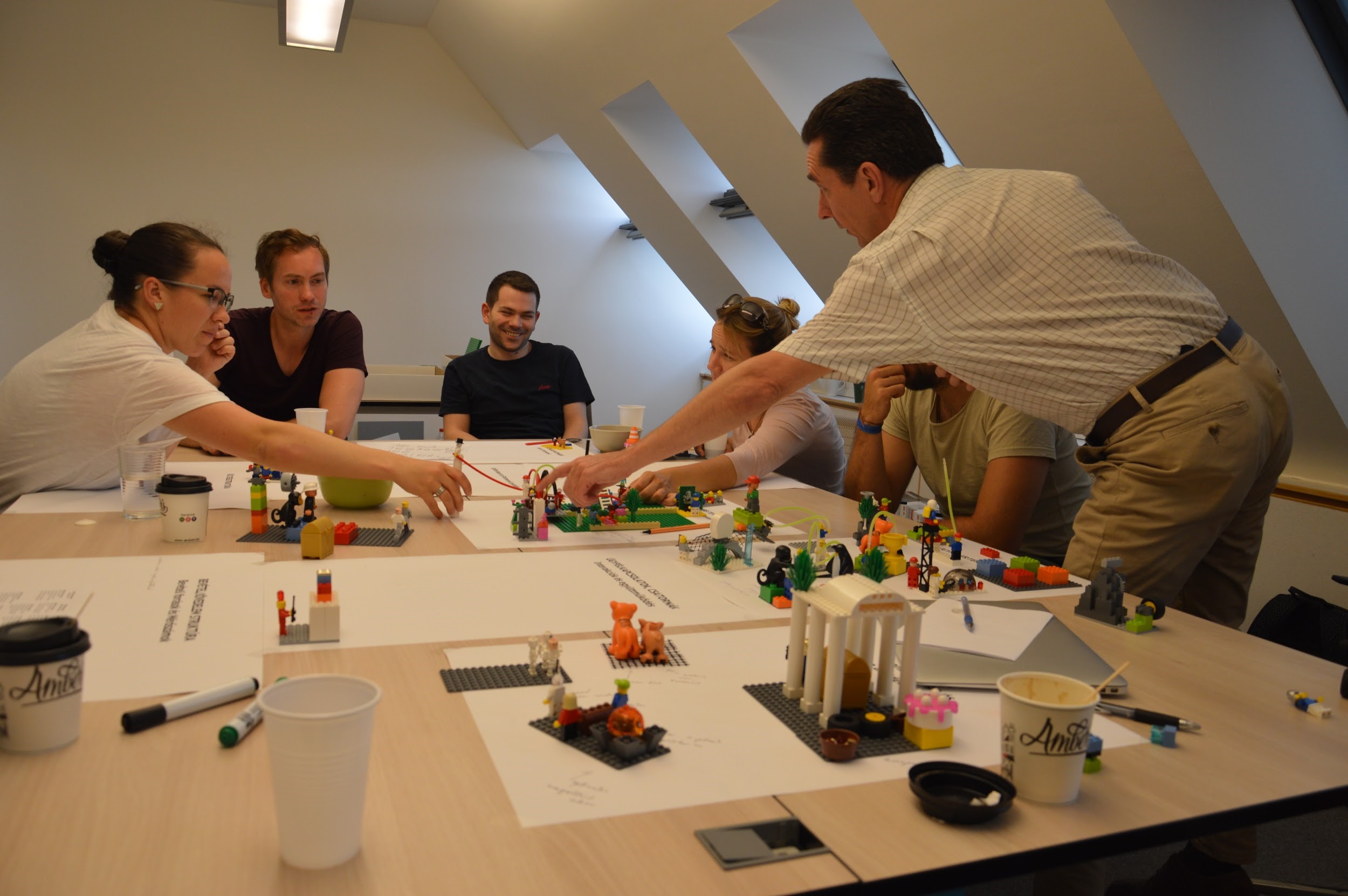
We then used the Lego® Serious Play® methodology to create the Business Model Canvas of the app.
Business Model Canvas models the components of the envisaged concept or the business venture under development in 9 different areas. It merges every relevant aspect into a single location, summarised in concise sentences. This yields a clear overview of the business venture’s viability and immediately pinpoints strategic or other flaws. Flexible changes can be made to the Canvas if any relevant changes in the business or broader environment occur. This is a huge advantage in an endlessly changing market environment.
We elaborated the Canvas containing the components of the app using LEGO® Serious Play®. This is a great methodology that uses and builds on team thinking and equal communication. It can help the group clarify and understand the current situation and allow it to figure out how to achieve certain objectives. By mainly using LEGO pieces to display these elements instead of words or sentences, the group can communicate them far more effectively.
Ergomania’s experts, including our UX designers, researchers and IT experts, worked hand-in-hand with the client to create the Business Model Canvas, with additional input from potential users. This was a particularly innovative method of revising the business model. The completed Canvas featured LEGO figures and compositions linked to detailed stories and explanations in every field. This method clarified and nuanced the Client’s concept.
Completed product: A fully completed Business Model Canvas.
Card sorting test
Using the insights from the in-depth interviews, we created the full contents of the planned interface and organized it with Card Sorting testing.
Using this method, we identified user’s thought process and terminology regarding the topic and the content classification and nomenclature that was clear to them. Once we have the results, we could confidently create the platform’s information architecture.
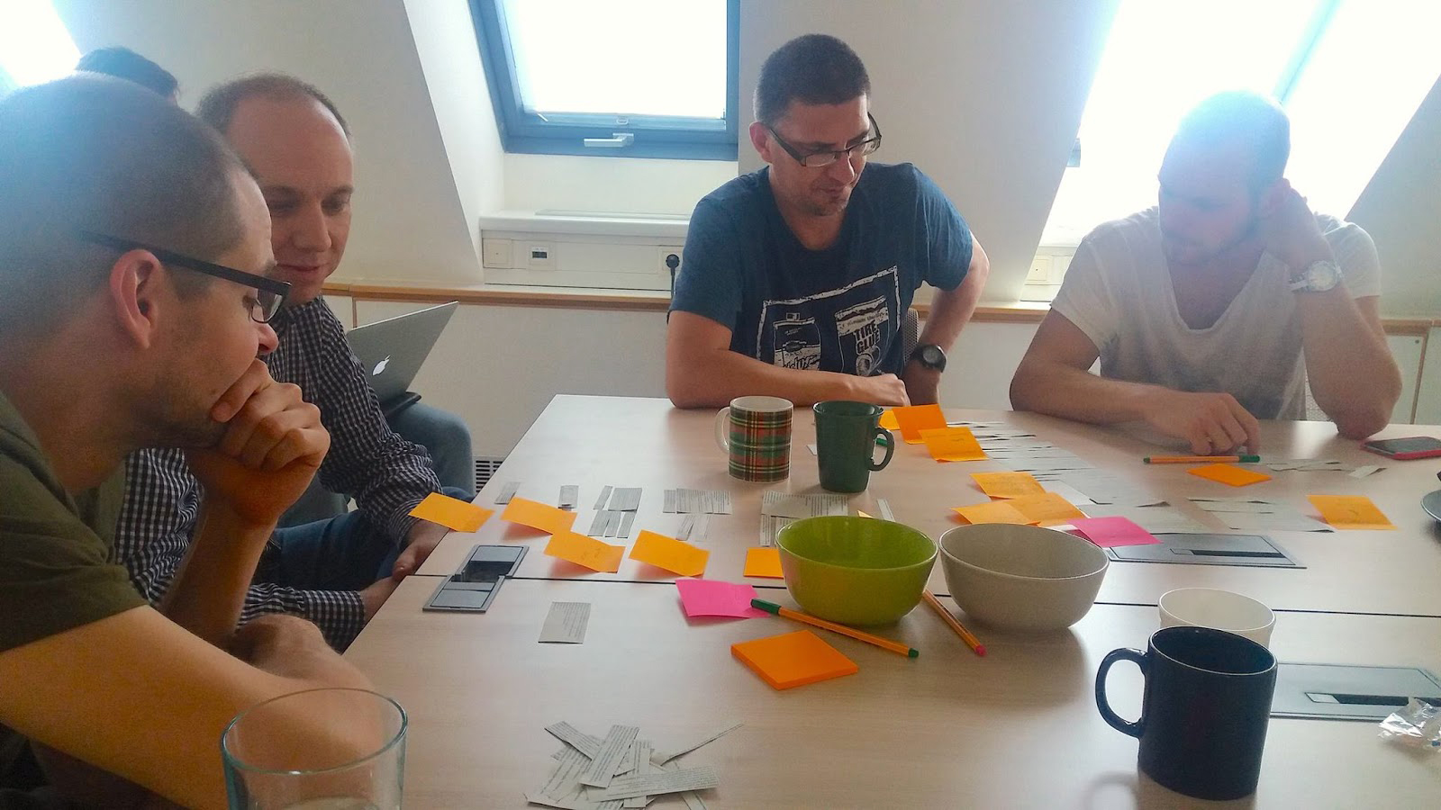
8 people were involved in the study. Participants included buyers, sellers, lessors and lessees. The participants worked in pairs and were given the task of classifying the contents, grouping by topic, according to the potential menu items and also naming them. The pairs then presented the structure and nomenclature what they deemed optimal. We concluded the testing by discussing the results together and allowed participants to comment on the classifications and nomenclature chosen by other group members.
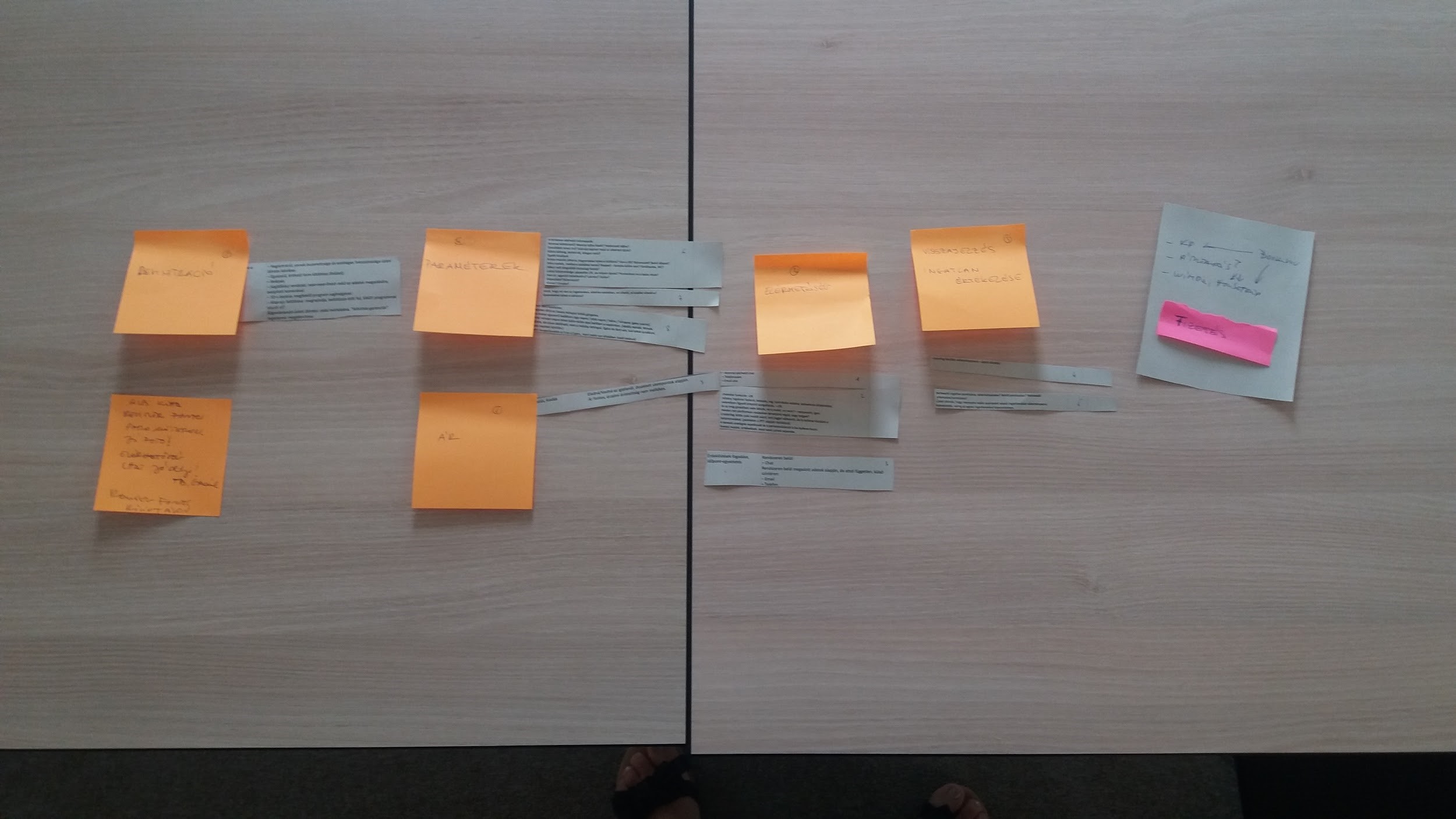
Testing outcomes:
– Identified the topic-related processes in greater details
– Specified the list of functions
– Created the menu structure for the future platform
Paper prototype testing
Building on the results of the previous research, we created the website prototype which we then tested using paper prototype testing. Paper prototype testing is extremely useful for identifying the hidden flaws and minor confusing points of designs in development. The advantage is that it is done with the initial raw designs and therefore enables the correction of fundamental and minor navigation and usage flaws without a substantial investment (i.e. on-site with a pencil and paper).
We performed paper prototype testing with 8 participants.
Testing outcomes:
– Identified the fundamental and minor navigation flaws and created a detailed list of errors
– Compiled the proposed solutions and changes
Mobile view testing
Preliminary research was followed by a 4 months design stage. We linked the interface ready for testing using InVision, yielding a testable and clickable prototype on a mobile interface. Based on the prevailing trends and the insights from the interviews, we opted to focus on mobile views in agreement with our client. Testing was done in a testing laboratory, an office and a café to work closely mimic future use.
Testing was performed with 8 participants, including the ones we had already worked with during earlier research projects. Our objective during the study was to find out how the representatives of the jointly defined target groups navigate the interface, how they use and what they think of key functions.
Our methodology consisted of UX testing during which we gave users tasks to complete using the test mobile phone. We tested both the rental search and posting functions. We wanted to find out which functions the participants could use smoothly and which ones they couldn’t. Could they notice and find the various functions on the interface? Is the map view or search bar in the right location? Are the filter criteria optimal? What questions came to mind for testers during data entry? What flaws did they uncover during use? We were also very interested in hearing their feedback about the interface, so we encouraged them to “think out loud”, engaging in continuous conversation with them.
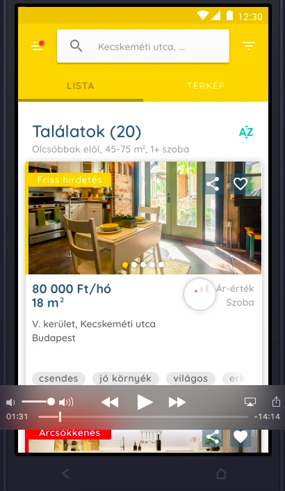
No glaring flaws were identified during testing, as we had already addressed them during earlier rounds of testing. So this round of testing allowed us to fine-tune the interface and address minor flaws before the development stage.
We plan to have the Ergomania research team run user tests on the completed interface to make what we hope will be the last minor tweaks.
and banking
We have grown to become the most experienced UX team specialising in FinTech in Europe, with 30+ FinTech projects successfully completed. Our portfolio ranges from mobile and Internet banking to internal systems, from sales support to chatbot and voice interfaces.
We established written and visual consistencies and guidelines for TreasurUp’s financial platform. To date TreasurUp has 4 multinational banks as clients, with the Scandinavian giant Nordea being the latest recruit, as of 2020.
