The best examples how to use microinteractions to enhance your ux design

Microinteractions are functions that are able to do one thing but one thing well. Microinteractions feel natural and thus remain uncovered; they’re making people feel delighted without making them realize how much thought went into one single step. Microinteractions are focusing on one task and try to make that specific task as natural as it can get. To understand the importance of microinteractions in our designs the best way is to see examples and learn their importance. This time, we will mostly look at user-triggered microinteractions.
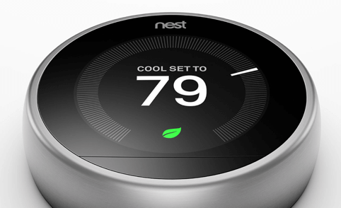
As a start, I would mention the well-known NEST thermostat which is a microinteraction itself. Even though this might be an exaggeration, there is truth in this statement. Although it is a bit of an outlier in my pool of examples since it is a real-world physical product, it shows the essence of microinteractions well.
You can set the temperature so simply that it is almost a sin against humanity. It’s one big, round control that you can use by rotating until the desired temperature is reached. Nest also takes into account the distance between you and the thermostat and adjust the display accordingly.
Moreover, you don’t need to pre-program it, it learns by itself and sets itself. When nobody is at home, it automatically turns itself off. If you are saving energy, Nest is displaying you a leaf which you can also collect and see how your energy saving abilities has improved over time.
In the online magazine Medium, if you click on an in-text picture, the picture will expand and when you make a scrolling movement, it will collapse into its original size. In this way, you don’t have to find the close button to return to the article you’re engaging with.
Medium – Expanding and collapsing images
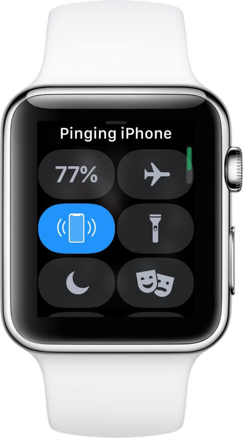
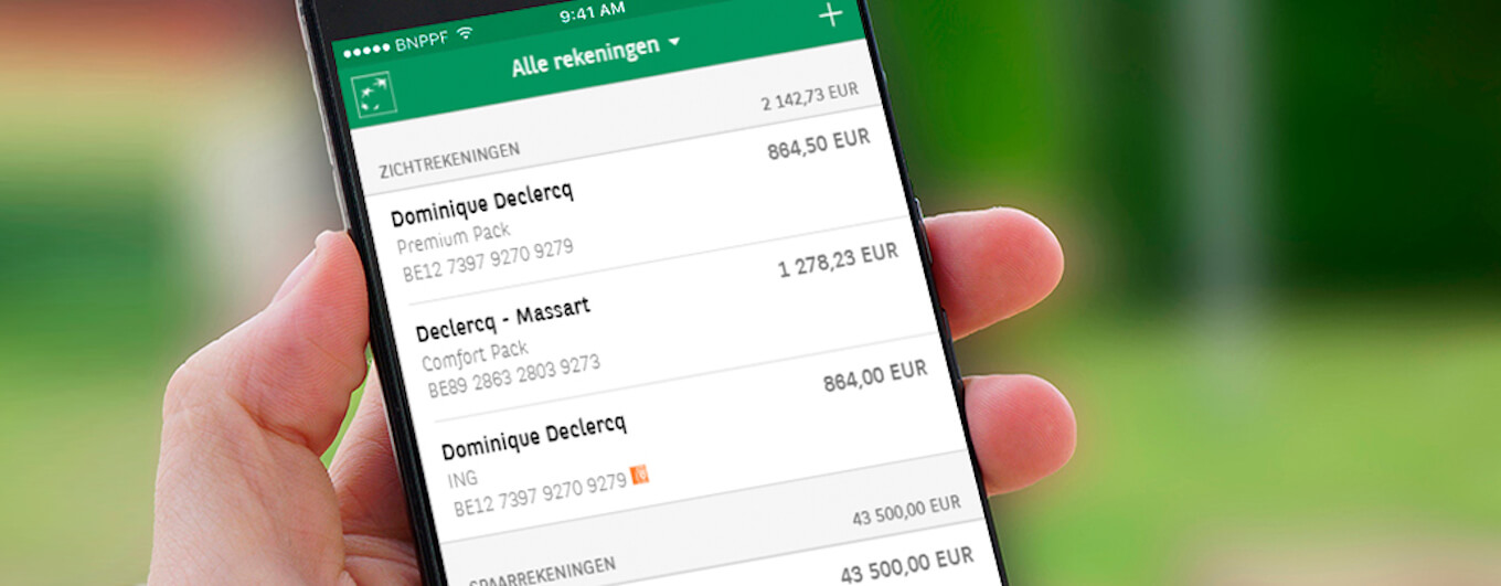
A much appreciated feature of the Apple Watch is the Find My iPhone feature. If your phone is nearby, you can make it ping. The sound your Apple Watch inducing your phone to produce is quite loud, so you’ll definitely hear it.
Another nice example of a micro interaction which is system generated is the loading visualisation in the Douban App.
Douban App – loading animation
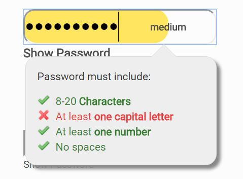
In the process of password creation there is a contradiction between security and user experience interest. From a UX perspective, the main goal is to make the process as straightforward as possible but from a security aspect the strength of the actual password is the most important thing.
If we take a closer look, these two are not really against one another, you just have to find a way to align the two. In the the picture below we see such a solution. As you’re typing in your new password you’ll get instant feedback about the strength of your password and what kind of character still needs to be added. This instant feedback, saves you from experiencing rage when even after the third time you’re typing a new extra-difficult password, it’s still insufficient for the site’s requirements.
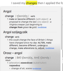
My favourite microinteraction of all is the dictionary feature in Macintosh computers; if you highlight a word and right click on it, you can choose the “define” command and you’ll see the dictionary entry for that word.
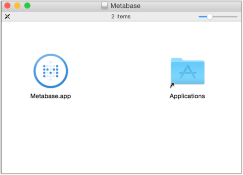
On Mac you can install applications by simply dragging them to the Applications folder.
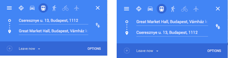
In Google Maps web version, you can simply change the direction to the opposite by clicking on the arrows. This is quite common now, but it wasn’t always like this.
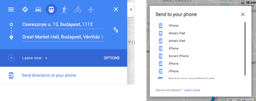
Moreover, you can directly send these directions to your phone by simply clicking on the “Send directions to your phone” link which saves you some re-typings.
In iOS, there is a built-in feature which helps you positioning the cursor by only tapping on the space button, holding it and moving your finger on the screen. The previous solution used a magnifier you could activate by keeping your finger on the text. The newer version lets you move your cursor more freely and actually see what you are doing.
iPhone – cursor relocation
On Dribbble, in the default mode, you’ll be presented with the visual design and by hovering over the picture, you’ll see the short description of that particular design. This makes easier for us to have an overview quickly, even without clicking on anything.
Main aspects of a good microinteraction
- Single task completion – It focuses on a single task and designed to complete only that
- Make it functional – Microinteractions should be invisible which means they must not be kitschy but purely functional. Not more and not less that is necessary
- Think ahead – They should expect the mistakes people may make and act to either prevent them or make them reversible. Make your design forgiving
- Use it wisely – Don’t overpopulate your product with microinteractions, only use them if they can really make a difference
As we can see from the examples above, details are not just nuances but they are the foundation of a good product. They, in essence, can decide about the fall or success of a service. In reality, these details can turn UX into a good UX, since in these cases the designer really puts the thought behind the product. The designer really has to think how to present a process on the surface in a way it is taking into account the operation of the human mind instead of mirroring the operations happening in the background.
This, however, doesn’t mean that we should overfill our product with microinteractions without a well-grounded reason. The whole point of microinteractions is that they are only present when they really can make a difference in terms of turning the process simpler and add delight to our everyday digital activities.
recommended
articles
Find out more about the topic
We like you;
get in touch
Let's make memorable things together.
Dear Ergo,

Bartók Béla street 39.
1114 Budapest
Visitor info
Share your opinion with us