Assessing the ROI
of UX
‘Wow! Will you take a look at that!’ This is the sort of response that all Designers would like for their labors, and sometimes even get. We usually recognize ‘classic design’ although rarely agree with each other about what this constitutes: The Volkswagen Beetle, Fender guitar, Converse sneakers? – All classic designs, probably. The general public most likely considers ‘design’ to be simply the surface attributes of an object, the ‘skin’ which covers the working parts. It’s nice to have, rather than essential. And yet we are all using designed objects all the time, nowhere more so than in the software and apps which underpin our lives. Anyone who logs into their bank or financial service is utilizing highly sophisticated design which has to function clearly, cleanly, and with the greatest possible ease of use. In the last decade we have all learned that negotiating with apps does not have to be difficult, and Big Tech in the form of Google, Facebook, or Amazon has increasingly demonstrated to the financial markets that there is a huge appetite for great, well functioning software.
Bangs for bucks
It’s easier to spot when the User Experience – UX – is not good, however. If there are glitches and problems, we really notice them. If there is a choice available, we’ll then dump the bad UX experience and move on to something more seamless and pleasing. If the UX and User Interface – UI – is good, then in a way we don’t actually see it. This is something of an issue for UX designers and their clients, because if the definition of ‘perfect’ is that no-one notices, then how can you measure and evaluate that?
As is usually true, it’s the bad news that attracts attention. There’s no story involved in: ‘Plane takes off, has uneventful flight, lands safely’. On the other hand, everyone pays attention if things go wrong. So from the client side as well as the design side, the UX aim is in some senses to always have an ‘uneventful journey’, but one which also delivers maximum effectiveness, and sometimes even pleasure in using a service. Those are big demands, which corporations and clients of UX sometimes struggle with: ‘You want us to pay a ton of money so that no-one notices?’
This is where Return On Investment comes into the picture – to assess the bangs for bucks being delivered by the UX process. Few organizations today would argue that UX isn’t necessary to some extent, but assessing the degree and depth of User Experience and User Interface might be something of a dark art. Or not: let’s look at some of the factors in determining ROI for UX.
Looking to the endpoint
Right at the start of a project, there needs to be a framework put in place that will enable assessment at the endpoint. If we set out to design an airplane, for example, it has to be defined as more than simply ‘an object that flies’. Only when we’ve decided whether it will carry passengers, what distances it will cover and heights and speeds it should attain can the design process truly be commenced. After that, all of the results achieved will be referred back to those original criteria and the client gets what they wanted: a 200 seat passenger jet, rather than a single engine, solo stunt plane.
So what kind of metrics should be put in place at the beginning of a UX design project to ensure at the end that all criteria are met? Forget the aircraft analogy now, we’ll go straight for the throat and start in on a Financial Technology project.
Looking at Best in Class
Firstly, benchmark: Find out comprehensively what is already ‘out there’ and being offered by other banks and Fintechs. How do ‘best in class’ financial products perform? What is their history and their uptake? What do users like (or hate) about other apps and software? Thorough benchmarking defines the scope of the project because it gives clear comparators for similar products to the new proposed offering. This research period is vital, and should never be rushed through, and is often where a good UX Agency can bring some ‘wisdom’ to the proceedings. Product managers in financial institutions might be ready to push ahead with their great new idea, whereas the experience of the agency can be brought in to really examine the proposal, compared to other products. Eager startups are often particularly keen to power forward with their game-changing app, so benchmarking is vital both upfront, and as a continuing process.
UX Metrics
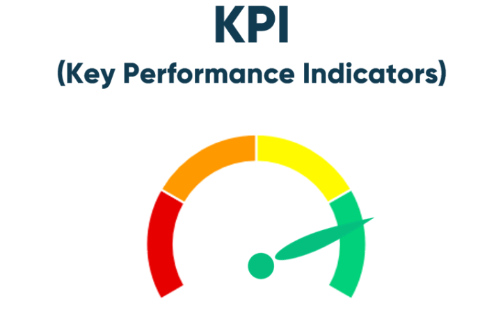
Benchmarking produces UX metrics through Surveys, Analytics, Quantitative Usability Testing and Customer Interviews – all ways of getting to a Single Source of Truth which will produce an outstanding product. With UX metrics established, these must be expressed in the form of Key Performance Indicators, which are not always the same for every stakeholder. For example a Customer KPI might be to spend as little time engaging with an app as possible, while for a sales department the opposite could be true. And what does the bank or financial organization really care about? These are the factors which must be collated upfront, and rigorously challenged where necessary. The Mission Statements of organizations are notoriously ‘wooly’ and all-encompassing, but KPIs have to be as precise and measurable as possible. That’s why they are KPIs.
Measuring and understanding
Now at this point it’s worth introducing a UX-UI Design Agency, based in Budapest, but working across Europe, (and indeed, the world): Ergomania has over twenty years experience in UX-UI design, specializing in banking and Fintech, having worked for many major financial players, especially in the Central and Eastern European region. The company is adept at structuring projects, and asking the necessary questions to ensure that KPIs and Objectives & Key Results are created, measured, understood, and acted upon. So UX design is not just about what color the landing screen should be, and whether the company logo should be animated. In fact it’s clearly very far from that!
The message from Ergomania is always about structure, and testing, but that is only possible and effective if the design team and the client team know all of the parameters, based on UX metrics and resulting in KPIs and OKRs.
Yes, of course there will be clear on-screen graphics to be designed and tested, but that’s just a small fraction of the whole. For an end user, the genius of great UX design should never be obvious or overt. To achieve that end, vast amounts of work must happen, far beyond what the customer finally experiences.
Fails and pitfalls
Dr. András Rung, Founder and CEO of Ergomania says, “Nowadays UX is a matter of hygiene that must be applied to every digital project, in the same way as we need to include an architect in the process of building something. – Unless we are thinking of creating an ugly unstable slum dwelling! But this fact is still not clear for many people, so they need proof.” The greatest proof for any business comes in the Return On Investment: If a process or product earns more than it cost, then the ROI is positive. The more spectacularly positive the ROI is, the better for everyone concerned. This is a basic which has been applied to manufacturing industries forever, but the product of UX-UI design is not what is sold – UX is simply the enabling medium to conduct business, so costing the advantages of good design becomes more difficult.

Bad design is easier to cost. According to a 2005 report from the IEEE (Institute of Electrical and Electronics Engineers), failing software was behind the loss of trillions of dollars worth of business, with an assessment of the reasons including:
- Unrealistic or unarticulated project goals
- Inaccurate estimates of needed resources
- Badly defined system requirements
- Poor reporting of the project’s status
- Unmanaged risks
- Poor communication among customers, developers, and users
- Poor project management
The IEEE list goes on, but that should be enough to recognize a few pitfalls! But perhaps we have all become much better at managing software processes? Well actually, no: A 2017 report on software fails recorded a cost to the U.S. economy of $1.7 trillion a year, with problems at 314 companies affecting 3.6 billion people and causing more than 268 years of downtime. True, that’s overall IT software issues, but the question starts to look like, can an organization afford not to engage in rigorous UX design? Fixing things later is always more costly and time-consuming.
Rational spending
András Rung is an advocate of ‘rational spending,’ saying, “In Ergomania we think that even basic projects should deploy research, flow design, wireframing and testing. On the other hand we understand that business leaders need a justification for spending and they want to understand how their investment is returned.”
Let’s take a step back and see how Rational Spending is involved in gathering those UX Metrics which go towards defining KPIs.
Surveys form the first basis for information gathering. This includes satisfaction ratings, ease-of-use ratings, and perceived usability, by interviewing as many potential users as possible (with the number of interviewees being agreed at the start of the project).
Tools such as NPS (Net Promoter Score), SUS (System Usability Scale), and SUPR-Q (Standardized User Experience Percentile Rank Questionnaire) are used to define ‘personas’ and accurately drill down to find what users need and want, and oftentimes find frustrating. For example, using the Net Promoter Score method typically involves a single survey question, asking people to rate the likelihood of recommending a product or service to someone else. A low NPS may be an early predictor of customer loss, which in turn signals a decrease in income. So using such techniques to assess UX-UI effectiveness are not only about increasing income, but also about avoiding financial and reputational loss. ROI can therefore also be viewed in the light of how spending on UX-UI can help a company avoid losing income.
As well as NPS, SUS and SUPR-Q, in the case of Ergomania, there are also techniques utilized with the client team such as Lego Serious Play, a method of group problem solving ‘designed to enhance innovation and business performance.’
Analytics then measure developing solutions for factors including frequency of return visits, conversion rates, possible customer churn, and error counts. All the time this is building a picture of how the final product will be used, in advance of its full launch. Of course not all products will be entirely new launches, and often an app is being redesigned and updated, in which case there is already a wealth of user material to evaluate. It’s important however that proposed changes don’t simply come from the client side – they must also engage with and acknowledge the feedback of end users, in a fully measurable way.
Quantitative Usability Testing is then used to assess the success rate of using the app, the time spent on the task, and the associated error rate. This is now about precise measurement, rather than the possibly more subjective feedback from users, and is designed to demonstrate productivity, and how effective the program is in achieving what it is being designed to do. For example, a bank onboarding program must work seamlessly, and for the user, quickly. The benchmarks already exist with highly-tuned Fintech offerings and neobank onboarding, which demonstrate that swift onboarding is possible, so potential customers know that the process does not have to take forever.
ROI tools
It should be clear that András Rung’s commitment to ‘Rational Spending’ is well -founded, but how can these metrics be costed to determine the ROI of UX? There are three overlapping approaches: the Single Usability Metric, the Conversion Rate, and the Drop Off Rate (Fewer drop-offs being a strong indication of less errors in the UX design).
SUM – Single Usability Metric – is a standardized usability metric measuring basic components of usability such as effectiveness, efficiency, through to task completion rates, error counts, task-times, and task-time satisfaction. SUM calculations can be accomplished using an agreed algorithm which analyzes UX errors to optimize conversion.
The Conversion Rate is the ratio of total visitors who take a desired action, such as new customers onboarding. Onboarding would fall into the Macro conversion category, while there is also a subset which might feature – for example – blog viewing, which then tends to feed forward to the macro conversion results.
It’s unlikely that any app will ever achieve a 100% conversion rate, so it’s important to measure the Drop Off Rate too. How many potential users of the site are not following through from their initial contact? And why? Is it because the UX-UI is too difficult to navigate? Is it too complex, with too many options? ‘Keep It Simple Stupid’ (the KISS principle) is a very old idea, but it has survived because it is true. Calculating the Drop Off rate is a vital part of the UX process because it tells the real story of the difference between how an app is being developed, and how it may be actually used, or rather not used.
Research and Testing, then more Testing
Classic design is pleasing to the senses, and so must great UX-UI design be. However it goes much further than that, and agencies such as Ergomania have pioneered the importance of careful research and rigorous testing, to create products which are as perfect as possible, and which hit markets truly ready for use. That means being aware of all the stakeholders in a project. With massive experience in UX-UI Design specifically for banks and financial organizations, Ergomania is an example of a breed of agencies which, while certainly delivering stylish and elegant solutions, also concentrate a huge amount of their firepower on measurement and analysis. Banks and Fintechs are after all very interested in their Return On Investment, and the ROI of UX can be measured and assessed.

Napkin Math
So let’s take a brief look at a typical calculation:
A bank has an internal interface which is used by 1,000 employees, whose wages, taxes and insurance contributions, plus share of the infrastructure costs and equipment, can be averaged out to €50 an hour. With each employee working approximately 2,000 hours a year, that means the workforce costs 1,000 x 2,000 x €50 = €100M a year.
However if the bank replaces its software with something more efficient that costs – say – €10M euro (comprising €9M dev and business + €1m UX) and that €1M spend on UX results in software with a 10% speed increase, then ROI is achieved in 1 year.
Compare and contrast to the cost of not attending to inefficient, or outdated software, which isn’t working to contemporary UX-UI best practices: In the USA alone it’s reckoned that more than 600 million hours are devoted to code debugging, at a cost of over $60 Billion in wages. OK, that’s not all because of poorly-realized UX, but the importance of UX in the whole process of bringing new software and processes to market is of checking and proving concepts before they are deployed. A February 2021 survey of 950 developers globally revealed that 38% spent 25% of their time fixing software problems, while another 26% of developers spent nearly half their time bug fixing. And of course while they’re fixing problems which could well have been avoided, they’re not doing the work they should be doing – developing.
UX is short for User Experience, but of course we all know that. It’s easy to forget the User part though, despite the fact that – according to a 2018 PWC report – among all end users, 73% said that experience formed an important factor in their purchasing decisions and choices about which company to engage with. In the banking sector, the experience and expectation gap (the difference between the level of user satisfaction and level of perceived importance) was assessed as being 20%. That’s a big gap.
Is that acceptable? – No. Can it be addressed? – Yes. UX-UI isn’t a ‘nice to have’ but a ‘must have’ which can also easily demonstrate good ROI.
Influencing and engaging
Having said all this about measurement of the ROI of UX, of course great design also works to influence and engage. Just look at the way Apple Computers won a loyal and dedicated audience for its products over many years. Design demonstrates a brand’s message, and expresses core values and beliefs, which go on to create differentiation from other brands within the same market. Both banks and Fintechs operate in crowded and highly competitive fields, so they must ensure that they have great UX from all points of view – for effectiveness and functionality, for outstanding ROI, and so that the end user might say, ‘Wow! Will you take a look at that!’
recommended
articles
Find out more about the topic



Share your opinion with us