Wireframing tips

For beginners it is often difficult to decide whether pen and paper or digital wireframing is the most efficient and what are the necessary steps that one should consider. Now, let’s have an overview of the basics of wireframing.
Digital wireframing
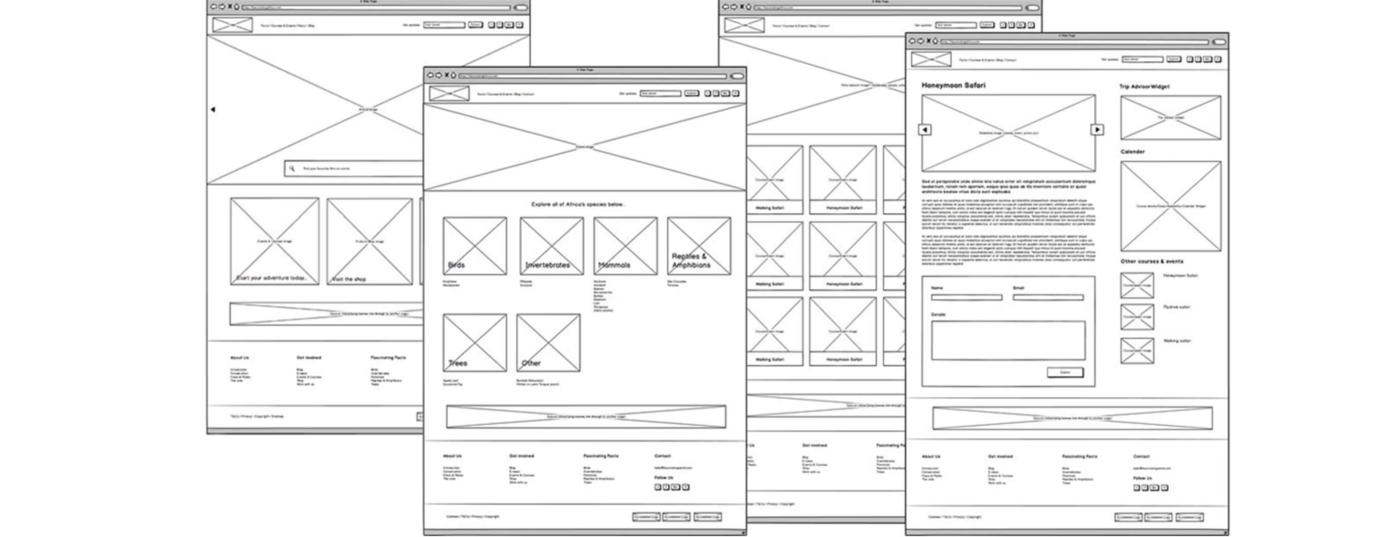
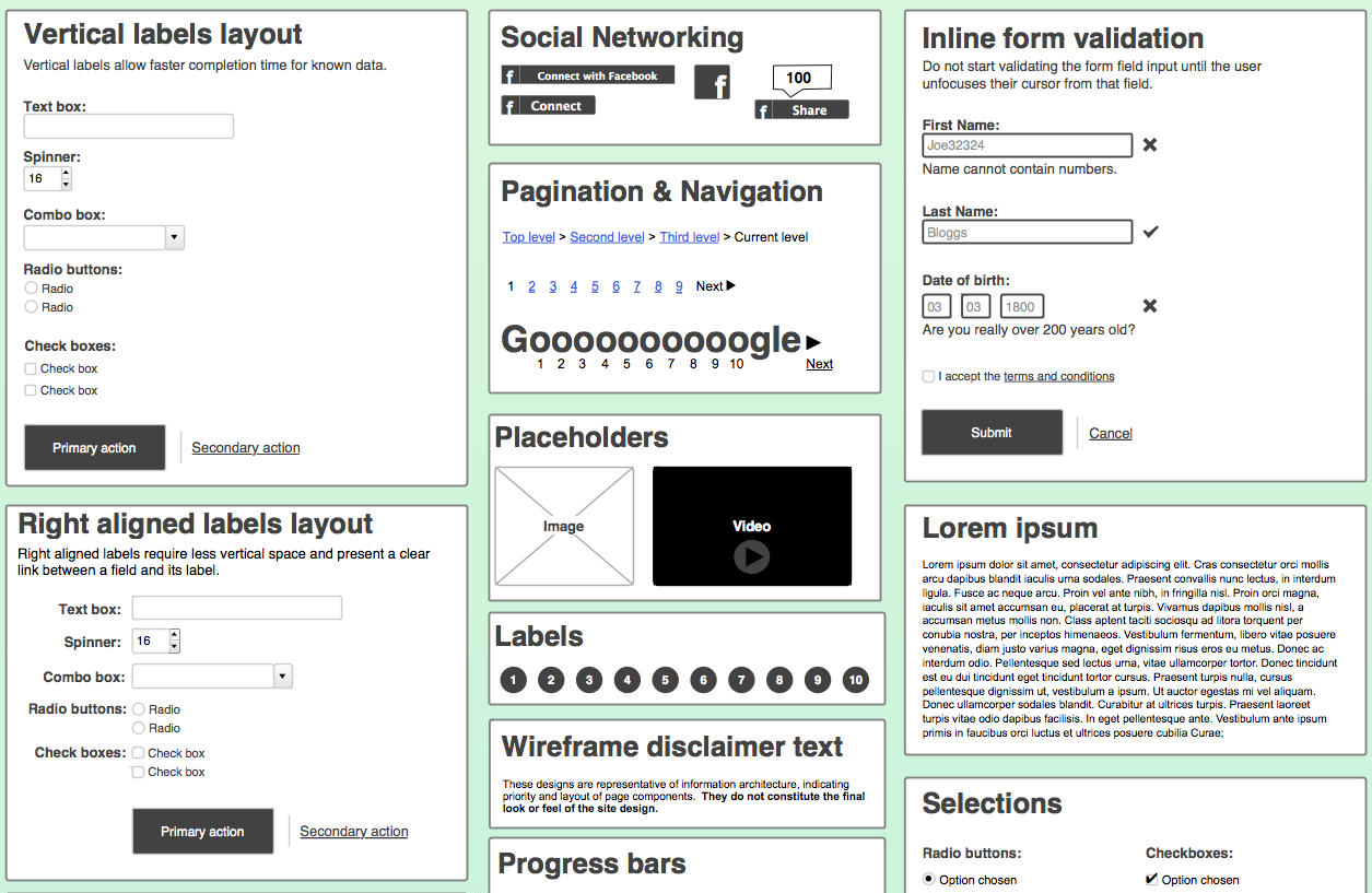
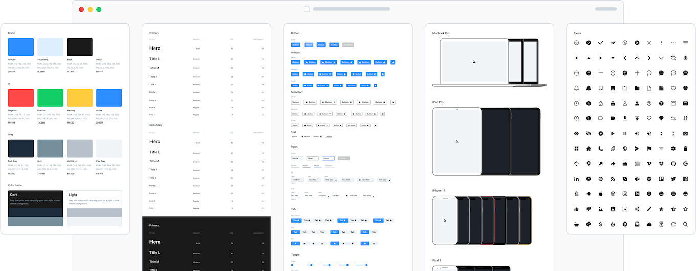
Digital wireframing guarantees all the advantages of digital design: an easy way to edit, modify and share documents which is pretty useful if you want to try a lot of variations to achieve best result in layout and arrangement. Digital wireframing tools enable you to copy & paste and scale existing elements within one wireframe or between separate documents, and insert images and other resources. Wireframing tools like Axure and Omnigraffle have great multi-purpose widget libraries (including for example popular icons, and ready-made interactions) which can help you to speed up the design process. There are several free widgets libraries available to try.

One great advantage of digital tools is that they allow you to create interactive, clickable mock ups which help you and the client to visualize the working performance of a website or mobile app. The interactive mock up is also a great asset for user testing. Digital files are quick and easy to archive compared to paper prototypes and the majority of the tools have a dedicated team work option as well, which allows you and your co-workers to work on the same file together.
On the other hand, your laptop and wireframing software is not always at hand, therefore it is worth to make pen and paper sketches as well. Working on the computer might hinder creativity and in the first phases of brainstorming, drawing ideas by hand is more comfortable to promote collective idea gathering. Digital drawing is slower and the designer is tempted to add too many details nevertheless unnecessary on wireframes and will make it too complex, difficult to parse and less playful.
To sum it up, it is best to use traditional pen and paper technique at the initial brainstorming period and continue with the help of digital wireframing tools. I suggest the digital method for routine design tasks, complex projects and projects that require strong collaboration. Digital wireframes are also better when you are working with immature clients.
Wireframing vs. graphic design
Wireframes are simply designed and they concentrate on layout, arrangement and information architecture. It is important that we should not mix it up with graphic UI design, although there are several graphic elements that might come handy in wireframing. For example, the grid system is traditionally used by graphic designers, but applying its structure will make wireframes easier to understand. Wireframes do not aim to please the eye, the easier to understand them is the better therefore a clear and harmonized layout is worth the effort.
Colors are helpful to enhance the functionality of the wireframes: red for error messages, orange for warnings, blue for links, grey for less important elements of the page. As a UX designer you should certainly not care about color hues, font types and precise proportions on your wireframes. Nevertheless, you are allowed and encouraged to use placeholder images and icons as well.
How to create a wireframe?
First, sit down and have a short brainstorming session and create some sketches on paper. Afterwards, observe and analyze the existing interface (in case of redesign) and start a best practice research. Shape your design based on your observations and research and include new ideas that might have come up since the initial brainstorming. Add the final touches and then leave your work and do something else. This is important, because this interval will help you to spot errors and inconsistency later. As a last step, print out your plans, examine them carefully and correct the mistakes you have found.
Taking notes
Since, unfortunately even an interactive mock up is unable to show every animation and interaction, several solutions on our wireframes will require explanation. We can take notes on the wireframe explaining developers how certain elements should behave or where a link should lead. Moreover, I suggest to prepare an additional document to help development and make the working mechanism of the website or application absolutely clear.
Although, digital wireframing allows you to prepare several versions of the same page easily, you should resist making too many variations because it will slow down the decision making process. Client feedback is important, but consider the impact of the change request before you include it in your wireframe. If a request is easy to carry out be generous and do it and make the client happy. Be always consistent in your design and solutions and in using widget libraries.
recommended
articles
Find out more about the topic


Share your opinion with us