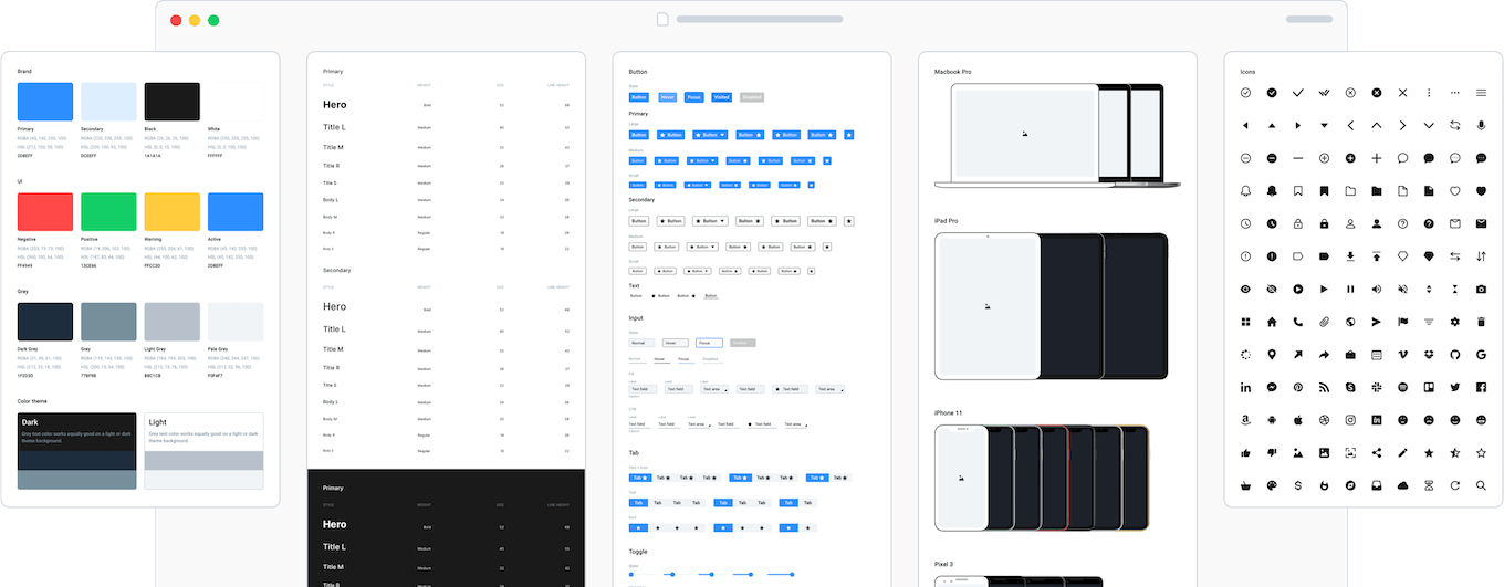
Unity in design

The concept of unity is an essential principle in design. Today, we cannot imagine a quality web page without carefully applied typography, color unity and other look and feel elements. Although, less emphasis is put on the unified and well-designed working mechanisms of the page, it has equal or rather more significance. Users get confused and feel insecure if the working mechanism lacks unity and they cannot perform certain interactions because the mechanisms are unexpected and obscure.
The following list contains several useful considerations to achieve consistency and unity in the working mechanism:
- If you use widgets (e.g. to show weather), place them in the same location on every page unless you have a very good reason to do otherwise.
- Is the information structured in a similar way on every page?
- Are actions presented by similar means? For example: do links lead to unimportant actions? Are tabs used consistently to break down information? If secondary action buttons are less emphasized on one page, are they less emphasized elsewhere as well?
- Are error messages consistent?
- Is the way the user is informed consistent?
- Do you use consistent language and vocabulary? Do you say computer on one page and PC on another?
- Is background information consistent? How do you use tooltips, pages with secondary information and help elements?
- Do you use bold text to emphasize consistently?
- Do you arrange radio buttons in the same way (horizontally or vertically) throughout your site? Are you sure, you don’t mix them up?
The list is endless and depends on the application. The bottom line is that you should not focus on only one process or only on one screen (which is worse) but always consider the other solutions you used elsewhere in your application, those the user has already encountered with. During the design phase, you should often check and compare various details of your design.
Unfortunately, there are still chances that several inconsistent elements will remain in the application. To review these on screen is impossible since maximum only two or three pages can be displayed on one screen. Therefore, I suggest printing the wireframes and having a look at all the pages you have together. This way, spotting errors is easier. Mark the errors on the paper, and then improve the digital wireframes. Then have a couple of day rest to gain distance from the design phase. Have a rest by working on another project at least. Following the break, print and check the wireframes again for inconsistent elements (there will be some for sure), correct the wireframes and close the project. Don’t be lazy to write a working mechanism document or to make the wireframes interactive because here you can spot further inconsistent processes. Stuff might look good on the static screen but when implementation starts you may realize that certain features are not designed and lead to obscure pages or result in horrifying changes in layout.
recommended
articles
Find out more about the topic


Share your opinion with us