Key UX Principles to Design Great Dashboards
The term dashboard comes from automobile dashboard, it has evolved during the decades and it is now also used in the digital world. Dashboards are a dynamic way to visualize data,s track statistics and demonstrate key performance indicators. The data management tool’s objective is to help decision makers to make quicker choices, realize and monitor business patterns. Data should be shown in an understandable, easy to scan way for fast tracking.
“A dashboard is a visual display of the most important information needed to achieve one or more objectives; consolidated and arranged on a single screen so the information can be monitored at a glance.” Stephen Few – www.dashboardinsight.com
Know the audience
When starting to create a dashboard, as the first step you have to get to know your users. What is the role of the user who will gather the necessary information form the dashboard? Is it used by a CEO, CFO or a Marketing manager? Whether it’s used by one person or a group? Does it serve the data for people in different roles or just one? The main objective is to make it simple. The data is to be visualized in a clear and minimal way and it must serve the audience. The 5-second rule requires us to create dashboards that can be understood in 5 seconds. Dashboards must represent data clearly and efficiently.
Studies show that people remember 80% of what they see and do and 20% of what they read.
Enable drill down
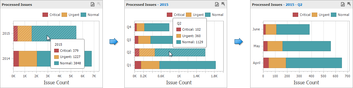
Drill down action can be brought up when the user clicks on a chart and can see the details of that element. When adding drill down interactions to your chart, indicators and tables or even websites, it can be personalized for a user or a team of users. Zooming in and out of charts is essential as moving time scales, group the data by weeks, month or quarters.
Dashboard Classifications
Dashboards can be classified in several ways. The following shown option is based on Stephen Few Information dashboard design book, where he classifies the dashboards by their role – strategic, analytic, operational and by the type of business they assist.
Strategic dashboards
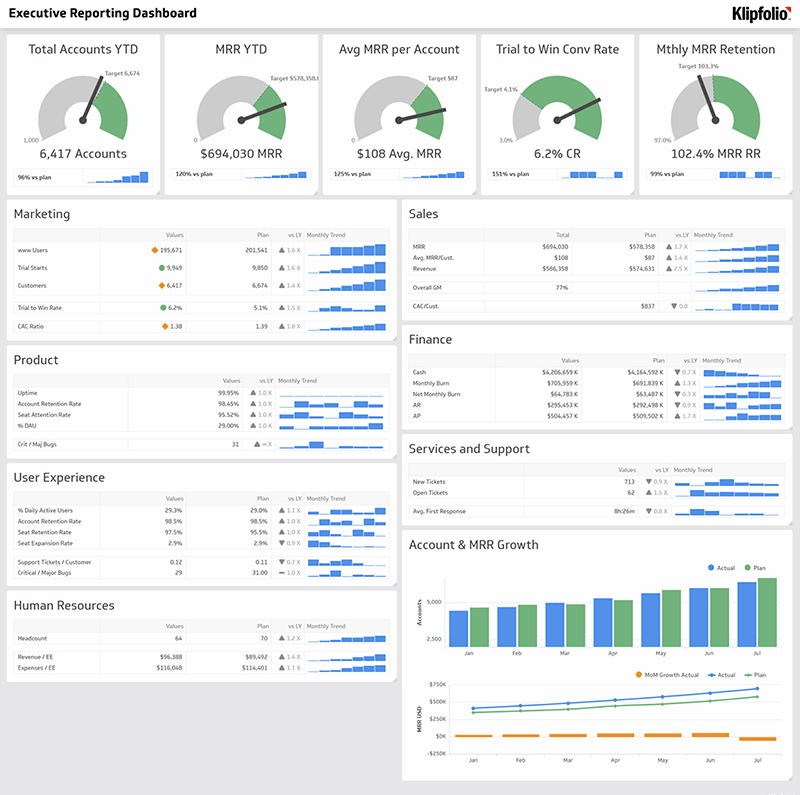
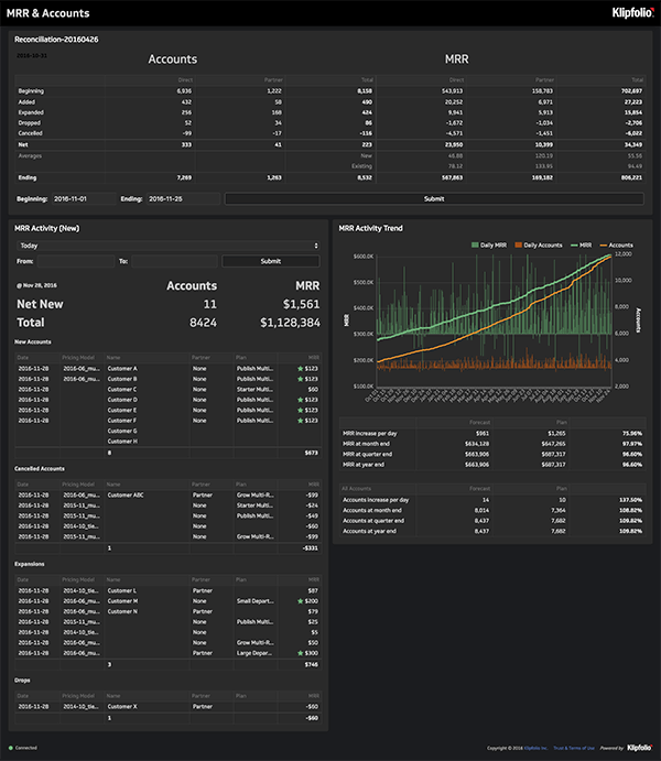
Strategic dashboards track KPIs (Key Performance Indicators). Nowadays dashboards are mostly strategic, giving a quick view for managers on the health and everyday operation of their businesses. These kind of boards concentrate on the actual performance and forecasts. These executive dashboards are not driven by real time data, but rather statistics of weekly, monthly periods. Mostly strategic dashboards do not give the possibility for interactions to its users.
Analytic dashboards
Analytic dashboards show data to keep track of trends. This type of dashboard requires bigger complexity. It has to analyze large quantity of data, compare and evaluate, investigate trends and predict outcomes. It often includes Business Intelligence like drill down and it supports interactions with data.
Operational dashboards
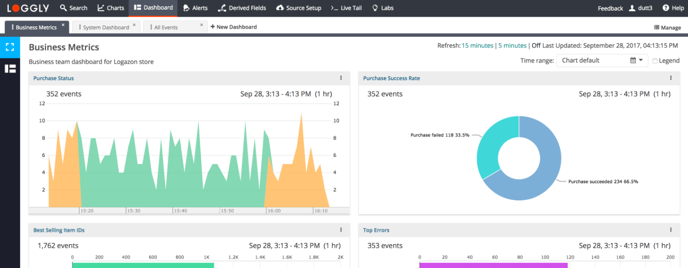
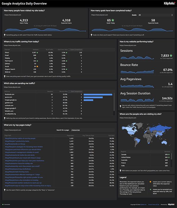
Operational dashboards tell you what is going on now. The operations that mostly influence the design of such a dashboard are very quickly changing and dynamic. It often requires immediate response when a problem occurs. It is used throughout the day and the visualized data must be very simple and quickly understandable in order to make fast decisions.
Types of diagrams
Lines
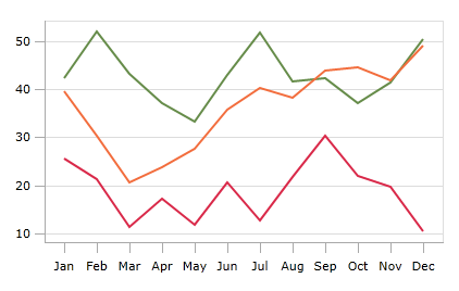
Line chart is often used to visualize a trend. It should not be too flat or exaggerated to show the message. The right height of a line chart is the 2/3rd of the chart area. It should be simple and the increments should be used in the way how usually people count: 0, 5, 10, 15, etc. Always a maximum of four lines should be used in a single chart. Too many is confusing and not effectively showing the data that is presented.
Bars
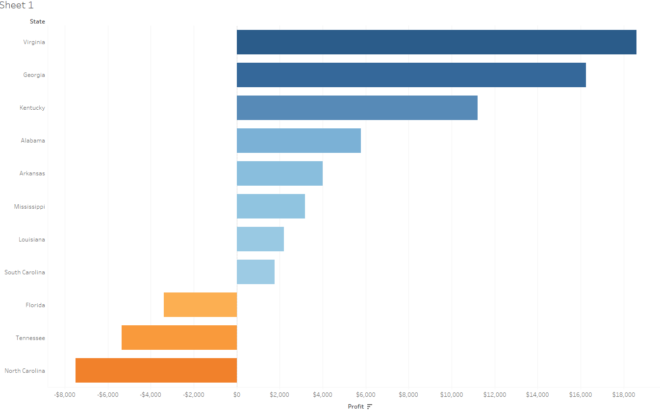
A bar chart is a way of summarizing a set of categorical data. It is best used for comparison. The same rule has to be followed here: keep it simple. There are few principles that has to be followed to deliver the message. The width of bars has to be twice the width of the space between them. If they represent the same data use the same color. In case of multiple bars, where the number of charts should be a maximum of 4, the shading should go from light to dark. In this case a legend can be used as labeling would be confusing.
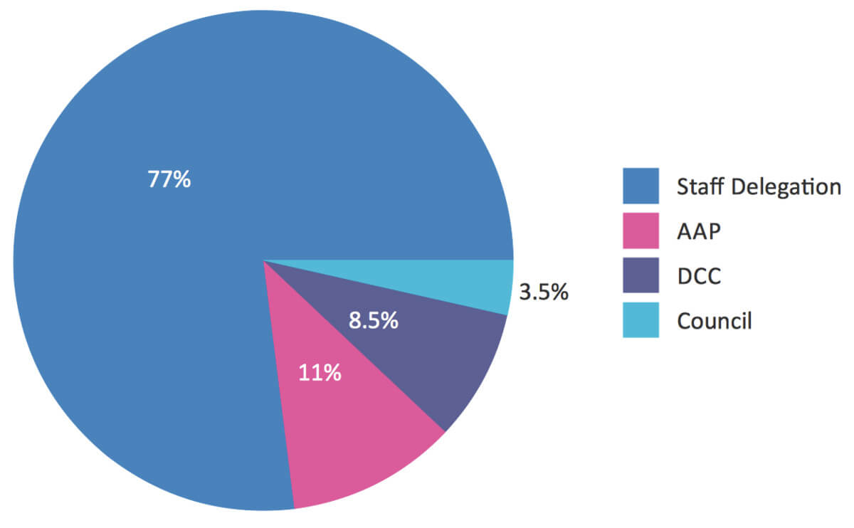
Pies
This is a statistical graphic that is divided into slices to demonstrate the proportion. It should be only used for simple composition. Reading a pie chart is like reading a clock from 12 o’clock moving to right. That’s why it is more efficient to visualize the largest segment on the top.
Tables
Tables are not a way of visualization by definition but a form to show the data in a raw way. However there are a few useful tips to make it visually easy to the reader. It should be used to compare data when you have to show precise values. Thin rules should be used after each 3 to 5 entry and a wide table needs a rule after every 3 lines for better visual understanding. Chart can be nicely presented and helpful in a table to highlight the most important data.
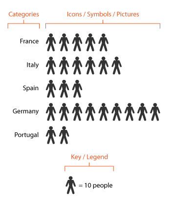
Pictograms
A good pictogram used in a chart must be simple, clear and symmetrical. In an effective pictogram, the data should be a multiplication of a single data. A pictogram is used to visualize the data in a bar chart.
Maps
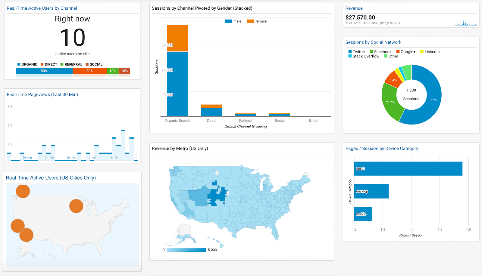
Map charts are to present data that is mostly geographical. It should be used when there is data in the presentation like: country, state, city. Maps should be only used when the regional context of the data is important. Maps can contain different shapes or markers. If the map is setup, it is also possible to navigate within the map by zooming in and out, in this case an interaction mode control has to be setup.

Other interesting chart types
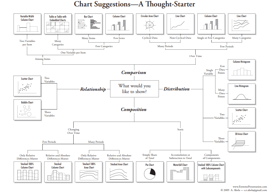
We can use more types of diagrams based on the data to be visualized: mosaic, population pyramids, spider, scatter plots, binary decision diagram, multi level pie charts, gauge, pareto, stock, gantt, waterfall charts and heat maps. Which is the chart to choose for data visualization? Thanks to Dr. Andrew Abela, there is a chart selection diagram that should help to pick the one that suits the aim and data the best.
Visual rules
There are a few rules that is suggested to be followed when creating a dashboard.
Fonts
At dashboards the data has to be the main focus, so highlighted fonts, special typos should not be used to draw away the attention. Serif and sanserif fonts can be used as they are legible and gives the option for a big variety. Let’s keep it simple!
Colors
There are 3 main attributes that have to be considered: hue, value, saturation. Hue is the term for the pure spectrum colours called as “colour names” – red, orange, yellow, blue, green, violet – which appear in the rainbow. Saturation is the intensity of the colour. Value shows how light or dark it is. A good visualization can be done by dark or light colours. Warm colours (red, orange, brown) appear larger and closer than cool colours (blue, green or grey) when used in the same amount. To avoid distraction 3 to 5 shades should be used in a chart. Too much colours in the presentation should be avoided. A darker shade of a colour can draw the attention of the reader. Colours that are legible to colorblind people should be used. There are special colour blind friendly palettes available.
Golden rules for dashboard design
The most important rule is to get to know the audience, who, where, when will use it. Find the most suitable diagram type for data visualization and build the dashboard logically. Mind the place used as a real dashboard fits in one screen. Intent to keep the “less is more” rule, the most important is the data. Keep in mind that the easy interpretation is essential. Test that all these rules work out.
Zsuzsanna Imrei
UX designer

Zsuzsanna has gained her experience in numerous business fields. As a UX Designer, her goal is to provide a better product user experience. She specializes in product analysis and design while enjoying observing product improvement.
recommended
articles
Find out more about the topic
We like you;
get in touch
Let's make memorable things together.
Dear Ergo,

Bartók Béla street 39.
1114 Budapest
Visitor info
Share your opinion with us