How we Fixed our Dishwasher’s usability problem with 3D Printing
We found a UX problem right before us;
in our kitchen
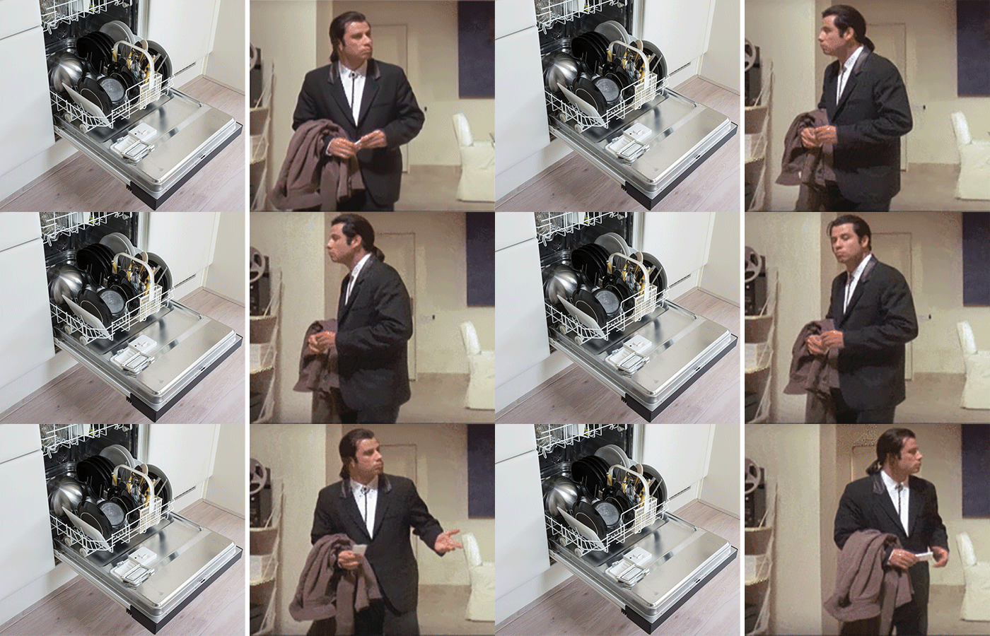
As in most of the working spaces, the dishwasher is in constant use in our office. Everyone can load it, empty it, or just pick out a mug for a quick coffee. But how can you decide whether the dishes in the machine are clean or dirty? It’s not always obvious without close examination or touching some of the dishes. That’s where we came up with an idea. We’re a UX agency anyway – why don’t we fix this usability problem?

First, we came up with the simplest paper prototype
Problems can be solved in many ways. For example, life would be much simpler if everyone would be a good boy and just empty the dishwasher when it stops. To achieve this however, we would need to change human behaviour which is not just a major task but totally out of the scope in terms of user experience design. We need to stick to our expertise and find a way to indicate whether the load of the machine is clean or dirty at any given moment.

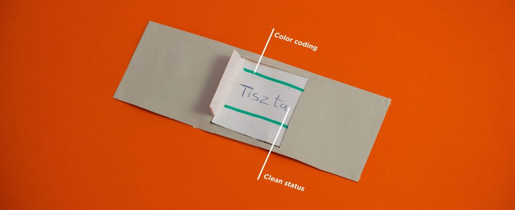
Our first quick-and-dirty paper prototype was ready in 15 minutes. It was basically a toggle switch. We attached it to the dishwasher’s door and observed how curious colleagues are going to interact with the new tool. It took a little while before they learned how to use it, but worked out perfectly after all it, as everyone loves to push or switch things.
Few months passed, the switch was working and bringing the expected results. However, the paper prototype could not bear the daily usage and it was time to move forward.
3D printed prototype
Offers the opportunity to execute the ideas with an affordable price. We can choose different printing technologies depending on the quality and the price. In our project, we used a cheaper printer. Meanwhile, we also extended our knowledge in 3D design and technical factors.

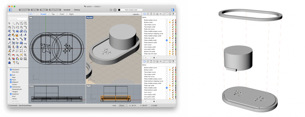
We created several functional and aesthetical preliminary plans and measured different aspects of each. Ultimately, we chose the iOS-inspired look. Our switch consists of 3 elements for operational purposes. The base of the switch contains the icons, the moving button and the upper frame that keeps all the pieces together. During the design we had to also think about the strain between the elements, the button is moving and the frame holds it together. The element’s tolerance are depending on the printing technology and the printer. The final model had to be adjusted for the selected device.

Icons
Having solved the movement of the button, we started to define the actual meaning. Since we are working in a multilingual environment, we decided to design icons instead of texts. The model was printed in one colour, afterwards the icon’s holes were filled with the selected paints. After the printing and painting, we attached the switch to the designated location, check out the image below:

Why don’t all dishwashers have clean-dirty indicators?
We’ve solved our problem, our switch looks superb, works perfectly and we really love it. Our button has triggered many conversations in the recent months and we have realized that this is a common problem in an office environment.
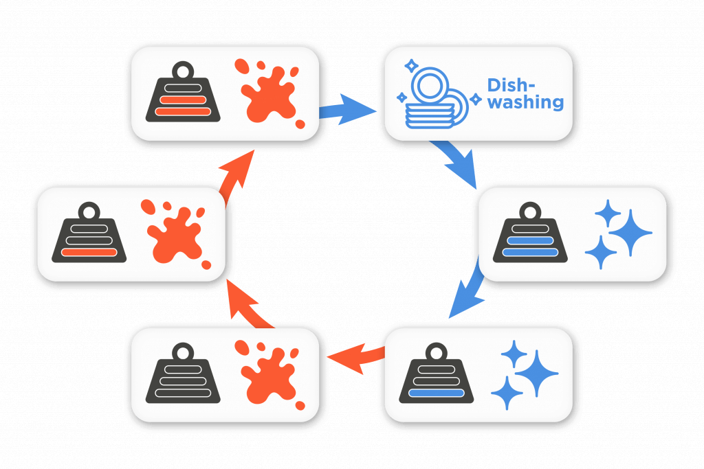
Yet why all the dishwashers don’t have these indicators by default? After the 3D printed prototype, we also designed a built-in logic model for this feature. 
Using a scale, you can clearly determine whether there are dirty or clean dishes in the dishwasher. After washing, the dishwasher contains clean dishes until it’s completely unloaded. afterwards, the machine is waiting for dirty dishes again.
Participants and special thanks to:
Illés Lukács, Kristóf Munkácsi, Szabolcs Pápai, Imre Somogyi, Tamás Zelizi


Share your opinion with us