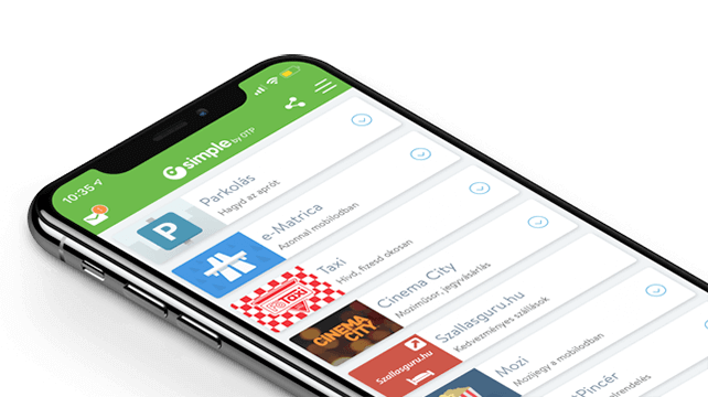
"Simple by OTP Bank" is Hungary's No.1 mobile payment app for cashless payments with 1M+ downloads and 1 million+ transactions. However, as a Fintech-focused product design agency, we are particularly proud of the user ratings: 4.8 (App Store) and 4.5 (Google Play). The app also won the Most User-Friendly Finance App award in 2017.
Woocommerce is great for operating webshops which are offering a small range of products, and has a simple, user-friendly and easy to learn administrator interface for the client. We have already used the Royal Woocommerce template when designing another webshop (bagbolsa.hu). This is a well-developed template in terms of functionality, UX and design.The client had some functional expectations (automatic invoice creation, individually scalable special offers, Sofort Überweisung payment method) that the template did not contain as default functions; we have resolved these by searching and finding best plugins suitable for these purposes and integrating them.
We used the tried-and-tested Asana as our project management tool, Slack for communication amongst the team members and Skype to communicate with the client, and held weekly status meetings.
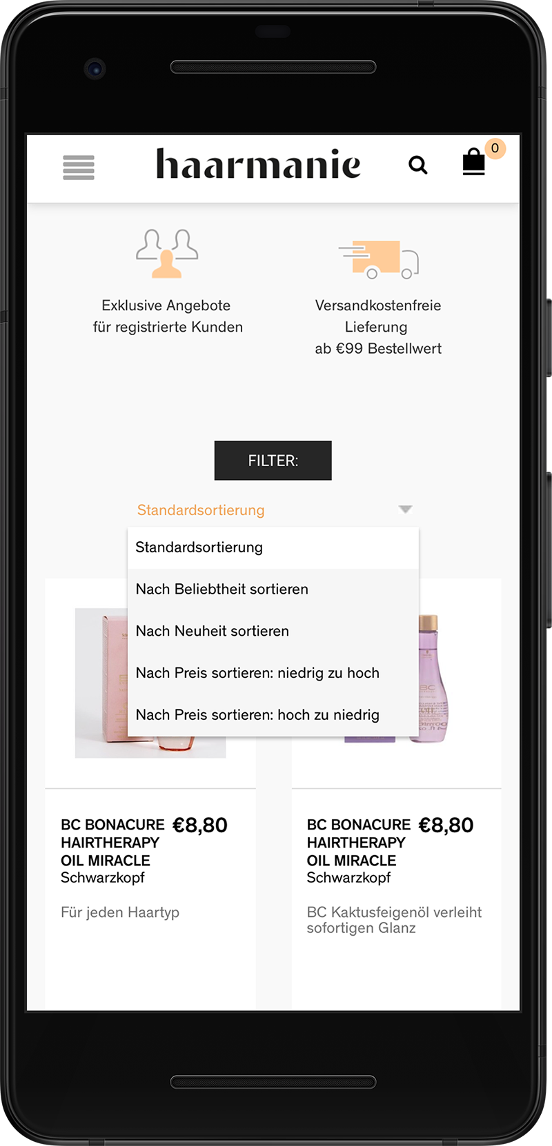
After specifying the brief, we started defining our UX concept by customising the template: we enabled product filtering by various criteria and product placement into the cart directly from the opening page. The quantity, the assortment, etc. can be immediately selected on the product cards which can then be placed into the cart, so users do not have to navigate to the page of the selected product, but can immediately add the desired quantity/type of the product. Taking into account the quantity of products offered in the webshop, we created a flat navigation structure and grouped the products into 4 categories (and created 4 corresponding menu items) in order to obtain an easy product access. We replaced the template’s slider with a hero image (a large web banner image) since the slider distracts users’ attention and the Call to Action button does not convert very well either. For this reason, we are showing with a relevant image showing seasonal /special offers and promotions as well as discount periods and users can easily get engaged with the content.

We also modified the template’s filter function. The filter category blocks can be opened and closed. When using the filter function, we can immediately see the number of products filtered in the given category and results are shown accordingly. On the home page, we replaced the last product box with a contact form which can be used for ordering any product currently not available in the webshop.

The entire purchase process (placing products in the cart, indicating payment and billing details, finalising the order) is structured and easy to follow; no registration is needed to make a purchase because registration significantly increases the abandonment rate.

We used Mailchimp newsletter software and created a template about the grand opening promotions based on client requirements. We significantly modified the administrator-side management of the ordering process and added new functionalities to meet the client’s needs. We expanded the basic functions of Woocoommerce with individual status management and automated message sending and implemented price display broken down by product.

We included individual fields for client details (delivery details, individual tracking code, etc.) on the check-out page. We also enabled order filtering according to order status (order received, under processing, etc.) We customized the billing plug-in: prices and discounts are displayed separately by unit.
When we customize a readily available template for a project, we need to take into consideration the limitations of the available functionalities. If we had to considerably deviate from the out of box capabilities, it would be worth considering creating a bespoke code to provide a customised solution for the client.
In certain cases we considered replacing the third party plugins with our own codes, warranted by the unique needs of the client. But for this project, we decided to customise and modify the third party plugins which allowed us to complete the development in a cost-efficient and timely manner. During the development process we had weekly status meetings with the client making sure that all their needs is neatly dealt with, helped them to use the WordPress administrator interface (uploading and modifying products, handling status, using the billing plugin, etc.)
Overall we have created a webshop with a user friendly interface, easy to use on the administrator side by customising a well-designed template and by substantially expanding the functionalities of Woocommerce.
Further screenshots:


and banking
We have grown to become the most experienced UX team specialising in FinTech in Europe, with 30+ FinTech projects successfully completed. Our portfolio ranges from mobile and Internet banking to internal systems, from sales support to chatbot and voice interfaces.
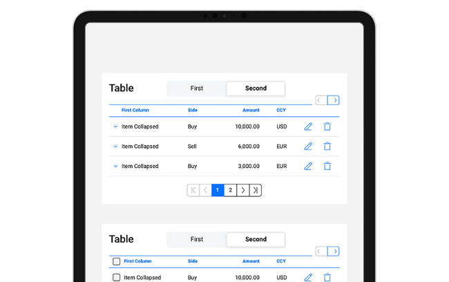
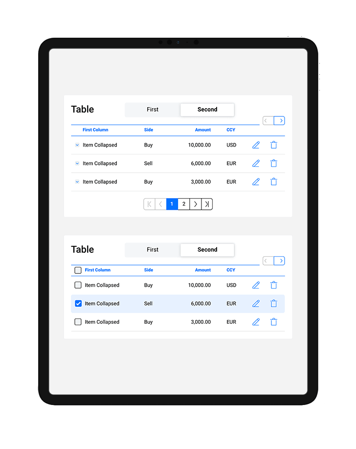
We established written and visual consistencies and guidelines for TreasurUp’s financial platform. To date TreasurUp has 4 multinational banks as clients, with the Scandinavian giant Nordea being the latest recruit, as of 2020.


